Chapter: Psychology: Sensation
The Neural Basis of Color Vision
The Neural
Basis of Color Vision
What is the neural basis of color
vision? The answer turns out to have two parts: how the retina itself
functions, and how the nervous system handles the information received from the
retina.
COLORRECEPTORS
More than 200 years ago, Thomas
Young hypothesized that humans have three types of color receptors; and he
offered a theory of color vision building on these three ele-ments. In 1866,
Hermann von Helmholtz offered some refinements of this view. Today we know
that, at least in broad outline, the Young-Helmholtz
theory was essentially correct. Human color vision is trichromatic—based on three elements, each tied to one type of cone.
What are these “elements”? We’ve
already mentioned that each of the three cone types contains a different
photopigment. Each of these photopigments is sensitive to a broad range of
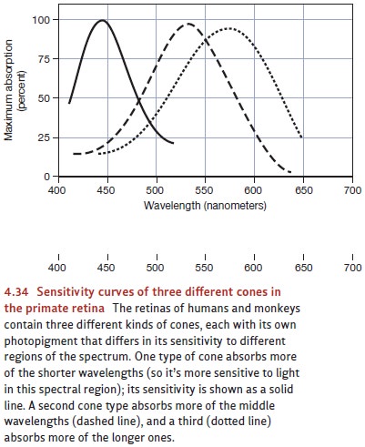
wavelengths, but their patterns of sensitivity are plainly distinct (Figure
4.34). One pigment, and so the cones containing that pigment, is most sensitive
to wavelengths in the short-wave region of the spectrum. Consequently, this
pigment is sensitive to many inputs but especially sensitive to wavelengths
typically perceived as blue. A second pigment is especially sensitive to
wavelengths in the middle range (wavelengths typically perceived as green), and
the third to wavelengths in the long range (typically perceived as orange or
red; Bowmaker & Dartnall, 1980; MacNichol, 1986).
It’s important to realize that
due to the broad sensitivities of these pigments, all three types of cones
respond to most of the wavelengths in the visible spectrum. It’s therefore
impossible to discriminate among wavelengths simply by noting which
cones are responding, because
generally all of them are. So once again, it appears that the nervous system
relies on pattern coding; the input’s wavelength is being specified by the
relative rates of response by all three cone types. For an input of 480
nanome-ters, for example, the “short-preferring” and “middle-preferring” cones
will respond equally, and their response will be about double the response of
the “long-preferring” cones. This pattern of response specifies this particular
wavelength. Likewise, an input of 580 nanometers will produce a response in the
long-preferring cones that’s roughly double the response in the
middle-preferring cones, and there will be virtually no response from the
short-preferring cones. This pattern identifies this specific wave-length. And
so on for the millions of other response patterns, each of which identifies a
specific wavelength.
Of course, many of the colors you
encounter involve a mix of several different wavelengths; but that’s not a
problem. Each of the wavelengths contained in this mix will trigger the neural
response that would result if that wavelength were presented on its own, and so
the total response for each cone type will simply be the sum of that cone’s
responses to each ingredient—each wavelength—in the mix. Here’s an example: If
the input contains wavelengths A, B, and C, the short-preferring cones’
response to this stimulus will simply be the total of those cones’ response to
A when it’s presented alone, plus their response to B when it’s presented
alone, plus their response to C. (And so if, say, the light is at an intensity
in which wavelength A on its own would trigger the receptor to fire 70 times
per second, and B on its own would trigger the receptor to fire 30 times per
second, and C would trigger the cell to fire 10 times per second, the mix of A,
B, and C will cause the cell to fire roughly times per second.) The same goes
for the middle-preferring and long-preferring cones; their responses, too, will
simply be the sums of their responses to each of the individual ingredients in
the mix.
Be aware, though, that it’s the
total response that matters—not how the total was achieved. Thus, if three
wavelengths together cause the short-preferring cones to fire times per second,
it doesn’t matter if the wavelengths on their own would have produced rates of
70, 30, and 10 (as in the previous paragraph), or if they would have produced
rates of 20, 60, and 30 or 37, 15, and 58. All that matters is the sum. And
this is crucial, because it’s almost always possible to find different mixes of
wavelengths that will produce the same three totals (again, one total for each
of the cone types). This explains why artists can mix their pigments to produce
virtually any color, and it’s how a television or computer monitor produces the
various colors that appear on the screen. In both of these cases, we’re
combining wavelengths so that we’ll get the three totals we need to produce the
desired perception.
COMPLEMENTARY HUES
The trichromatic analysis of
color vision is consistent with many facts—including the central observation
that there are just three cone types, each with its own photopig-ment. Other
observations, however, don’t seem to fit with the trichromatic view—such as the
fact that, in important ways, colors seem to come in pairs. This pairing is
evident, for example, in simultaneous
color contrast—the chromatic counterpart of brightness contrast. Color
contrast refers to the tendency of any chromatic region in the visual field to
induce a complementary color in
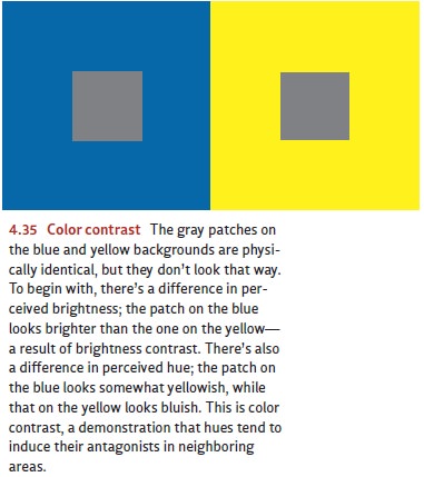
adjoining areas. For example, a gray patch tends to look bluish if it’s
surrounded by yellow, and yellowish if surrounded by blue; likewise, a gray
patch looks reddish if surrounded by green, and greenish if surrounded by red
(Figure 4.35). In this way, then, blue and yellow are “paired,” as are red and
green.
Color contrast can also be
demonstrated in temporal relationships rather than spatial ones. Suppose that
you stare at a green patch for a while and then look at a white wall. You’ll
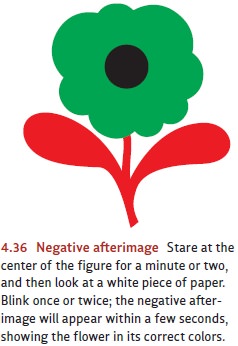
see a negative afterimage of the
patch—in this case, a reddish spot (Figure 4.36). In the same way, staring at a
red patch will produce a green afterimage; staring at some-thing blue will
produce a yellow afterimage; and staring at yellow will produce a blue
afterimage. In all cases, the afterimage has the comple-mentary hue of the
original stimulus. This effect again emphasizes the apparent pairing of
colors—a pairing that trichromatic analyses leave completely unexplained.
Another way to appreciate the
importance of complementary col- ors is by mixing together colored lights. In
these mixtures, “paired” colors seem to can-cel each other; thus, if we mix
blue and yellow lights, we produce a hueless white. The same is true if we mix
red and green lights, or purple and yellow-green, or orange and blue-green.
Here, too, it appears that colors are paired, such that each color has an
“opposite” that cancels it—a relationship that, again, has no explanation in
trichro-matic theory.
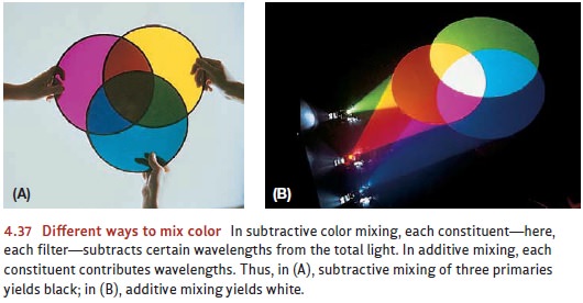
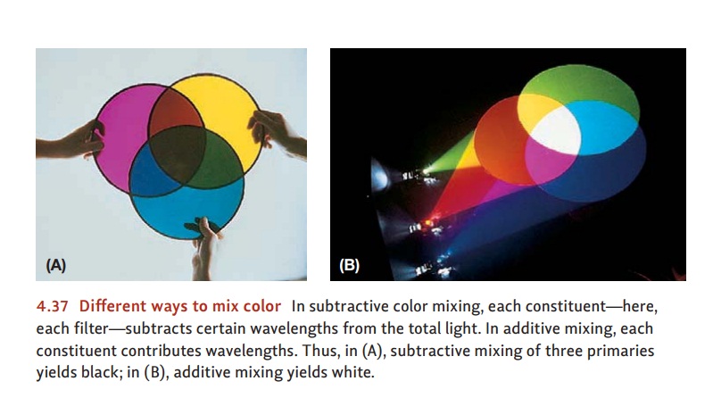
As an aside, note that color mixing works differently when we mix paints or other pig-ments rather than lights (as in Figure 4.37). Why? Because of the physics. Here’s an example: If a blue light is shining on a white surface, then the surface will reflect the wavelengths contained within that blue light. If a yellow light is also shining on the surface, then its wavelengths will be reflected too. So the full set of wavelengths reflected will be those from the blue light plus those from the yellow—which is why this is called an additive color mixture. In contrast, when white light shines on a pigment, only a certain band of wavelengths is reflected; the remaining wavelengths are absorbed by the pigment. Thus blue paint reflects the wavelengths between 420 and 520 nanome-ters, but it absorbs wavelengths outside this range; and so these other wavelengths are removed or “subtracted” from the reflected light. Yellow paint reflects wavelengths above 480 nanometers, and it absorbs those below. If the two paints are mixed together, then the only wavelengths reflected by the combination are those that aren’t absorbed (i.e., not subtracted from the input) by either ingredient. This mixture turns out to be just the wavelengths above 480 nanometers and below 520; and that band of wavelengths is seen as green.
THE OPPONENT- PROCESS THEORY
How should we think about the
fact that colors seem to come in pairs? The answer ies in
the opponent-process theory, first
suggested by Ewald
Hering but then developed by Leo Hurvich and Dorothea
Jameson. This theory begins with the unde- niable fact
that we have
three cone types, but
it argues that
the output from
these cones is then processed by another layer of neural mechanisms that
recode the sig- nal on the basis of
three pairs of colors—red versus
green, blue versus yellow, and black versus white. These pairs are said to
involve an “opponent process” because the two members of each pair are
antagonists—that is, excitation of neurons on one side of these mechanisms
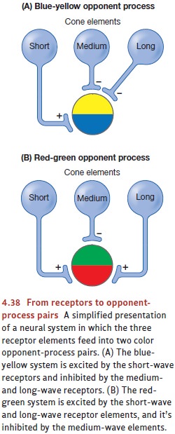
automatically inhibits cells on the other side (Figure 4.38). As a result, each
of the opponent-process mechanisms can be thought of as a balance— and if one
arm of the balance goes down, the other necessarily goes up (Hurvich
&Jameson, 1957).
How do these mechanisms shape our
perception of color? According to the opponent- process theory, the
psychological experience of hue depends
on two of the opponent- process pairs—red-green
and blue-yellow. If, for example, the input tips the red-green balance toward
red and the blue-yellow balance toward blue, the perceived hue will be violet.
If the input contains neither red nor green (so the red-green pair stays in
balance) and the blue-yellow system tips toward blue, we perceive a pure blue.
If both hue systems are in balance, there will be no hue at all, and the
resulting color will be seen as achro- matic (i.e., without hue).
This conception easily explains
the apparent pairing of colors, because the pairing is built into the opponent
processes themselves. It also explains why, according to most observers, there
appear to be four primary colors (red, green, blue, and yellow)—even
though, without question,
our retina has
only three cone
types. But, in
addition, evidence has directly
confirmed the claims
of the opponent-process theory
by docu- menting that many of the
neurons in the visual system behave exactly as the theory pro- poses. For
example, certain cells increase their firing rate if the retina is stimulated
by green light, but they decrease their rate if the retina is stimulated by red
light. Other cells show the opposite pattern (increase for red, decrease for
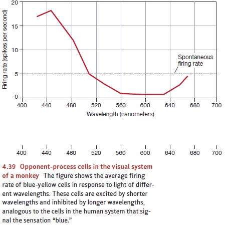
green). Still other cells show a similar pattern of responses for blue and
yellow light (Figure 4.39; De Valois, 1965). All of this is exactly what we
might expect if these cells embody the mechanisms proposed by the
opponent-process theory.
COLOR BLINDNESS
Not everyone responds to color
like most of us do. Some form of color-vision defect is found in 8% of
Caucasian males (but only 0.03% of females; the rate of color blindness is
lower in other races). The deficiencies in color vision come in various forms.
The great majority of people identified as color blind are actually missing one
of the three visual pigments (and so they’re “dichromats,” not “trichromats”).
Other forms of color blind-ness can involve a defective opponent process or a
malfunction in brain circuitry needed for color vision (Hurvich, 1981). Most
common is a confusion of reds with greens; least common is total color
blindness, in which no hues can be distinguished at all. Interestingly, though,
most of these problems are rarely noticed in everyday life, and color-blind
people can spend many years without even realizing they’re color blind. They
call stop signs “red” and grass “green,” just like anyone else does. And,
presum-ably, they spend much of their lives believing that others perceive colors
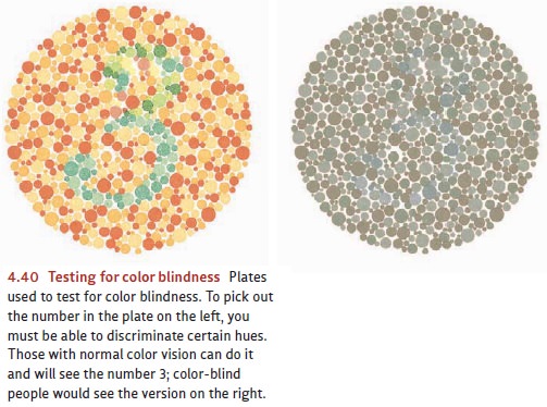
the same way they do. Their color blindness can be confirmed only with special
tests like the one shown in Figure 4.40.
Color blindness can result from
various injuries to the eye or brain, but this condi-tion most commonly has a
genetic origin. It’s also much more frequent in humans than it is in other
primates with color vision similar to our own. This finding has led some
scholars to explore the evolutionary origins of color blindness. They argue
that this supposed “defect” might actually have benefited some of our
evolutionary ancestors— for example, in certain situations a color-blind hunter
can spot prey that others might miss. (Because hues that appear “matched” to
someone with normal color vision sometimes don’t appear matched for someone who
is color blind, some forms of cam-ouflage—when the prey seems to be the same
hue as the background foliage—will fail with someone who is color blind.) These
situations might have produced a reproduc-tive advantage for our color-blind
ancestors, leading to an increased frequency in the relevant human genes.
Recent studies indicate that the genetics of color blindness are relatively complex and that many genes, on at least 19 different chromosomes, can contribute to color blindness. One of the genetic causes involves a gene mutation on the X chromosome, and this finding explains why color blindness is much more common in men than in women. Women have a pair of X chromosomes, so at least one of the chromosomes in this pair is likely to have a normal version of the relevant gene—leading to normal color vision. Men have an XY genetic pattern, and so only one X chromosome. If this chromosome contains the mutated gene, men have no “backup” gene on another chromosome—and color blindness is the result.
How does the world look to
someone who is color blind? For a long time, this ques-tion seemed impossible
to answer, since most color-blind individuals have no way to compare their
experience to that of an individual with normal color vision, and so no way to
describe the difference. However, researchers discovered one unusual person
(one of the rare women with a color-vision defect) who was red-green
color-blind in one eye but had normal color vision in the other. She was able to
describe what she saw with the defective eye by using the color language she
had learned to use with her other eye. As she described it, with the
color-blind eye she saw only grays, blues, and yellows. Red and green hues were
altogether absent, as if one of the opponent-process pairs were missing (Graham
& Hsia, 1954).
Related Topics