Chapter: Mechanical : Total Quality Management (TQM) : TQM Tools & Techniques
The seven traditional tools of quality
The seven traditional tools of quality
I - Pareto chart: Italian
economist Vilfredo Pareto Shows on a bar graph which factors are
more significant. This method helps to find the vital few contributing maximum
impact.
Purpose: The
purpose of the Pareto chart is to prioritize problems No company has
enough resources to tackle every problem, so they must prioritize.
Pareto Principle: The
Pareto concept was developed by the describing the frequency
distribution of any given characteristic of a population. Also called the 20-80
rule, he determined that a small percentage of any given group (20%) account
for a high amount of a certain characteristic (80%).
Conclusion: The most
important thing in improving quality is to start somewhere, doing
something. As you begin using the Pareto chart to decide where your problems
are, you will discover many things about your processes and will come because
you will know where to improve.
II - Flowchart: A
technique that separates data gathered from a variety of sources so that patterns
can be seen (some lists replace "stratification" with or "run
chart").
Purpose: Flow
Charts provide a visual illustration of the sequence of operations required to
complete a task.
A picture of the steps the
process undergoes to complete it's task. Every process will require input(s) to
complete it's task, and will provide output(s) when the task is completed. Flow
charts can be drawn in many styles. Flow charts can be used to describe a
single process, parts of a process, or a set of processes. There is no right or
wrong way to draw a flow chart. The true test of a flow chart is how well those
who create and use it can understand it. Input ---------------------Process----------------Output
III - Cause-and-Effect
Diagrams - 1943 by Mr. Kaoru Ishikawa at the University of
Tokyo
Purpose: One important part of process
improvement is continuously striving to obtain more information about
the process and it's output. Cause-and-effect diagrams allow us to do not just
that, but also can lead us to the root cause, or causes, of problems.
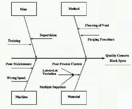
Constructing the Cause-and-Effect Diagram:
Step 1: Select the team members
and a leader. Team members knowledgeable about the quality. Team members focus
on the problem under investigation.
Step 2: Write the problem
statement on the right hand side of the page, and draw a box around it with an
arrow running to it. This quality concern is now the effect.
Step 3: Brain-storming. The team
members generate ideas as to what is causing the effect.
Step 4: This step could be
combined with step 3. Identify, for each main cause, its related sub-causes
that might affect our quality concern or problem (our Effect). Always check to
see if all the factors contributing to the problem have been identified. Start
by asking why the problem exists.
Step 5: Focus on one or two
causes for which an improvement action(s) can be developed using other quality
tools such as Pareto charts, check sheets, and other gathering and analysis
tools. Conclusion: Improvement requires knowledge. The more information
we have about our processes the better we are at improving them.
Cause-and-effect diagrams are one quality tool that is simple yet very powerful
in helping us better understand our processes.
IV - Check Sheet
Purpose: Check
sheets allow the user to collect data from a process in an easy, systematic,
and organized manner.
Data Collection: Before we
can talk about check sheets we need to understand what we mean by data
collection. This collected data needs to be accurate and relevant to the
quality problem. The first is to establish a purpose for collecting this data.
Second, we need to define the type of data that is going to be collected.
Measurable data such as length, size, weight, time,...etc., and countable data
such as the number of defects. The third step is to determine who is going to
collect that data and when it should be collected.
V-
Histograms
Purpose: To
determine the spread or variation of a set of data points in a graphical form.
It is always a desire to produce things that are equal to their design
values.
Histograms: A
histogram is a tool for summarizing, analyzing, and displaying data. It provides
the user with a graphical representation of the amount of variation found in a
set of data.
Constructing a Histogram: The
following are the steps followed in the construction of a histogram:
Data collection: To ensure good
results, a minimum of 50 data points, or samples, need to be collected
Calculate the range of the sample
data: The range is the difference between the largest and smallest data points.
Range = Largest point - smallest point.
Calculate the size of the class
interval. The class interval is the width of each class on the X axis. It is
calculated by the following formula:
Class interval = Range / Number of classes.
Calculate the number of data
points (frequency) that are in each class. A tally sheet is usually used to
find the frequency of data points in each interval.
Conclusion: Histogram
is simple tools that allow the user to identify and interpret the variation
found in a set of data points. It is important to remember that histograms do
not give solutions to problems.
VI - Scatter Diagrams
Purpose: To
identify correlations that might exist between a quality characteristic and a
factor that might be driving it.
Scatter Diagrams: A
scatter diagram is a nonmathematical or graphical approach for identifying
relationships between a performance measure and factors that might be driving
it. This graphical approach is quick, easy to communicate to others, and
generally easy to interpret.
Interpreting the Results: Once
all the data points have been plotted onto the scatter diagram, you are
ready to determine whether their exists a relation between the two selected
items or not. When a strong relationship is present, the change in one item
will automatically cause a change in the other. If no relationship can be
detected, the change in one item will not effect the other item. Their are
three basic types of relationships that can be detected to on a scatter
diagram: 1. Positive relationship 2. Negative relationship 3. No relationship
Conclusion: Scatter diagrams allow the
user to graphically identify correlations that could exist between a
quality characteristic and a factor that might be driving it. It is a quality
tool that is simple, easy to communicate to others, and generally easy to
interpret
VII - Control Charts
Purpose: Process is
in control and to monitor process variation on a continuous basis. Identifying
the tolerance level in the variations. Control charts is one SPC tool that
enables us to monitor and control process variation. Types of variation Common
and Special Cause Variation
Control charts: Developed
in the mid 1920's by Walter Shewhart of Bell labs. There are two basic
types of control charts, the average and range control charts. The first deals
with how close the process is to the nominal design value, while the range
chart indicates the amount of spread or variability around the nominal design
value. A control chart has basically three line: the upper control limit UCL,
the center line CL, and the lower control limit LCL. A minimum of 25 points is
required for a control chart to be accurate.
Related Topics