Chapter: Mechanical : Total Quality Management (TQM) : TQM Tools & Techniques
New Seven management Tools
New Seven
management Tools
It is a simple and effective tool. This approach
focuses on the process (to reveal the causes), rather than the people.
Example: Why was there a delay in dispatch
of good? Cutting tool failed, resulting in delay in manufacture. Why?
The tools were reused?
Why?
Ordered tool were not delivered?
Solution
changes the dispatch schedule, if ever the tools were not delivered.
Forced
Field Analysis
ReadersŌĆÖ
attention is invited to the discussion in Chapter 2 on this topic.
Nominal
Group Technique
This technique provides for ideas input from every
one in the team and for effective decision making.
A team wants to decide upon a current complaint to
attend. Every one in the team writes the problem on a paper, what they think is
most important. They are listed in a chart and then the team members are asked
to rank, from most important to least important. The ranking are given a
numerical value starting from, say, on a 10 to 1 scale. Points for each problem
is totaled and the ones with highest number of points, is considered o be the
most important.
The seven advanced tools of quality management or
the ŌĆśNew SevenŌĆÖ is a collection of tools put together by a set of
Japanese quality professionals. , Arrow Diagram, was known to engineers and
project managers by names like PERT (Programme Evaluation and Review Technique)
or CMP (Critical Mean Path). Another tool in this set PDPC (Process Decision
Programme Chart) has been used in operations research.
CONCEPT
These tools, unlike SPC tools are qualitative tools. Most of
these tools do not involve the use of numerical data.
. Like
all management tools these are judgmental tools.
Managers are often called upon to make decisions based on
their judgement with help of incomplete information or on subjective issues.
Team work
and techniques like brainstorming are very essential for best results with such
tools.
The seven
tools we will see are :
1. Affinity
diagram
2. Relations
diagram
3. Tree
diagram
4. Matrix
diagram
5. Matrix
data analysis diagram .
6
.Process decision programme chart
7. Arrow
diagram
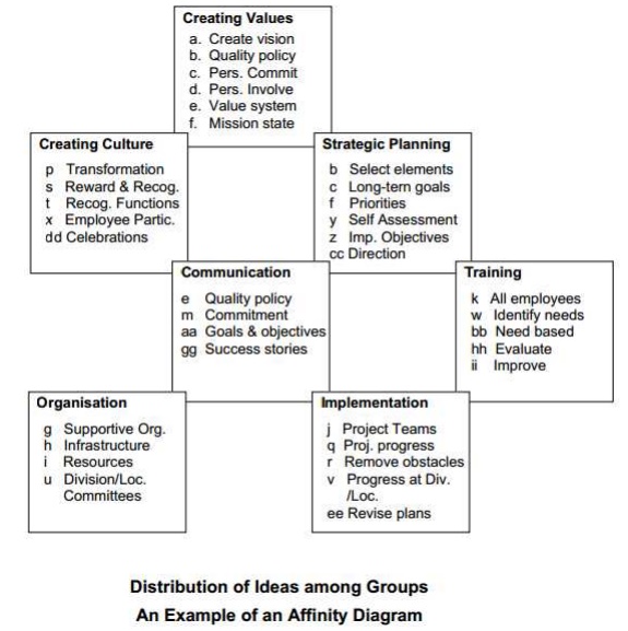
Affinity
Diagram
The purpose of an affinity diagram is to provide a visual
representation of grouping of a large number of ideas or factors or
requirements into logical sets of related items to help one organise action
plans in a systematic manner.
Procedure
The steps
in the procedure for preparing an affinity diagram are :
1. Decide
the subject or the topic
2. Generate a
large number of ideas through brainstorming
3. Decide
the number of groups and their titles. Create a card for each group. Enter the
title of the group at the top of the card.
4. Distribute
all the ideas among the cards. If necessary, create new cards for additional
groups.
5. Arrange
the cards according to the relationship between the groups.
6. Give a
name to the affinity diagram.
Applications:
The structure and the procedure for affinity diagram would
have shown how simple the tool is. Its simplicity makes it easy to combine it
with other tools and put it to a wide variety of applications. For instance, it
can be combined with a cause-and-effect diagram or a relations diagram to
identify and regroup causes for a problem or it can be combined with a tree diagram
to categorise
possible solutions. Thus it can assist in problem solving. It
can be used to group customer requirements in a complex product and can help
one to design a product with characteristics and features that would satisfy
and delight customers. It can be used to categorise actions in an
implementation plan leading to a rationalised distribution of responsibility.
In fact the tool can
be used to break up any complex problem or task into smaller
more easily manageable bits. Someone has asked a question - ŌĆ£How
do you eat a whale ?ŌĆØ which has an obvious answer -ŌĆØA
mouthful at a timeŌĆØ. Another similar set of a question
and an answer is - ŌĆ£How to eat an elephant -
slice by sliceŌĆØ.
Well
affinity diagram is a tool that helps to break up a whale into convenient
mouthfuls or an elephant into manageable slices. Its simplicity makes it a very
widely applicable tool.
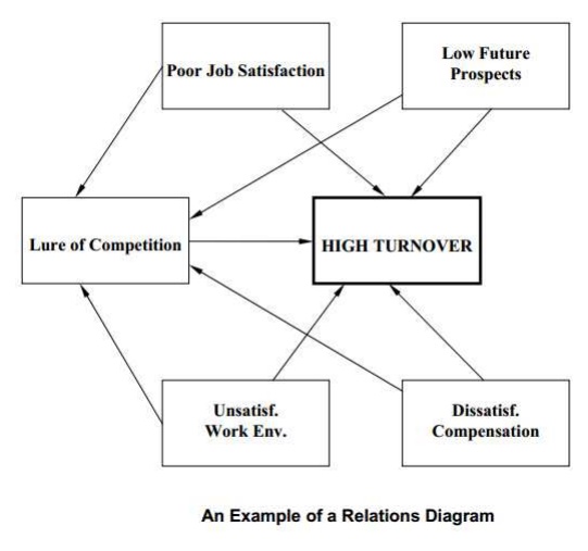
Relations Diagram Purpose
The purpose of relations diagram
is to generate a visual representation of the relations between an effect and
its causes as well as the interrelationship between the causes in complex
problems.
Structure
As mentioned in the opening paragraph of the chapter, the
structure of relations diagram is not very rigid; it is quite flexible. Only thing
fixed about the diagram is a bold bordered rectangle in which the ŌĆśeffectŌĆÖ
is written. The causes are entered in light rectangles and lines are drawn to
show relation
between
the rectangles. The lines have arrows at one end showing which is the cause and
which is the effect - the arrow always leading from the cause to the effect.
The most common shape the diagram takes has the ŌĆśeffectŌĆÖ
at the centre, with immediate causes surrounding it and secondary and
tertiary causes as outer layers.
Procedure
To
prepare a relations diagram, there is a need for a large number of causes. No
single individual can generate an exhaustive list of causes.
Hence the tool gives best results when it is used in a group.
The group must brainstorm the subject to
get the maximum number of causes.
The steps
in the preparation of a relations diagram are:
1.
Decide the ŌĆśeffectŌĆÖ or the problem for which causes are to be found.
Write is
in the centre of the flip chart or a board and enclose it in a dark bordered
rectangle.
Discuss
the subject and confirm the ŌĆśeffectŌĆÖ.
2. Brainstorm
to identify the immediate causes for the effect first. Enter these in
rectangles around the central dark rectangle.
Take care to place causes likely to be related to one another
in adjacent positions.
It is quite possible that the locations of the causes may have
to be changed as one progresses.
Hence a white board is preferable to a flip chart for this
exercise. If a flip chart is used, the causes may be written on post-it pads
and stuck on the chart so that their location can be changed easily.
3. Connect
these immediate causes to the effect by connecting the rectangles of the causes
to that of the effect with a line with an arrow pointing towards the effect.
Explore the cause and effect relationship among the immediate causes and
connect them, keeping in mind that
the arrow always points to an effect.
4. Taking
each of these immediate causes as an effect, brainstorm to find causes for them
one by one.
The key question for identifying causes is ŌĆ£why ?ŌĆØ.
Keep asking the question till the root causes are
identified
for the immediate, secondary and tertiary causes.
5. Explore
the relationship between all the causes and connect the rectangles as in
step-3. Show as many relations among different causes as possible. A large
number of routes leading to the same root causes provides an indication that
the root cause may be an important contributor to the problem.
6. Brainstorm
to find the more important root causes and more prominent links leading to the
effect. Mark these by making the rectangles and the connecting lines darker.
7. If
necessary, rearrange the rectangles in such a way that the connecting lines are
short and the diagram compact.
9. Provide a suitable title to the diagram.
Applications
Relations diagram can be applied to explore cause and effect
relationships, especially in complex situations where the causes are likely to
be mutually related. The most common use is in problem solving to identify
multiple interrelated causes. The output of the tool is a list of root causes
for the problem with some indication of their relative importance. The output
has to be considered as only an indication of the relative importance of the
causes. Data has to be collected to confirm or reject the conclusions arrived
at the end of the session. Priority of corrective actions to eliminate the
causes should be based on the data collected, not on output of relations
diagram. The output of relations diagram is based on the perception of the
members of the group brainstorming the issue; it needs to be supported by
facts. While the output is important as it points a direction to data
collection efforts, it is no substitute for facts and data.
Relations
diagram
Tree
Diagram
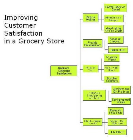
Purpose
The purpose of the tree diagram
is to explore ways and means to achieve an objective, develop a list of
alternate means to reach the desired situation in a sequential order and to
present them in a visual form.
Procedure
This tool like other tools in the
ŌĆśnew sevenŌĆÖ is a group tool. A brainstorming session is necessary to collect
a large number of ideas for the means to achieve the objective. The rules of
brainstorming should be observed to get the best results from the tool.
The steps in the procedure to develop a tree diagram are :
Identify
a high priority problem that needs to be solved at the earliest. Prepare an
objective statement describing the desired situation or the target solution.
2. Decide
the appropriate form of the diagram - cascade or tree as well as direction of
flow after a brief discussion. Place the target solution in the dark rectangle.
3. Brainstorm
to identify the primary means to achieve the objective. Arrange them in an
appropriate order keeping in mind the likely interrelations between them and
place them in rectangles at the first level.
4. For each
of the primary means, identify secondary means which would be necessary to
attain those means. Arrange them in next level boxes.
5. Identify
tertiary means required to attain each of the secondary means and place them in
a proper order in the next level boxes.
6. Continue
the process till the group feels that the end of the line has been reached.
7. If a
lower level means is required to attain two higher level means, it may be
connected to both. Rearrange the boxes if necessary to make this possible. Use
of POST-IT pads can make such a rearrangement simple.
8. Brainstorm
to reach a consensus on the relative importance of the last level means to
priorities action.
9. Give a
suitable title to the diagram. Application The most important application of
the tree diagram is for devising solutions for problems. It helps one to
develop a systematic step by step strategy to achieve an objective. It is also
useful in monitoring the implementation of solutions by taking care of
accomplishment of means at different levels.
Matrix
Diagram
Purpose
The purpose of a matrix diagram is to explore the existence
and the extent of relations between individual items in two sets of factors or
features or characteristics and express them in a symbolic form that is easy to
understand. The purpose for which the tool is most frequently used is to
understand the relation between customer expectations as expressed by the
customers and product characteristics as designed, manufactured and tested by
the manufacturer.
Procedure
The steps
in the procedure to prepare a matrix diagram are :
1. Decide the two sets of factors for which relations are
required to be clarified. Call the set of the main factors
ŌĆśfeaturesŌĆÖ and the set of factors dependent on it counterpart ŌĆścharacteristicsŌĆÖ
or
characteristics.
2. Divide
the features into primary, secondary and tertiary features.
3. Divide
the characteristics into primary, secondary and tertiary characteristics.
4. Place the
features vertically on the left hand side of the matrix and characteristics
horizontally on top of the matrix.
5. Enter the
importance of the features on the column after that for the tertiary features.
6. In the
main body of the matrix, place symbols at the squares denoting the relationship
between thefeature and the characteristic meeting at the intersection. The
symbols to be used are :
- Strong relationship - Medium relationship - Weak
relationship
In case there is no relation between the concerned feature and
characteristic, leave the square blank to indicate ŌĆśno relationŌĆÖ.
The relationship should be based on data available with the team or on the
results
of a brainstorming session which must be confirmed by collecting necessary
data.
7. Title the diagram suitably. ApplicationsMatrix diagram,
being a very simple table showing relations between individual items in two
sets of factors, can be put to a wide variety of uses.
The symbolic representation of the relationship makes the
diagram so much easier to understand as compared to a table with a lot of
figures. Let us see some of the possible applications of a matrix diagram.
Matrix diagram can be used to solve problems by arranging data
in such a way that the relations between relevant factors are brought into
sharp focus. It can be used to understand relations between
customer satisfaction and product characteristics, between
complaints and product groups, between complaints and
geographical regions, between a productŌĆÖs performance in the market and
promotional inputs on it and so on. Once the relations between
individual items in sets of factors are clearly understood and agreed upon, it
becomes easy to solve problems and to plan and implement solutions
systematically.
There is no limit to the use of the tool. The unlimited
possibility of the application of the tool is proved by a couple of unusual
examples. A book on
QC tools written by Japanese authors gives an example where
the tool was used to describe the relations between male and female members of
the staff in an office. A recent article in a magazine brought out by an NBFC
(Non Banking Finance Company) for the benefit of investors used the matrix
diagram to depict the vulnerability of different industries. The diagram
provides relation between 24 industries from Aluminium and Automobiles to tyres
and yarn with half a dozen parameters such as over-capacity, demand recession,
cheap imports etc. The matrix had symbols indicating high, moderate, slight or
no vulnerability of the industry on that parameter. The only difference is that
the symbols used were not the same as those conventionally used in a matrix
diagram. The most important application of matrix diagram is in clarifying
relations
between individual features of
customer requirements and individual product characteristics. Thus the tool
enables one to translate customer expectations into technical specifications
accurately. In other words it helps one develop a product specification that
will satisfy customer expectations. Its use can be extended to clarify the
relationship between product characteristics on one side and product
formulation and process parameters on the other side. In other words it can be
used to generate a process specification that would ensure compliance to the
requirements of a product specification. It can be used to develop
specification requirements for inputs to a process by studying their relation
to the output requirements.
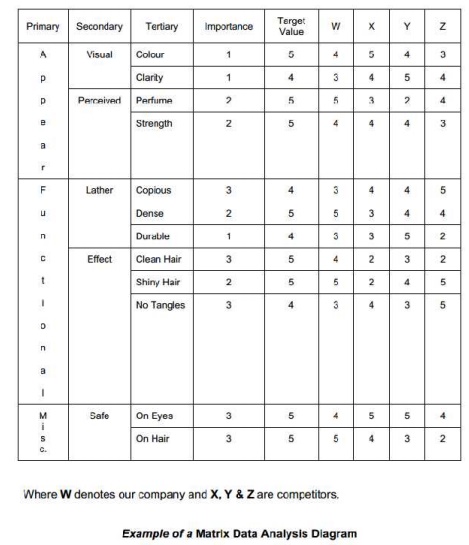
Matrix
Data Analysis Diagram
Purpose
The purpose of matrix data analysis diagram is to present
numerical data about two sets of factors in a matrix form and analyse it to get
numerical output. The factors most often are products and product
characteristics. The purpose then is to analyse the data on several
characteristics for a number of products and use the information to arrive at
optimum values for the characteristics for a new product or to decide the
strong points of a product and use the information for designing a strategy for
the promotion of the product.
Procedure
The procedure
for creating a matrix data analysis diagram consists of the following steps:
1. Decide
the two factors whose relations are to be analyses.
2. Check the
number of individual items in the two factors.
3.
Prepare a matrix to accommodate all the items of the two factors.
4. Enter
numerical data in the matrix.
5. Give the
diagram a suitable title. Applications
The most common application of matrix data analysis diagram is
to decide the desired product characteristics of a new product based on the
analysis of product characteristics of similar products in the market and the
intended positioning of the new product. For instance the characteristics of a
toilet soap for customers with normal skin would be somewhere in between those
for a soap for dry skin and a soap for oily skin. A cosmetic product for
growing children would have characteristics between those of a baby cosmetic
and an adult cosmetic. By collecting data on the product characteristics of
related products and placing them in a matrix data analysis diagram, one can
decide the desired characteristics of the proposed product depending on target
group of customers for the new product.
Analysis of the data can also be used to identify the
strongest characteristics of an existing product to decide its promotional
inputs. The tool can also be used to study the causes of customer complaints.
It can also be used to determine process parameters to achieve desired product
characteristics.
The tool can be very useful in
compiling data obtained on the analysis of competitive products with a view to
develop a product better than the competition or to devise a marketing strategy
for the product based on its strengths.
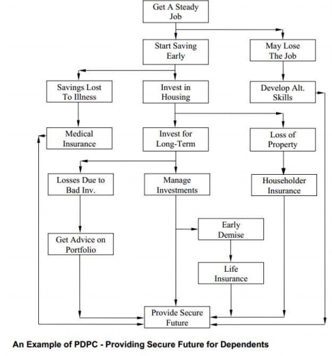
Process Decision Programme Chart
Purpose
The purpose of process decision programme chart is to prepare
for abnormal occurrences with low probability which may otherwise be overlooked
and to present the occurrences as well as the necessary countermeasures to
guard against such occurrences in the form of a visual chart. The tool forces one
to
think of the possible obstacles in the smooth progress of a
process or a project and then find ways and means to surmount those obstacles
to ensure the successful and timely completion of the process or the project.
Thus the tool helps one to prepare a contingency plan to achieve the objective
if
adverse
events occur.
Procedure
The steps
in the preparation of a process decision programme chart are :
1. Prepare
a ŌĆśnormalŌĆÖ flowchart of the process with all expected events as steps in the
chart.
2. Consider
the possibility of the process not going as per the plan due to any abnormal,
though less probable, occurrences.
3. Show
these occurrences on the flowchart through branching at appropriate locations.
4. Consider
how the abnormal occurrence will affect the process and search for ways and
means to counter the effect.
5. Show
these countermeasures in rectangles connecting the corresponding abnormal
occurrence on one side and the process objective or the goal on the other.
6. Give a
suitable title to the diagram.
Steps 2 and 4 require totally different type of thinking and
hence the team must be prepared to think on appropriate lines.
One needs to put on different ŌĆśthinking hatsŌĆÖ while brainstorming steps 2 and 4
and the facilitator must inform all members about it. As
suggested by Dr. Edward De Bono in his book ŌĆśSix Thinking
HatsŌĆÖ the correct thinking hats for steps 2 and 4 are black and yellow which
respectively encourage ŌĆśnegative logicalŌĆÖ and ŌĆśpositive logicalŌĆÖ thinking.
Applications
The tool has the widest range of
applications as it can be used for a range of activities from simple ones like
a game of bridge or reaching railway station or airport in time to catch a
train or a plane to complex processes or projects. In fact if can be applied to
all processes to ensure their success by systematically minimising the untoward
effect of unexpected adverse occurrences. Through the process of brainstorming
for possible adverse occurrences and for measures to counter them, one assures
the success of the process even if such events do occur. The tool can be used
to prevent problems by identifying opportunities for error and devising
measures to avoid failure. It can be used during the implementation of
solutions for predicting resistance and for planning measures to overcome the
resistance.
Process decision programme chart
Arrow Diagram
Purpose
The purpose of an arrow diagram
is to create a visual presentation of the steps of a process or tasks necessary
to complete a project with special emphasis on the time taken for these
activities. The diagram provides a clear understanding of the schedule of
various steps in the process which helps one to monitor the process for
ensuring its completion on time.
Procedure
The steps for preparing an arrow
diagram are :
1. List all
tasks or activities that need to be accomplished before the completion of the
process or the project.
2. Decide
which steps are undertaken in series and which steps can be run in parallel.
3. Arrange
the activities in a proper sequence.
4.
Prepare ŌĆśEvent NodesŌĆÖ at the completion
of steps and number them. Where the process is
bifurcating into two or more parallel streams, more lines will
flow from a node and where the parallel streams are merging, two or more steps
will lead to a node.
5. Write the
description of the step on top of the line or to the left of the line. Decide
the time required for completing each step and write it under or to the right
of the line.
6. Calculate
the earliest time to reach an event node for the start of the process. Where
more than one streams are combining, the maximum time taken by a stream is
taken into consideration. This time is entered on the top half of the
rectangle. This time is related to the starting time of the process which is
taken as zero.
7. After the
time for all event nodes including the completion of the process or the project
is available, one calculates the latest time by which an event node must be
reached. This is done by starting at the time of completion and going back step
by step. The time is entered on the bottom half of the rectangle. The time
indication at all event nodes will appear as :
X Y where X is the earliest time by which the event can be
completed and Y is the latest time by which the event should be completed.
Give a title to the diagram. As
the calculation of the time indications is extremely important in the
construction of an arrow diagram it is necessary that we understand the
procedure well. Let us understand the concept through diagram.
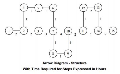
Let us calculate the time the events can be reached earliest
by adding time for the step to the time of the earlier event starting with zero
time at the start i.e. event-1. Where there are two streams one has to take the
time for the longer or the critical path. The time to be put on the top half of
the rectangle for the 15 event nodes are given in table 3.
For event node 7, we get two
values. As the time for node 6 is 5 hours and step from 6 to 7 takes one hour,
the time for 7 would be 6 hours. But time for node 3 is 4 hours and the step
from 3 to 7 takes 3 hours, the time for node 7 comes to 7 hours. The earliest
both streams get ready is 7 hours and hence one has to take 7 hours as the time
for node 7. The same principle has been applied for calculating the time for nodes
10 and 14.
Now let us see how to calculate
the time to be put on the bottom half of the rectangle or the time by which the
event must be reached to ensure
1 2 3 7 10 11 14 15
8 9
1 1 2
1 1 1 1
2 2 3 4 2 5 2
1 11completion of the project on
time. In this case one has to start with event 15 as 20 hours and calculate the
time for the event by reducing the time taken for the step. Step from event 14
to 15 takes 2 hours. To complete the project at 20 hours, it is essential that
one reaches event 14 by 18 hours. In this way
we get the time by which the
events must be accomplished. These are given in table 4. Applications
The most common application of an
arrow diagram is in planning and scheduling projects which involve a large
number of activities. The diagram is also useful in planning and scheduling
steps in complicated processes. Once an arrow diagram is ready with time
indications for all stages of the project or the process, referred as the event
nodes in the procedure, one can look for
opportunities to reduce the time
taken for the project by concentrating on the steps on the critical path. It
can then be used to monitor the progress of the project throughout its
duration.
Related Topics