Chapter: 11th 12th std standard Home Science Maintain Basic Knowledge for family life Higher secondary school College
Colour and colour combinations for House Designing
Colour and colour
combinations
The appeal of colour is universal. It enhances the beauty of objects and
gives satisfaction to the mankind. Each colour has got its own characteristic
such as irritating, charming, boring, welcoming or repelling. Because of these
effects, colour affect the atmosphere of the home and we react emotionally to
different colours.
Dimensions of colour
Colour has three qualities or dimensions. They are hue, value and
intensity.
Hue: hue indicates the name of the
colour. Examples are red, yellow,
blue etc.
Value: Value indicates the lightness or darkness of a colour. The value
of the colour can be changed by adding white or water to make it lighter and
black or more colour to make it darker than the normal colour. A value that is
lighter than the normal hue is termed as tint and a value darker than the
normal hue is termed shade.
Example: Red is a normal hue. Pink is tint of red and maroon is shade of
red.
Dr. Denman W. Ross has given nine degrees of value scales ranging from
white to black. While is the highest of all values and no colour can be as
light as white. Black is the lowest of all values and no colour can be as dark
as black. When black and white are mixed, we get seven different scales of grey
namely highlight, light, lowlight, middle, light dark, dark and low dark, based
on the amount of black and white present in the grey colour.
Ross Value Scale
White
High Light
Light
Low Light
Middle
High Dark
Dark
Low Dark
Black
Intensity
This indicates the brightness or dullness of a colour. It indicates the
purity or strength of a colour.
Classification of
colours
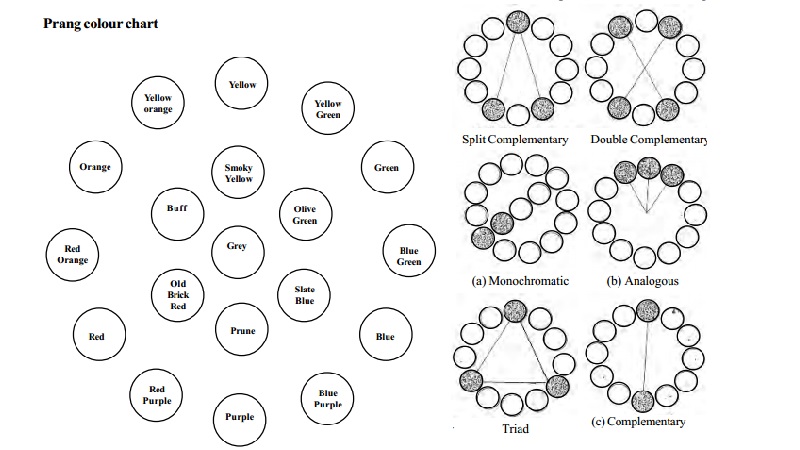
Prang colour chart: According to Prang colour chart, there are three primary colours. They are yellow,
blue and red. They are called primary colours because these colours cannot
be produced by mixing other colours.
When two primary colours are mixed in equal proportions, we get
secondary colours.
Yellow + Blue = Green.
Blue + Red = Violet or Purple.
Red + Yellow = Orange
The primary and secondary colours together are called basic colours.
When a primary and an adjacent secondary colour is mixed an intermediate
colour is produced. There are six intermediate colours.
They are
Yellow + Green = Yellow Green.
Blue + Green = Blue Green.
Blue + Violet = Blue Violet
Red + Violet = Red Violet
Red + Orange = Red Orange
Yellow + Orange = Yellow Orange.
The three primary colours, three secondary colours and six intermediate
colours form the outer circle of the Prang colour chart.
When two binary colours are mixed a tertiary colour is produced. There
are three tertiary colours. They are
Green + Orange = Grey Yellow or Smoky Yellow.
Orange + Violet = Grey Red or Old brick Red.
Green + Violet = Grey Blue or Slate Blue.
When two tertiary colours are mixed a quaternary colour is produced.
There are three quaternary colours.
They are
Smoky Yellow + Old Brick Red = Grey Orange or Buff.
Smoky Yellow + Slate Blue = Grey Green or Olive
Green
Old Brick Red + Slate Blue = Grey Violet or Prune.
The three tertiary and three quaternary colours form the inner circle of
the prang colour chart. Grey colour is in the centre of the Prang colour chart.
When we draw an imaginary vertical line in the centre of the Prang
colour chart, the colours will be divided into two large groups. The colours on
the right side of the prang colour chart closer to blue are cool colours and
the ones on the left side, closer to red and orange are warm colours. Red and Orange are the warmest colours and
Blue and Blue Green are the coolest
colours.
Warm colours make the objects appear bigger and closer where as cool
colours make the objects appear smaller and far away. Warm colours are cheerful
and stimulating where as cool colours are calm and restful. Light values
increase the size of the objects and dark values reduce the size.
Colour combination or
colour harmonies
Colours should be combined effectively to create beauty, pleasure and
satisfaction. They produce a sense of unity in colour combinations. Colour
combination or colour harmonies can be classified into related and contrasting
colour harmonies.
Related colour
Harmony: They are obtained by using colours which are similar. They are classified
into monochromatic and analogous colour harmony.
Monochromatic colour
harmony: This is also known as one hue or one mode harmony. In this only one colour in different
values and intensities is used. Example. Dark blue and light blue. In a
monochromatic colour scheme, charming effects can be obtained through contrast
in textures of the materials used.
Analogous colour
harmony: In this colour scheme the colours which are lying adjacent to each other
in the prang colour chart are used. They provide interesting variety than
monochromatic harmony. The colours should be of different intensities and
values.
Examples: Yellow, Yellow Green, Red, Red Orange, Orange.
Contrasting colour
harmonies
Complementary colour
scheme: Two colours that are directly opposite in the Prang colour chart are
combined. Example: Yellow and Violet, Blue and Orange.
Double complementary
colour harmony: Two adjacent colours and their opposite colours In the Prang colour chart are combined.
For example: Yellow, Yellow Green, Violet and Red Violet.
Split complementary
colour harmony: In this a primary or an intermediate colour and the two colours that lie on either side of
its complementary colour are combined. For example: Yellow, Blue Purple and Red
Purple.
Triad: In this, three colours which are at equal distance in the Prang colour chart are combined. We
get four triads namely primary, secondary and two intermediate triads.
Primary Triad - Yellow, Blue and Red. Secondary Triad - Green, Orange
and Violet. Intermediate Triad -
Blue Green, Red Purple and Yellow Orange
Yellow Green, Blue Purple and Red Orange.
Tetrad: This is formed by any four hues equidistant. on the Prang colour chart. Example : Green, Yellow
Orange, Red and Blue Purple.
Factors to be
considered while planning colour scheme:
The expected effect in size, shape and direction of the room.
The mood to be created in the room. Example: Masculine, feminine,
traditional, formal, etc.
Individual preference of the family members.
The activities to be carried out in each room.
Colours of other existing furniture and furnishings in the house.
Only one colour should dominate.
The basic colour should occupy atleast 60-70% of the whole colour
scheme. Second hue should be used in lesser quantity and if a third colour is
used, it should be used in least quantity.
Follow 'Law of areas' that is, larger the area lighter the colour and
smaller the area brighter the colour.
The current trends and fashions.
Related Topics