Chapter: Java The Complete Reference : Introducing GUI Programming with JavaFX : Exploring JavaFX Controls
ToggleButton - JavaFX
ToggleButton
A useful variation on the
push button is called the toggle button.
A toggle button looks just like a push button, but it acts differently because
it has two states: pushed and released. That is, when you press a toggle
button, it stays pressed rather than popping back up as a regular push button
does. When you press the toggle button a second time, it releases (pops up).
Therefore, each time a toggle button is pushed, it toggles between these two
states. In JavaFX, a toggle button is encapsulated in the ToggleButton class. Like Button,
ToggleButton is also derived from ButtonBase. It implements the Toggle interface, which defines functionality common to all
types of two-state buttons.
ToggleButton defines three constructors. This is the one we will use: ToggleButton(String str)
Here, str is the text displayed in the button. Another constructor allows
you to include an image. Like other buttons, a ToggleButton generates an action event when it is pressed.
Because ToggleButton defines a two-state control, it is commonly used to
let the user select an option. When the button is pressed, the option is
selected. When the button is released, the option is deselected. For this
reason, a program usually needs to determine the toggle button’s state. To do
this, use the isSelected( ) method,
shown here:
final boolean isSelected( )
It returns true if the button is pressed and false otherwise. Here is a short
program that demonstrates ToggleButton:
// Demonstrate a toggle button.
import javafx.application.*; import javafx.scene.*;
import javafx.stage.*; import javafx.scene.layout.*; import
javafx.scene.control.*; import javafx.event.*;
import javafx.geometry.*;
public class ToggleButtonDemo extends
Application {
ToggleButton tbOnOff;
Label response;
public static void main(String[] args) {
// Start the JavaFX application by calling
launch().
launch(args);
}
// Override the start() method.
public void start(Stage myStage) {
//Give the stage a title.
myStage.setTitle("Demonstrate a Toggle
Button");
//Use a FlowPane for the root node. In this
case,
//vertical and horizontal gaps of 10.
FlowPane rootNode = new FlowPane(10, 10);
//Center the controls in the scene.
rootNode.setAlignment(Pos.CENTER);
//Create a scene.
Scene myScene = new Scene(rootNode, 220, 120);
//Set the scene on the stage.
myStage.setScene(myScene);
//Create a label.
response = new Label("Push the
Button.");
// Create the toggle button.
tbOnOff = new ToggleButton("On/Off");
//Handle action events for the toggle button.
tbOnOff.setOnAction(new
EventHandler<ActionEvent>() {
public void handle(ActionEvent ae) {
if(tbOnOff.isSelected()) response.setText("Button is on."); else
response.setText("Button is off.");
}
});
Add the label and buttons to the scene graph.
rootNode.getChildren().addAll(tbOnOff, response);
Show the stage and its scene.
myStage.show();
}
}

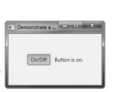
Sample output produced by the
program is shown here, with the button pressed:
In the program, notice how
the pressed/released state of the toggle button is determined by the following
lines of code inside the button’s action event handler.
if(tbOnOff.isSelected())
response.setText("Button is on."); else response.setText("Button
is off.");
When the button is pressed, isSelected( ) returns true. When the button is released, isSelected( ) returns false.
One other point: It is
possible to use two or more toggle buttons in a group. In this case, only one
button can be in its pressed state at any one time. The process of creating and
using a group of toggle buttons is similar to that required to use radio
buttons. It is described in the following section.
Related Topics