Statistics | Chapter 6 | 8th Maths - Graphical Representation of the Frequency Distribution for Ungrouped Data | 8th Maths : Chapter 6 : Statistics
Chapter: 8th Maths : Chapter 6 : Statistics
Graphical Representation of the Frequency Distribution for Ungrouped Data
Graphical
Representation of the Frequency Distribution for Ungrouped Data
A graphical
representation is the geometrical image of a set of data. It is a mathematical picture.
It enables us to think about a statistical problem in visual terms. A picture is
said to be more effective than words for describing a particular thing. The graphical
representation of data is more effective for understanding. In the previous classes,
we have studied some graphical representations of ungrouped data such as Line graph,
Bar graph, and Pictograph. Now, we are going to represent the given ungrouped data
in the circular form namely the pie diagram or the pie chart.
1. Pie
chart (or) Pie diagram
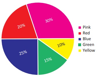
A pie chart
is a circular graph which shows the total value with its components. The circle
is divided into sectors and the area of the sectors is proportional to the information
given. The area of a circle represents the total value and the different sectors
of the circle represent the different components. In the ‘pie chart’ the data are
mostly expressed in percentage. Each component is expressed as percentage of the
total value.
The Pie diagram
is so called because the entire graph looks like an American food ‘pie’ and the
components like slices cut from ‘pie’.
2. Method
of constructing a pie chart:
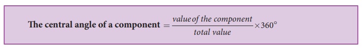
In a pie
chart, we know that the various components are represented by the sectors of a circle
and the whole circle represents the sum of the value of all the components. Therefore,
the total angle of 360° at the centre of the circle is divided into different sectors
according to the value of the components.

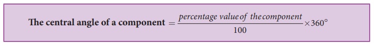
Sometimes,
the value of the components are expressed in percentage. In such cases,
Steps for construction
of the pie chart:
(i) Calculate
the central angle for each component using the above formula and tabulate it.
(ii) Draw
a circle of convenient radius and mark one horizontal radius in it.
(iii) Draw
radius making central angle of first component with horizontal radius. This sector
represents the first component. From this radius, draw next radius with central
angle of the second component and so on, until the completion of all components.
(iv) For
identification of each sector, shade with different colours.
(v) Label
each sector.
Here are
given some examples, let us draw the pie chart for the given data.
Example 6.4
Draw a pie
diagram to represent the following data, which shows the expenditure of paddy cultivation
in 2 acres of land.
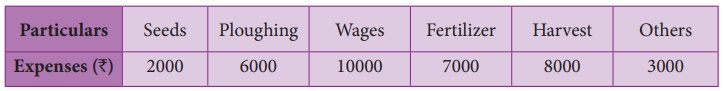
Also, 1.
Find the percentage of the head in which more money had been spent?
2. What percentage
of money was spent for seeds?
Solution:
Expenditure
of paddy cultivation in 2 acres.
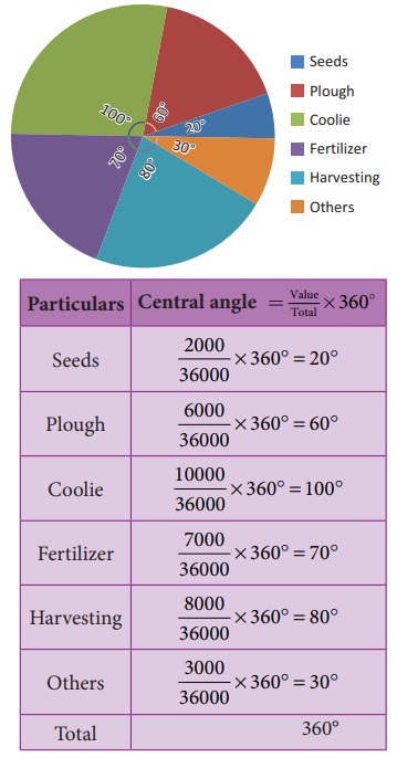
1. More money
had been spent for wages ₹10,000. Converting into percentage, We have Wages = [10000/36000]
×100% = 27.7%
2. ₹2000
was spent for seeds. Converting into percentage, We have,
Seeds = [2000/36000]
×100% = 5.55%
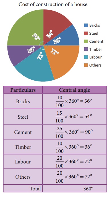
Example 6.5
Draw a suitable
pie chart for the following data relating to the cost of construction of a house.

Also, find
how much was spent on labour if ₹55000 was spent for cement.
Solution:
Cost of construction
of a house.
If the expenses
on cement is ₹ 55000 then, it represents 25 % and he spent 20 % on labour
Therefore,
the expense on Labour = 20/25 × 55000
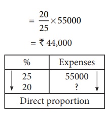
= ₹ 44,000
Note
Uses of pie chart:
1. Pie charts are widely used by the business and the media people.
2. With the help of Pie charts, one can show how the expenditure
of the Government or Industry is distributed over different heads.
3. Research people use these type of charts to show their results.
Related Topics