Statistics | Chapter 6 | 8th Maths - Graphical Representation of the Frequency Distribution for Grouped Data | 8th Maths : Chapter 6 : Statistics
Chapter: 8th Maths : Chapter 6 : Statistics
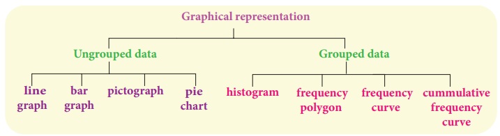
Graphical Representation of the Frequency Distribution for Grouped Data
Graphical
Representation of the Frequency Distribution for Grouped Data
The Line
graph, Bar graph, Pictograph and the Pie chart are the graphical representations
of the frequency for ungrouped data. Histogram, Frequency polygon, Frequency curve,
Cumulative frequency curves (Ogives) are some of the graphical representations of
the frequency distribution for grouped data.
In this class,
we are going to represent the grouped data frequency by Histogram and Frequency
polygon only. You will learn the other type of representations in the higher classes.
1. Histogram
A histogram
is a graph of a continuous frequency distribution. Histogram contains a set of rectangles,
the base of which is the length of the class interval and the frequency in each
class interval is its height. i.e the class intervals are represented on the horizontal
axis (x- axis) and the frequencies are represented on the vertical axis (y-axis).
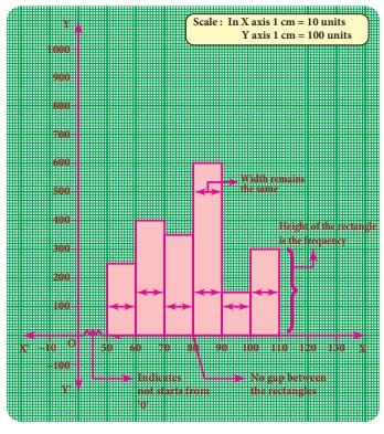
The area of each rectangle is proportional to the frequency in the respective class interval and the total area of the histogram is proportional to the total frequency. Because of the continuous frequency distribution, the rectangles are placed continuously side by side with no gap between adjacent rectangles.
Steps to construct a Histogram:
1. Represent
the data in the continuous form (exclusive form) if it is in discontinuous form
(inclusive form) by converting it using the adjustment factor.
2. Select
the appropriate units along the x-axis and y-axis.
3. Plot the
lower limits of all class interval on the x –axis.
4. Plot the
frequencies of the distribution on the y –
axis.
5. Construct
the rectangles with class intervals as bases and corresponding frequencies as heights.
Each class has lower and upper values. This gives us two equal vertical lines representing
the frequencies. The upper ends of the lines are joined together and this process
will give us rectangles.
Note
Differences between a Bar
graph and a Histogram
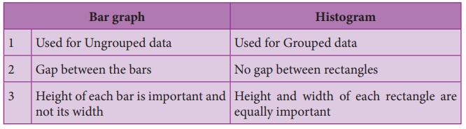
1. (i)
Construction of a histogram for continuous frequency distribution:
Example 6.6
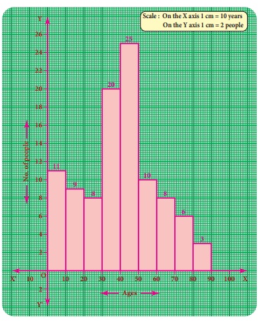
Draw a histogram
for the following table which represents the age groups from 100 people in a village.
Solution:
The given
data is a continuous frequency distribution. The class intervals are drawn on x-axis
and their respective frequencies on y-axis. Classes (ages) and its frequencies (number
of people) are taken together to form a rectangle.
The histogram
is constructed as given below.
Note
If class intervals do not start from ‘0’ then, it is indicated by
drawing a kink (Zig-Zag) mark (![]() ) on the x-axis near the origin. If necessary,
the kink mark (
) on the x-axis near the origin. If necessary,
the kink mark (![]() ) may be made on y-axis or on both the axes. i.e it indicates
that we do not have data starting from the origin (O)
) may be made on y-axis or on both the axes. i.e it indicates
that we do not have data starting from the origin (O)
1. (ii)
Construction of histogram for discontinuous frequency distribution:
Example 6.7
The following
table gives the number of literate females in the age group 10 to 45 years in a
town.
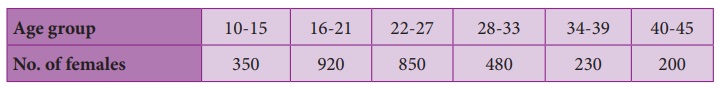
Draw a histogram
to represent the above data
Solution:
The given
distribution is discontinuous. If we represent the given data as it is by a graph
we shall get a bar graph, as there will be gaps in between the classes. So, convert
this into a continuous distribution using the adjustment factor 0.5.
The first
class interval can be written as 9.5-15.5 and the remaining class intervals are
changed in the same way. There are no changes in frequencies.
The new continuous
frequency table is
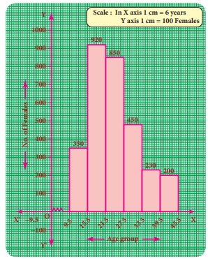
Example 6.8
Observe the given histogram and answer
the following questions

Hint: Under
weight: less than 30 kg; Normal weight:
30 to 45 kg; Obese: More than 45 kg
1. What information
does the histogram represent?
2. Which
group has maximum number of students?
3. How many
of them are under weight?
4. How many
students are obese?
5. How many students are in the weight group of 30-40 kg?
Solution:
1. The histogram
represents the collection of weight from std VIII.
2. There
are maximum 9 students in 30-35 kg weight.
3. There
are 7 (=
2 +5)
students who are under weight.
4. There
are 3 students who are obese.
5. There
are 16(=
9 +7)
students in the 30-40 kg weight group.
2. Frequency
Polygon
A frequency
polygon is a line graph for the graphical representation of the frequency distribution.
If we mark the midpoints on the top of the rectangles in a histogram and join them
by straight lines, the figure so formed is called a frequency polygon. It is called
a polygon as it consists of a number of lines as the sides of a polygon.
A frequency
polygon is useful in comparing two or more frequency distributions.
A frequency
polygon for a grouped frequency distribution can be constructed in two ways.
(i) Using
a histogram
(ii) Without
using a histogram
2. (i)
To construct a frequency polygon using a histogram:
1. Draw a
histogram from the given data.
2. Join the
consecutive midpoints of the upper sides of the adjacent rectangles of the histogram
by the line segments.
3. It is
assumed that the class interval preceding the first rectangle and the class interval
succeeding the last rectangle exists in the histogram and the frequency of each
extreme class interval is zero. These class intervals are known as imagined class
intervals.
4. To get
frequency polygon, join the midpoints of these imagined classes with the corresponding
midpoints of the upper sides of the first and last rectangles of the histogram.
Example 6.9
The following is the distribution of
time spent in the library by students in a school.
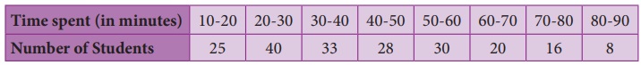
Draw a frequency
polygon using histogram.
Solution:
Represent
the time spent in the library along x- axis and number of students along the y–axis.
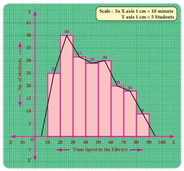
Draw a histogram
for the given data. Now, mark the midpoints of the upper sides of the consecutive
rectangles. Also mark the midpoints of two imagined class intervals 0-10 and 90-100
whose frequency is 0 on x- axis. Now, join all the midpoints with the help of ruler.
We get a frequency polygon imposed on the histogram.
Note
Sometimes imagined class intervals do not exist. For example, in
case of marks obtained by the students in a test, we cannot go below zero and beyond
maximum marks on the two sides. In such cases, the extreme line segments meet at
the mid points of the vertical left and right sides of first and last rectangles
respectively.
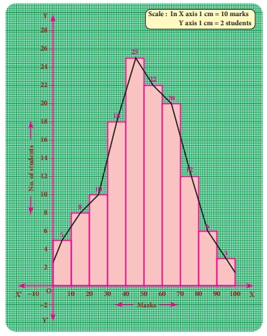
Example 6.10
Draw a frequency
polygon for the following data using histogram.
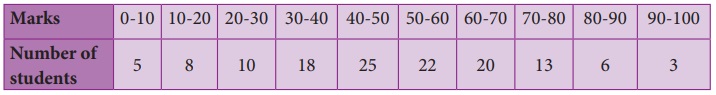
Solution:
Mark the
class intervals along the x-axis and the number of students along the y-axis . Draw
a histogram for the given data and mark the midpoints of the rectangles and join
them by lines. We get frequency polygon. Note that the first and last edges of the
frequency polygon meet at the mid points of the left and right vertical edges of
first and last rectangles.
Because imagined
class intervals do not exist in the marks (refer the above note).
2. (ii)
To draw a frequency polygon without using a histogram:
(1) Find
the midpoints of the class intervals and tabulate it.
(2) Mark
the midpoints of the class intervals on x-axis
and frequencies on y-axis.
(3) Plot
the points corresponding to the frequencies at each midpoints.
(4) Join
the points using a ruler, to get the frequency polygon.
Example 6.11
Draw a frequency
polygon for the following data without using histogram.
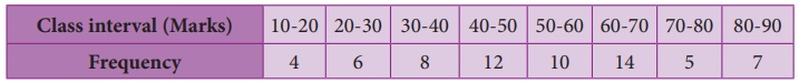
Solution:
Find the
midpoint of the class intervals and tabulate it.
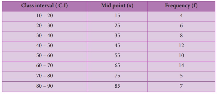
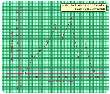
The points
are A(5,0) B(15,4) C(25,6) D(35,8) E(45,12) F(55,10) G(65,14) H(75,5) I(85,7) J(95,0).
In the graph sheet, mark the midpoints along the
x- axis and the frequency along the y- axis.
We take the
imagined class as 0 – 10 at the beginning and 90 – 100 at the end , each with frequency
‘zero’.
From the
table, plot the points. We draw the line segments AB, BC, CD, DE, EF, FG, GH, HI,
IJ to obtain the required frequency polygon ABCDEFGHIJ.
Related Topics