Questions with Answers, Solution | Statistics | Chapter 6 | 8th Maths - Exercise 6.1 (Frequency Distribution Table, Graphical Representation) | 8th Maths : Chapter 6 : Statistics
Chapter: 8th Maths : Chapter 6 : Statistics
Exercise 6.1 (Frequency Distribution Table, Graphical Representation)
Exercise
6.1
1. Fill in the blanks:
(i) Data
has already been collected by some other person is _____________ data. [Answer: Secondary]
(ii) The
upper limit of the class interval (25-35) is _____________. [Answer: 35]
(iii) The
range of the data 200, 15, 20, 103, 3, 196, is _____________. [Answer: 197]
(iv) If a
class size is 10 and range is 80 then the number of classes are _________. [Answer: 8]
(v) Pie chart
is a __________ graph. [Answer: circular]
2. Say True or False:
(i) Inclusive
series is a continuous series. [Answer: False]
(ii) Comparison
of parts of a whole may be done by a pie chart. [Answer:
True]
(iii) Media
and business people use pie charts. [Answer: True]
(iv) A pie
diagram is a circle broken down into component sectors. [Answer: True]
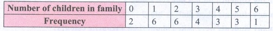
3. Represent the following data in ungrouped
frequency table which gives the number of children in 25 families.
1,3,0,2,5,2,3,4,1,0,5,4,3,1,3,2,5,2,1,1,2,6,2,1,4
Solution:
The data given is raw data.
Ascending order : 0, 1, 2, 3, 4, 5, 6
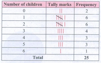
∴ Tabulating in frequency distribution table we get
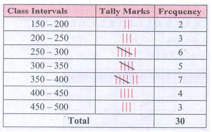
4. Form a continuous frequency distribution
table for the marks obtained by 30 students in a X std public examination.
328, 470, 405, 375, 298, 326, 276, 362,
410, 255, 391, 370, 455, 229, 300, 183, 283, 366, 400, 495, 215, 157, 374, 306,
280, 409, 321, 269, 398, 200.
Solution:
Maximum mark obtained = 495
Minimum marks obtained = 157
Range = Maximum value − Minimum value
Range = 495 − 157
= 338
If we take the class size as 50 then the number of class
intervals possible
= Range / Class size
= 338 / 50 = 6.76
≃ 7
5. A paint company asked a group of students
about their favourite colours and made a pie chart of their findings. Use the information
to answer the following questions.
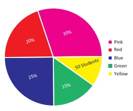
(i) What percentage of the students like
red colour?
(ii) How many students liked green colour?
(iii) What fraction of the students liked
blue?
(iv) How many students did not like red
colour?
(v) How many students liked pink or blue?
(vi) How many students were asked about
their favourite colours?
Solution:
Total percentage of students = 100%
∴ 50 students = 100% − (30% + 20% + 25% + 15%)
= 100% − 90%
50 students = 10%
10% of total students = 50
∴ 10/100 (total students) = 50
Total students = [ 50 × 100 ] / 10 = 500.
Total students = 500.
i) 20% of the students like red colour.
ii) 15% of the students liked green colour.
[ 15 / 100 ] × 500 = 75 students liked green colour.
iii) 25% students liked blue ⇒ 25/100 students liked blue.
=> 1/4 students liked blue.
iv) Percentage of students liked red colour = 20%
Percentage of students did not like red colour
= 100% − 20%
= 80%
∴ Number of students did
not like red colour
= 80% of 500
= [ 80 / 100 ] × 500 = 400
400 students did not like red colour.
v) Students liked pink or blue = students liked pink + students
liked blue.
= 30% of 500 + 25% of 500
= ( [30/100] × 500 ) + ( [25/100] × 500 )
= 150 + 125
= 275
vi) Total number of students = 500.
500 students were asked about their favourite colour.
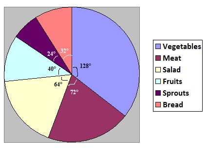
6. A survey gives the following information
of food items preferred by people. Draw a Pie chart.
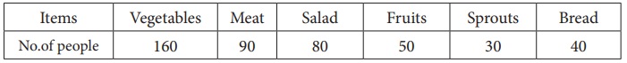
Solution:
Total number of people = 160 + 90 + 80 + 50 + 30 + 40 = 450
Converting the number of people prefer various food items into
components part of 360°
Central angle of a component = [ Value of the component /
Total value ] × 360
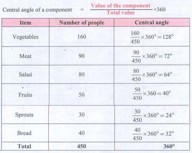
Food items preferred by people.
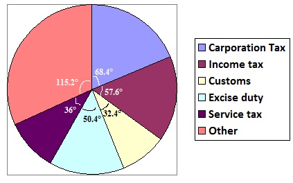
7. Income from various sources for Government
of India from a rupee is given below.
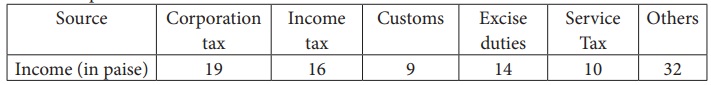
Solution:
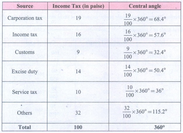
Income from various sources for Government of India in a rupee.
8. Monthly expenditure of Kumaran’s family
is given below. Draw a suitable Pie chart.
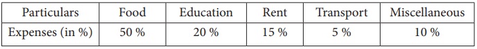
Also
1. Find the amount spent for education
if Kumaran spends ₹6000 for Rent.
2. What is the total salary of Kumaran?
3. How much did he spend more for food
than education?
Solution:
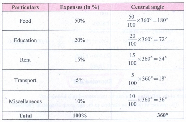
Monthly expenditure of Kumaran's family.
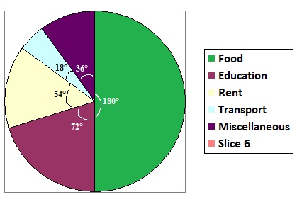
1. Given Kumaran spends ₹
6000 for Rent.
∴ 15% of total expenditure
= 6000
15/100 (Total Expenditure) = 6000
Total Expenditure = [6000 × 100] / 15
Total Expenditure = ₹ 40,000
Amount spend for education = 20% of total expenditure.
= [20 / 100] × 40,000
= ₹ 8000
2. Total salary of Kumaran = ₹ 40,000
3. Amount spend for food = 50% of (40,000) = [50/100] × 40,000 =
₹ 20,000
Amount spend for the food than education
= 20,000 − 8,000 =
= ₹ 12,000
Answer:
Exercise 6.1
1. (i) Secondary (ii)
35 (iii)197 (iv) 8 (v) Circular
2. (i) False (ii) True
(iii) True (iv) True
5. (i) 20% (ii) 75
(iii) 1/4 (iv) 400 (v) 275 (vi) 500
8. (i) ₹8000 (ii)
₹40000 (iii) ₹12000
Related Topics