Chapter: 11th Computer Technology : Chapter 10 : Functions and Chart
Charts in OpenOffice Calc
Charts
in OpenOffice Calc
Introduction
Charts
and graphs can be powerful ways to convey information to the reader through a
pictorial representation. Open Office Calc offers a variety of different chart
and graph formats for data. Using Calc, customization of charts and graphs to a
considerable extent. This facility enhances the presentation of data in an
effectine manner. Many of these options enable to present information in the
best and clearest manner.
Familiarization with the types of charts
There
are various charts graphs representing data through relevant pictorial
representation. The creation and presentation of charts are discussed in the
following sections.
It
is important to remember that while data can be presented with a number of
different charts, the messages to convey to audience dictates the chart
ultimately use. The following sections present examples of the types of charts
that Calc provides.
![]()
![]()
![]() 1. Column charts
1. Column charts
2.
Bar charts
3.
Pie charts
4.
Area charts
5.
Line charts
6.
Scatter or XY charts
7.
Bubble charts
8.
Net charts
9.
Stock charts
10.
Column and line charts
Column Charts
This
type shows a bar chart or bar graph with vertical bars. The height of each bar
is proportional to its value. The x-axis shows categories. The y-axis shows the
value for each category.
Normal type is a sub-type shows all data values belonging to a category
next to each other. Main focus is on the individual absolute values, compared
to every other value.
Stacked type is a sub-type shows the data values of each category on top of
each other. Main focus is the overall category value and the individual
contribution of each value within its category.
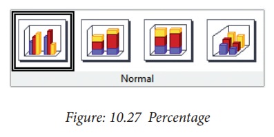
Percent is a sub-type shows the relative percentage of each data value
with regard to the total of its category. Main focus is the relative
contribution of each value to the category's total.
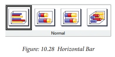
Bar Charts
This
type shows a bar chart or bar graph with horizontal bars. The length of each
bar is proportional to its value. The y-axis shows categories. The x-axis shows
the value for each category.
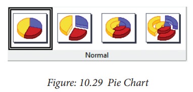
Pie Charts
A
pie chart shows values as circular sectors of the total circle. The length of
the arc, or the area of each sector, is proportional to its value.
Normal Pie is a sub-type shows sectors as colored areas of the total pie, for
one data column only. In the created chart, you can click and drag any sector
to separate that sector from the remaining pie or to join it back.
Exploded pie is a sub-type shows the sectors already separated from each
other. In the created chart, you can click and drag any sector to move it along
a radial from the pie's center.
Doughnut is a sub-type can show multiple data columns. Each data
column is shown as one doughnut shape with a hole inside, where the next data
column can be shown. In the created chart, you can click and drag an outer
sector to move it along a radial from the doughnut's center.
![]()
![]()
![]() Exploded doughnut is a sub-type shows the outer sectors
already separated from the remaining doughnut. In the created chart, you can
click and drag an outer sector to move it along a radial from the doughnut's
center.
Exploded doughnut is a sub-type shows the outer sectors
already separated from the remaining doughnut. In the created chart, you can
click and drag an outer sector to move it along a radial from the doughnut's
center.
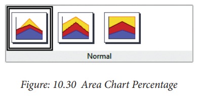
Area charts
An
area chart shows values as points on the y-axis. The x-axis shows categories.
The y-values of each data series are connected by a line. The area between each
two lines is filled with a colour. The area chart's focus is to emphasise the
changes from one category to the next.
Normal - this sub-type plots all values as absolute y-values. It first
plots the area of the last column in the data range, then the next to last, and
so on, and finally the first column of data is drawn. Thus, if the values in
the first column are higher than other values, the last drawn area will hide
the other areas.
Stacked - this sub-type plots values cumulatively stacked on each other. It
ensures that all values are visible, and no data set is hidden by others.
However, the ![]()
![]() y-values no longer represent absolute values, except for the
last column which is drawn at the bottom of the stacked areas.
y-values no longer represent absolute values, except for the
last column which is drawn at the bottom of the stacked areas.
Percent - this sub-type plots values cumulatively stacked on each other and
scaled as percentage of the category total.
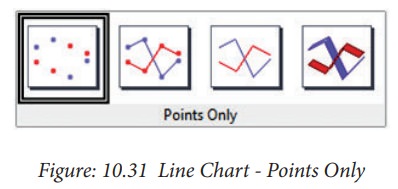
Line charts
A
line chart shows values as points on the y-axis. The x-axis shows categories.
The y-values of each data series can be connected by a line.
Points only - this sub-type plots only points.
Points and lines - this sub-type plots points and connects points of the same
data series by a line.
Lines only - this sub-type plots only lines.
3-D lines - this sub-type connects points of the same data series by a
3-D line.
Scatter or XY charts
An
X-Y chart in its basic form is based
on one data series consisting of a name, a list of x values, and a list of y
values. Each value pair (x|y) is
shown as a point in a coordinate system. The name of the data series is
associated with the y values and
shown in the legend.
![]()
![]()
![]() The chart is created with default settings. After the chart
is finished, you can edit its properties to change the appearance. Line styles
and icons can be changed on the Line tab
page of the data series properties dialogue
box.
The chart is created with default settings. After the chart
is finished, you can edit its properties to change the appearance. Line styles
and icons can be changed on the Line tab
page of the data series properties dialogue
box.
Double-click
any data point to open the Data Series
dialogue box. In this dialogue box, you can change many properties of the data
series.
For
2-D charts, you can choose Insert -
y-Error Bars to enable the display of
error bars.
You
can enable the display of mean value lines and trend lines using commands on
the Insert menu.
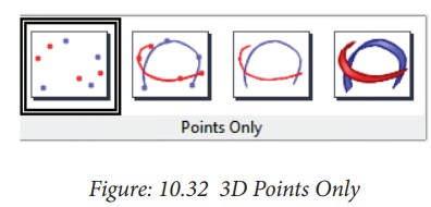
Points only
Each
data point is shown by an icon. OpenOffice uses default icons with different
forms and colours for each data series. The default colours are set in Tools - Options - Charts - Default Colours.
Lines Only
This
variant draws straight lines from one data point to the next. The data points
are not shown by icons.
The
drawing order is the same as the order in the data series. Mark Sort by x-values to draw the lines in the order of the x-values. This sorting applies only to the chart, not to the
data in the table.
Points and Lines
This
variant shows points and lines at the same time.
3-D Lines
The
lines are shown like tapes. The data points are not shown by icons. In the
finished chart choose 3-D View to set properties like illumination and angle of
view.
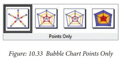
Bubble charts
A
bubble chart shows the relations of three variables. Two variables are used for
the position on the x-axis and y-axis, while the third variable is shown as the
relative size of each bubble.
The
Data Series dialog box for a bubble
chart has an entry to define the data range for the Bubble Sizes.
Net charts
A
Net chart displays data values as points connected by some lines, in a grid net
that resembles a spider net or a radar tube display.
For
each row of chart data, a radial is shown on which the data is plotted. All
data values are shown with the same scale, so all data values should have about
the same magnitude.
Column and line charts
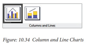
A
Column and Line chart is a combination of a Column chart with a Line chart.
Select one of the variants
•
Columns and Lines. The rectangles of the column data series are drawn side by
side so that you can easily compare their values.
•![]()
![]()
![]()
![]()
![]() Stacked Columns and Lines. The rectangles of the column data
series are drawn stacked above each other, so that the height of a column
visualises the sum of the data values.
Stacked Columns and Lines. The rectangles of the column data
series are drawn stacked above each other, so that the height of a column
visualises the sum of the data values.
You
can insert a second y-axis with Insert - Axes after you finish the wizard.
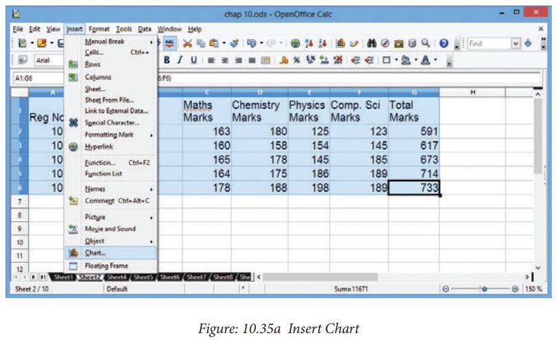
Creating and formatting charts
1.
Select the cells that contain the data that you want to present in your chart.
2.
Click the Insert->Chart option or
click Insert Chart icon  on the Standard toolbar.
3.
The Chart Wizard has three main parts:
•
List of steps involved in setting up the chart,
•
List of chart types, and
•
The options for each chart type.
At
any time you can go back to a previous step and change selections.
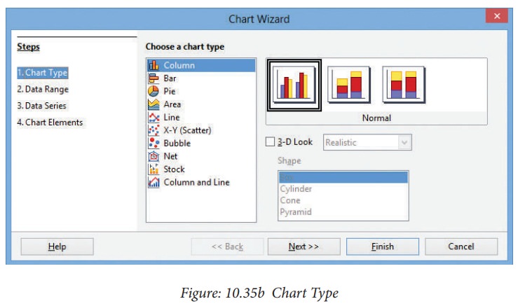
4.
Choose a Chart type and its option
type. Then click Next button.
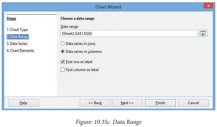
5.
In Step 2, Data Range, manually correct any mistakes made in selecting the
data. Click one of the options for data series in rows or in columns. Check
whether the data range has labels in the first row or in the first column or
both. Then click the Finish button, or click Next to change some more details
of the chart.
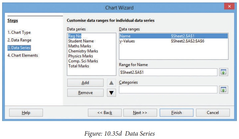
6.
In the Data Series list box contains a list of all data series in the current
chart.
•
To organize the data series, select an
entry in the list.
•
Click Add to add another data series
below the selected entry. The new data series has the same type as the selected
entry.
•
Click Remove to remove the selected
entry from the Data Series list.
•
Use the Up and Down arrow buttons to move the selected entry in the list up or
down. This does not change the order in the data source table, but changes only
the arrangement in the chart.
•
Then click Next button
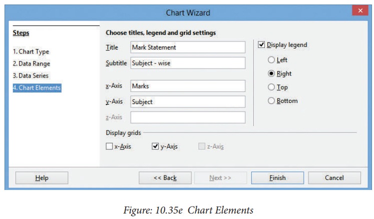
7.
On the Chart Elements page, chart a
title and, if desired, a subtitle. Use a title that draws the viewers’
attention to the purpose of the chart: what you want them to see. For example,
a better title for this chart might be Mark Statement. Then click Finish to
create chart..
Case Study: Create a spreadsheet file to store
sales data of a particular product
and present as Chart.
Related Topics