Chapter: User Interface Design
Selecting Menu Choices
Selecting
Menu Choices
Initial Cursor Positioning
If one option has a significantly higher probability of selection,
position the cursor at that option.
If repeating the previously selected option has the highest probability
of occurrence, position the cursor at this option.
If no option has a significantly higher probability of selection,
position the cursor at the first option.
Choice Selection
-
Pointers:
o
Select the choice by directly pointing at it with a
mechanical device such as a mouse or trackball pointer, or light pen, or
pointing with one’s finger.
o
Visually indicate:
§ Which
options can be selected.
§ When the
option is directly under the pointer and can be selected.
o
Visually distinguish single- and multiple-choice
menu alternatives.
o
If pointing with a mechanical device is the
selection method used:
§ The
selectable target area should be at least twice the size of the active area of
the pointing device or displayed pointer. In no case should it be less than 6
millimeters square.
§ Adequate
separation must be provided between adjacent target areas.
o
If finger pointing is the selection method used:
§ The touch
area must be a minimum of 20 to 30 millimeters square.
§ The touch
area must encompass the entire caption plus one character around it.
-
Keyboard:
-
If moving the cursor to a menu choice:
§ The up
and down arrow keys should move the cursor up or down vertically oriented menu
options.
§ The left
and right cursor keys should move the cursor left or right between horizontally
oriented menu options.
-
If keying a choice identifier value within an entry
field:
§ Locate
the entry field at the bottom of the last choice in the array of choices.
§ Uppercase,
lowercase, and mixed -case typed entries
should all be acceptable.
-
Selection/execution:
o
Provide separate actions for selecting and
executing menu options.
o
Indicate the selected choice through either:
§ Highlighting
it with a distinctive display technique.
§ Modifying
the shape of the cursor.
o
Permit unselecting choice before execution.
§ If a menu
is multiple choice, permit all options to be selected before execution.
-
Combining techniques:
o
Permit alternative selection techniques, to provide
flexibility.
Defaults
Provide a default whenever possible.
Display as bold text.
Unavailable Choices
Unavailable choices should be dimmed or “grayed out.”
Do not add or remove items from a menu unless the user takes explicit
action to add or remove them through the application.
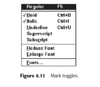
Mark Toggles or Settings
-
Purpose:
o
Use to designate that an item or feature is active
or inactive over a relatively long period of time.
o
Use to provide a reminder that an item or feature
is active or inactive.
-
Guidelines:
o
Position the indicator directly to the left of the option.
-
For situations where several nonexclusive choices
may be selected, consider
including one alternative that deselects all the items and reverts the state to
the “normal” condition.
Toggled Menu Items
Purpose:
-
Use to designate two opposite commands that are
accessed frequently.
-
Use when the menu item displayed will clearly
indicate that the opposite condition currently exists.
Guidelines:
-
Provide a meaningful, fully spelled-out description
of the action.
-
Begin with a verb that unambiguously represents the
outcome of the command.
-
Use mixed-case letters, with the first letter of
each word capitalized.
Kinds of Graphical Menus
The best kind of menu to use in each situation depends on several
factors. The following must be considered:
-
The number of items to be presented in the menu.
-
How often the menu is used.
-
How often the menu contents may change.
.
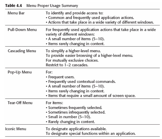
Menu Bar
Proper usage:
-
To identify and provide access to common and
frequently used application actions that takes place in a wide variety of
different windows.
-
A menu bar choice by itself should not initiate an
action.
The advantages of menu bars are that they:
o
Are always visible, reminding the user of their
existence.
o Are easy
to browse through.
o
Are easy to locate consistently on the screen.
o
Usually do not obscure the screen working area.
o
Usually are not obscured by windows and dialog
boxes. o Allow for
use of keyboard equivalents.
The disadvantages of menu bars are that:
o
They consume a full row of screen space.
o
They require looking away from the main working
area to find.
o
They require moving pointer from the main working
area to select.
o
The menu options are smaller than full-size
buttons, slowing selection time. o Their horizontal orientation is less efficient for
scanning.
o
Their horizontal orientation limits number of
choices that can be displayed.
Display
All primary windows must have a menu bar.
All menu bars must have an associated pull-down
menu containing at least two choices.
Do not allow the user to turn off the display of the menu bar.
If all the items in its associated pull-down menu are disabled, then
disable the menu bar item.
Display
the disabled item in a visually subdued manner.
However,
the disabled pull-down menu must always be capable of being pulleddown so that
the choices may be seen.
Location
Position choices horizontally over the entire row at the top of the
screen, just below the screen title.
A large number of choices may necessitate display over two rows.
Title
The window title will be the menu bar title.
Item Descriptions
The menu item descriptions must clearly reflect the kinds of choices
available in the associated pull-down menus.
Menu item descriptions will be the “titles” for pull-down menus
associated with them.
Use mixed-case letters to describe choices.
Use single-word choices whenever possible.
Do not display choices that are never available to the user.
Organization
Follow standard platform ordering schemes where they exist.
Place
application-specific choices where they fit best.
Order choices left-to-right with:
Most
frequent choices to the left.
Related
information grouped together.
Choices found on more than one menu bar should be consistently
positioned.
Left-justify choices within the line.
When choices can be logically grouped, provide visual logical groupings,
if possible.
Help, when included, should be located at the right side of the bar.
Layout
Indent
the first choice one space from the left margin.
Leave at least three spaces between each of the succeeding choices
(except for Help which will be right-justified).
Leave one space between the final choice and the right margin.
Separation
Separate the bar from the remainder of the screen by:
A
different background, or
Solid
lines above and below.
Other Components
Keyboard equivalent mnemonics should be included on menu bars.
Keyboard accelerators, to a window indicators, and cascade indicators
need not be included.
Selection Indication
Keyboard cursor:
Use a
reverse video, or reverse color, selection cursor to surround the choice.
Cover the
entire choice, including one blank space before and after the choice word.
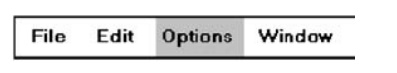
Pointer:
Use
reverse video, or reverse color, to highlight the selected choice.
Pull-Down Menu
Proper usage:
o
To initiate frequently used application actions
that take place on a wide variety of different windows.
o
A small number of items.
o
Items best represented textually.
o
Items whose content rarely changes.
The advantages of pull-down menus are:
o
The menu bar cues a reminder of their existence.
o
They may be located relatively consistently on the
screen. o No window
space is consumed when they are not used.
o
They are easy to browse through.
o
Their vertical orientation is most efficient for
scanning.
o Their
vertical orientation is most efficient for grouping.
o
Their vertical orientation permits more choices to
be displayed.
o
They allow for display of both keyboard equivalents
and accelerators.
The
disadvantages of pull-down menus are:
o
They require searching and selecting from another
menu before seeing options.
o
They require looking away from main working area to
read.
o
The require moving the pointer out of working area
to select (unless using keyboard equivalents).
o
The items are smaller than full-size buttons,
slowing selection time.
o
The may obscure the screen
working area.
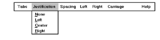
Display
Display all possible alternatives.
Gray-out or dim items that cannot be chosen due to the current state of
an application.
Location
Position the pull-down directly below the selected menu bar choice.
Size
Must contain a minimum of two choices.
Restrict to no more than 5 to 10 choices, preferably 8 or less.
Title
Not necessary on a pull-down menu. The title will be the name of the
menu bar item chosen.
Item Descriptions
Use mixed-case, headline-style words to describe choices.
o
If the choices can be displayed graphically, for
example, as fill-in patterns, shades, or colors, textual descriptions are not
necessary.
Do not:
o
Identify a menu item by the same wording as its
menu title.
o
Change the meaning of menu items through use of the
Shift key.
o
Use scrolling in pull-downs.
o
Place instructions in pull-downs.
Organization
Follow standard platform ordering schemes when they exist.
o
Place application-specific choices where they fit
best.
Place frequent or critical items at the top.
Separate destructive choices from other choices.
Align choices into columns, with:
o
Most frequent choices toward the top.
o
Related choices grouped together.
o
Choices found on more than one pull-down
consistently positioned.
Left-align choice descriptions.
Multicolumn menus are not desirable. If necessary, organize
top-to-bottom, then left-to-right.
Layout
Leave the menu bar choice leading to the pull-down highlighted in the
selected manner (reverse video or reverse color).
Physically, the pull-down menu must be wide enough to accommodate the
longest menu item description and its cascade or accelerator indicator.
Align the first character of the pull-down descriptions under the second
character of the applicable menu bar choice.
Horizontally, separate the pull-down choice descriptions from the
pull-down borders by two spaces on the left side and at least two spaces on the
right side.
o
The left-side border will align with the left side
of the highlighted menu bar choice.
o
The right-side border should extend, at minimum, to
the right side of its highlighted menu bar choice.
o
Pull-downs for choices on the far right side of the
menu bar, or long pull-down descriptions, may require alignment to the left of
their menu bar choice to maintain visibility and clarity.
Groupings
Provide groupings of related pull-down choices:
Incorporate
a solid line between major groupings.
Incorporate
a dotted or dashed line between subgroups.
Left-justify
the lines under the first letter of the columnized choice descriptions.
Right-justify
the lines under the last character of the longest choice description.
Display
the solid line in the same color as the choice descriptions.
Mark Toggles or Settings
If a menu item establishes or changes the attributes of data or
properties of the interface mark the pull-down choice or choices whose state is
current or active
“on.”
For
nonexclusive items, display a check mark to the left of the item
description.
If the
two states of a setting are not obvious opposites, a pair of alternating menu
item descriptions should be used to indicate the two states.
For
exclusive choices, precede the choice with a contrasting symbol such as a
diamond or circle.
Pull-Downs Leading to Another Pull-Down
If a pull-down choice leads to another pull-down, provide a cascade
indicator as follows:
o
Place an arrow or right-pointing triangle after the
choice description.
o
Align the triangles to the right side of the
pull-down.
o
Display the triangle in the same color as the
choice descriptions.
Pull-Downs Leading to a Window
For pull-down choices leading to a window:
o
Place an ellipsis (three dots) after the choice
description.
o
Do not separate the dots from the description by a
space.
o
Display the ellipsis in the same color as the
choice descriptions.
Keyboard Equivalents and
Accelerators
Provide unique mnemonic codes by which choices may be selected through
the typewriter keyboard.
o
Indicate the mnemonic code by underlining the
proper character.
Provide key accelerators for choice selection.
o
Identify the keys by their actual key-top
engravings.
o
Use a plus (+) sign to indicate that two or more
keys must be pressed at the same time.
o
Enclose the key names within parentheses ( ).
o
Right-align the key names, beginning at least three
spaces to the right of the longest choice description.
o
Display the key alternatives in the same color as
the choice descriptions.
Separation
Separate the pull-down from the remainder of the screen, but visually
relate it to the menu bar by:
o
Using a background color the same as the menu bar.
o
Displaying choice descriptions in the same color as
the menu bar.
o
Incorporating a solid-line border completely around
the pull-down in the same color as the choice descriptions.
A drop shadow (a heavier shaded line along two borders that meet) may
also be included.
Selection Cursor
Use a reverse video, or reverse color, selection cursor the same color
as the menu bar to surround the choice.
Create a consistently sized cursor as wide as the pull-down menu.
Cascading Menus
Proper usage:
·
To reduce the number of choices presented together
for selection (reduce menu breadth).
·
When a menu specifies many alternatives and the
alternatives can be grouped in meaningful related sets on a lower-level menu.
·
When a choice leads to a short, fixed list of
single-choice properties.
·
When there are several fixed sets of related
options.
·
To simplify a menu.
·
Avoid using for frequent, repetitive commands.
The advantages of cascading menus are that:
·
The top-level menus are simplified because some
choices are hidden.
·
More first-letter mnemonics are available because
menus possess fewer alternatives.
·
High-level command browsing is easier because
subtopics are hidden.
The disadvantages of cascading menus are:
·
Access to submenu items requires more steps.
·
Access to submenu items requires a change in
pointer movement direction.
·
Exhaustive browsing is more difficult; some
alternatives remain hidden as pull downs become visible.
Cascade Indicator
Place an arrow or right-pointing triangle to the right of each menu
choice description leading to a cascade menu.
Separate the indicator from the choice description by one space.
Display
the indicator in the same color as the choice descriptions.
Location
Position the first choice in the cascading menu immediately to the right
of the selected choice.
Leave the choice leading to the cascading menu highlighted.
Levels
Do not exceed three menu levels (two cascades).
Only one
cascading menu is preferred.
Title
Not necessary on the cascading menu.
The title
will be the name of the higher-level menu item chosen.
Other Guidelines
Follow the organization, content, layout, separation, and selection
cursor guidelines for the kind of menu from which the menu cascades.
Pop-up Menus
Use to present alternatives or choices within the context of the task.
The advantages of pop-up menus are:
·
They appear in the working area.
·
They do not use window space when not displayed. o No pointer movement is needed if
selected by button. o Their vertical orientation is most efficient scanning. o Their vertical orientation most
efficient for grouping.
·
Their vertical orientation allows more choices to
be displayed.
·
They may be able to remain showing (“pinned”) when
used frequently.
·
They allow for display of both keyboard equivalents
and accelerators.
The disadvantages of pop-up menus are:
·
Their existence must be learned and remembered.
·
Means for selecting them must be learned and
remembered.
o They
require a special action to see the menu (mouse click).
·
Items are smaller than full-size buttons, slowing
selection time. o They may obscure the screen working area.
·
Their display locations may not be consistent.
Display
Provide a pop-up menu for common, frequent, contextual actions.
·
If the pointer is positioned over an object
possessing more than one quality (for example, both text and graphics), at
minimum present actions common to all object qualities.
Items that cannot be chosen due to the current state of an application
should not be displayed.
Continue to display a pop-up until:
·
A choice is selected.
·
An action outside the pop-up is initiated.
·
The user removes the pop-up.
Location
Position the pop-up:
·
Centered and to the right of the object from which
it was requested.
·
Close enough to the pointer so that the pointer can
be easily moved onto the menu.
·
But not so close that the pointer is positioned on
an item, possibly leading to accidental selection.
If the pointer is positioned in such a manner that the pop-up would
appear offscreen or clipped, position the menu:
·
As close as possible to the object, but not
covering the object.
·
So that it appears fully on the screen.
Size
Restrict the pop-up to no more than 5 to 10 choices, preferably 8 or
less.
Title
Not necessary on a pop-up menu.
If included, clearly describe the menu’s purpose.
Locate in a centered position at the top.
Display in uppercase or mixed-case letters.
Separate it from the menu items by a line extending from the left menu
border to the right border.
Other Guidelines
Arrange logically organized and grouped choices into columns.
If items are also contained in pull-down menus, organize pop-up menus in
the same manner.
Left-align choice descriptions.
Use mixed-case headline-style words to describe choices.
Separate groups with a solid line the length of the longest choice
description.
If the choice leads to a pop-up window, place an ellipsis after the
choice description.
To separate the pop-up from the screen background:
Use a
contrasting, but complementary background.
Incorporate
a solid line border around the pull-down.
Tear-off Menus
It may also be called a pushpin, detachable, or roll-up menu. Its
purpose is to present alternatives or choices to the screen user that are
needed infrequently at some times
Follow all relevant guidelines for pull-down menus.
Advantages/disadvantages. No space is consumed on the screen when the
menu is not needed. When needed, it can remain continuously displayed. It does
require extra steps to retrieve, and it may obscure the screen working area.
Iconic Menus
Use to remind users of the functions, commands, attributes, or
application choices available.
Create icons that:
Help
enhance recognition and hasten option selection.
Are
concrete and meaningful.
Clearly
represent choices.

Advantages/disadvantages.
Pictures help facilitate memory of applications, and their larger size
increases speed of selection. Pictures do, however, consume considerably more
screen space than text, and they are difficult to organize for scanning
efficiency.
To create meaningful icons requires special skills and an extended
amount of time. Iconic menus should be used to designate applications or
special functions within an application.
Icons must be meaningful and clear. They should help enhance recognition
and hasten option selection.
Pie Menus
Consider using for:
Mouse-driven
selections, with one- or two-level hierarchies, short lists, and choices
conducive to the format.
Default Menu Items
File
A
standard element, the File menu provides all the commands needed to open,
create, and
save
files. Some standard File functions are:
New Open Close Save Save
As Print Preview Print Exit
Edit
A standard
element, the Edit menu provides commands that affect the state of selected
objects.
Some standard Edit functions are:
Undo Cut Copy Paste Select
All Find Replace
View
An
optional element, the View menu provides commands that affect the perspective,
details, and appearance of the application. They affect the view, not the data
itself. The view functions are application-specific and include the following:
Toolbars
Status BarMagnify Zoom In Zoom Out Grid Points
Window
The
Window menu, an optional element, provides commands to manipulate entire
windows. Included are items such as:
New Window Arrange All Hide Show
Help
The Help
menu, a standard element, provides Help commands, including:
Contents Search for Help on How
to Use Help About (Application)
Functions Not Represented by
Default Items
Labels
General:
·
Provide a label for each command.
·
Use labels that indicate:
o
The purpose of the command, or
o
The result of what happens when the command is
selected.
·
Use familiar, short, clear, concise words.
·
Use distinctive wording.
·
Use mixed case, with the first letter capitalized.
·
Begin commands with verbs or adjectives, not nouns.
·
Preferably, use only one word.
o
If multiple words are required for clarity,
capitalize the first letter of each
o
significant word.
o
Do not use sentences as labels.
·
Provide an ellipsis (. . .) to indicate that
another window will result from
·
selection of a command.
o
Do not use the ellipsis when the following window
is a confirmation or warning.
Dynamic labels:
o
As
contexts change, dynamically
change the label
wording to make
its meaning clearer in the new context.
§ For
example, after a cut operation, Undo may be changed to Undo Cut.
Disabled Commands
When a command is not available, indicate its disabled status by displaying
it grayed out or subdued.
If
selection of a disabled command is attempted, provide a message in the
information area that the “Help” function will explain why it is disabled.
Navigation and Selection
General:
·
Permit multiple methods for selecting commands.
Keyboard equivalents:
·
Assign a mnemonic for each command.
·
A mnemonic should be as meaningful as possible.
Use:
o
The first letter of the command, or if duplications
exist,
o
The first letter of another word in the command, or
o
Another significant consonant in the command.
·
For standard commands, use mnemonics provided by
the tool set.
Keyboard accelerators:
·
Assign keyboard accelerators for frequently used
commands.
·
For standard commands, use keyboard accelerators
provided by the tool set.
Applications:
·
Enable
keyboard shortcut for web application
·
Mobile
Applications
·
Online
portal
Related Topics