Chapter: User Interface Design
Understand the Principles of Good Screen Design
Understand
the Principles of Good Screen Design
A well-designed screen:
·
Reflects the capabilities, needs, and tasks of its
users.
·
Is developed within the physical constraints
imposed by the hardware on which it is displayed.
·
Effectively utilizes the capabilities of its
controlling software.
·
Achieves the business objectives of the system for
which it is designed.
How to Distract the Screen User
Unclear captions and badly worded questions. These
cause hesitation, and rereading, in order to determine what is needed or must
be provided. They may also be interpreted incorrectly, causing errors.
Improper type and graphic emphasis. Important
elements are hidden. Emphasis is drawn away from what is important to that
which is not important.
Misleading headings. These also create confusion
and inhibit one’s ability to see existing relationships.
Information requests perceived to be irrelevant or
unnecessary. The value of what one is doing is questioned, as is the value of
the system.
Information requests that require one to backtrack
and rethink a previous answer, or look ahead to determine possible context.
Inefficiency results, and mistakes increase.
Cluttered, cramped layout. Poor layout creates a bad initial impact and leads to more
errors. It may easily cause system rejection.
Poor quality of presentation, legibility, appearance, and arrangement.
Again, this degrades performance, slowing the user down and causing more
errors.
Visual inconsistency in screen detail presentation and with the
operating system.
Lack of restraint in the use of design features and elements.
Overuse of three-dimensional presentations.
Overuse of too many bright colors.
Poorly designed icons.
Bad typography
Metaphors that are either overbearing or too cute, or too literal
thereby restricting design options.
What Screen Users Want
An orderly, clean, clutter-free appearance.
An obvious indication of what is being shown and what should be done
with it.
Expected information located where it should be.
A clear indication of what relates to what, including options, headings,
captions, data, and so forth.
Plain, simple English.
A simple way of finding out what is in a system and how to get it out.
A clear indication of when an action can make a permanent change in the
data or system.
What Screen Users Do
When interacting with a computer, a person
·
Identifies a task to be performed or need to be
fulfilled: The task may be very structured or semi structured or structured
with free form activities.
·
Decides how the task will be completed or the need
fulfilled: set of transaction screens will be used. The proper transaction is
identified and the relevant screen series retrieved.
·
Manipulates the computer’s controls: To perform the
task or satisfy the need, the keyboard, mouse, and other similar devices are
used
·
Gathers the necessary data: Screens information is
collected from its source through forms or coworker and placed on the screen,
through control manipulation.
·
Forms judgments resulting in decisions relevant to
the task or need: Structured transactions will require minimal decision-making.
Semi-structured transactions, in addition, may require decisions such as: Which
set of screens, from all available.
Interface Design Goals
To make
an interface easy and pleasant to use, then, the goal in design is to:
·
Reduce visual work.
·
Reduce intellectual work. o Reduce memory work.
·
Reduce motor work.
·
Minimize or eliminate any burdens or instructions
imposed by technology.
The Test for a Good Design
Can all screen elements be identified by cues other than by reading the
words that make them up?
A simple test for good screen design does exist. A screen that passes
this test will have surmounted the first obstacle to effectiveness. The test is
this: Can all screen elements (field captions, data, title, headings, text,
types of controls, and so on) be identified without reading the words that
identify or comprise them? That is, can a component of a screen be identified
through cues independent of its content?
If this is so, a person’s attention can quickly be drawn to the part of
the screen that is relevant at that moment. People look at a screen for a
particular reason, perhaps to locate a piece of information such as a customer
name, to identify the name of the screen, or to find an instructional or error
message.
The signal at that moment is that element of interest on the screen. The
noise is everything else on the screen. Cues independent of context that
differentiate the components of the screen will reduce visual search times and
minimize confusion.
Screen Meaning and Purpose
Each screen element . . .
·
Every control
·
All text
·
The screen organization
·
All emphasis
·
Each color
·
Every graphic
·
All screen animation
·
Each message
·
All forms of feedback
Must . . .
·
Have meaning to screen users.
·
Serve a purpose in performing tasks.
Organizing Screen Elements
Clearly and Meaningfully
Visual
clarity is achieved when the display elements are organized and presented in
meaningful and understandable ways. A clear and clean organization makes it
easier to recognize screen’s essential elements and to ignore its secondary
information when appropriate.
Consistency
Provide real-world consistency. Reflect a person’s experiences,
expectations, work conventions, and cultural conventions.
Provide internal consistency. Observe the same conventions and rules for
all aspects of an interface screen, and all application or Web site screens,
including:
o
Operational and navigational procedures.
o
Visual identity or theme.
o
Component.
§ Organization.
§ Presentation.
§ Usage.
§ Locations.
Follow the same conventions and rules across all related interfaces.
Deviate only when there is a clear benefit for the user.
Quite simply, consistency greatly aids learning. It establishes an
expectation
Ordering of Screen Data and
Content
Divide information into units those are logical, meaningful, and
sensible.
Organize by the degree interrelationship between data or information.
Provide an ordering of screen units of information and elements that is
prioritized according to the user’s expectations and needs.
Possible ordering schemes include:
·
Conventional.
·
Sequence of use.
·
Frequency of use.
·
Function.
·
Importance.
·
General to specific.
Form groups that cover all possibilities.
Ensure that information that must be compared is visible at the same
time.
Ensure that only information relative to the users tasks or needs is
presented on the screen.
An organizational scheme’s goal is to keep to a minimum the number of
information
Upper-Left Starting Point
Provide an obvious starting point in the screen’s
upper-left corner.
Screen
Navigation and Flow
Provide an ordering of screen information and
elements that:
—Is rhythmic, guiding a person’s
eye through the display.
·
In establishing eye movement through a screen, also
consider that the eye tends to move sequentially, for example:
·
From dark areas to light areas.
·
From big objects to little objects.
·
From unusual shapes to common shapes.
·
From highly saturated colors to unsaturated colors.
-Encourages
natural movement sequences.
-Minimizes
pointer and eye movement distances.
Locate the most important and most frequently used
elements or controls at the top left.
Maintain a top-to-bottom, left-to-right flow.
Assist in navigation through a screen by:
·
Aligning elements.
·
Grouping elements.
·
Using of line borders.
1.
Through focus and emphasis, sequentially, direct
attention to items that are: 1. Critical.
2. Important.
3. Secondary.
4. Peripheral.
Tab through window in logical order of displayed information.
Locate command buttons at end of the tabbing order sequence.
When groups of related information must be broken and displayed on
separate screens, provide breaks at logical or natural points in the
information flow.
Visually Pleasing Composition
Provide
visually pleasing composition with the following qualities: o Balance
·
Symmetry
·
Regularity.
·
Predictability.
·
Sequentially.
·
Economy.
·
Unity.
·
Proportion.
·
Simplicity.
·
Groupings.
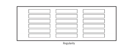
Regularity
Create regularity by establishing standard and
consistently spaced horizontal and vertical alignment points.
Also, use similar element sizes, shapes, colors,
and spacing.
Balance
Create screen balance by providing an equal weight
of screen elements, left and right, top and bottom.

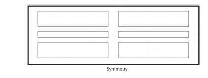
Symmetry
Create symmetry by replicating elements left and right
of the screen centerline.
Predictability
Create predictability by being consistent and following conventional
orders or arrangements.
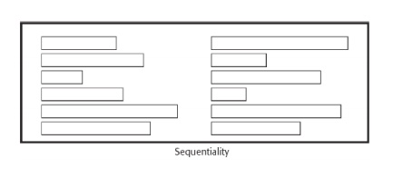
Sequentiality
Provide sequentiality by arranging elements to guide the eye through the
screen in an obvious, logical, rhythmic, and efficient manner.
The eye tends to be attracted to:
o
A brighter element before one less bright.
o
Isolated elements before elements in a group.
o
Graphics before text.
o
Color before black and white.
o
Highly saturated colors before those less
saturated.
o
Dark areas before light areas.
o
A big element before a small one.
o
An unusual shape before a usual one.
o
Big objects before little objects.
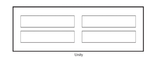
Unity
Create unity by:
-
Using similar sizes, shapes, or colors for related
information.
-
Leaving less space between elements of a screen
than the space left at the margins.
Proportion
Create windows and groupings of data or text with aesthetically pleasing
proportions.
Pleasing
proportions.
Square 1:1
Square-root
of two 1:1.414
Square-root
of three 1:1.732
Double
square 1:2
Golden
rectangle 1:1.618
Simplicity (Complexity)
Optimize the number of elements on a screen, within limits of clarity.
Minimize the alignment points, especially horizontal or columnar.
-
Provide standard grids of horizontal and vertical
lines to position elements.
complexity guidelines:
-
Optimize the number of elements on a screen, within
limits of clarity. o
-
Minimize the alignment points, especially
horizontal or columnar.
Groupings
Provide functional groupings of associated elements.
Create spatial groupings as closely as possible to five degrees of
visual angle (1.67 inches in diameter or about 6 to 7 lines of text, 12 to 14
characters in width).
Evenly space controls within a grouping, allowing 1/8 to 1/4 inch
between each.
Visually reinforce groupings:
-
Provide adequate separation between groupings
through liberal use of white space.
-
Provide line borders around groups.
Provide meaningful titles for each grouping.
Perceptual Principles and
Functional Grouping
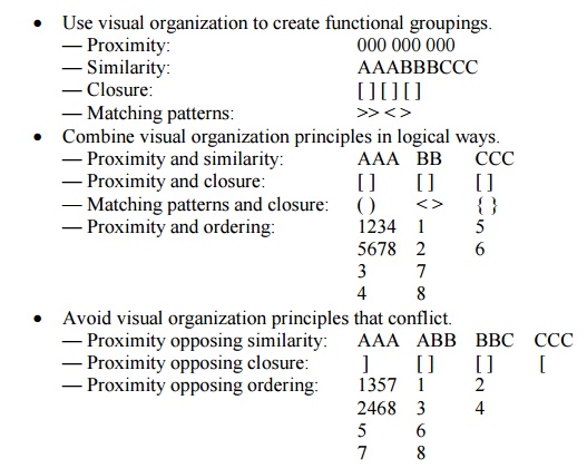
Use visual organization to create functional groupings.
— Proximity: 000
000 000
— Similarity: AAABBBCCC
— Closure: [
] [ ] [ ]
— Matching patterns: >> < >
Grouping Using White Space
Provide adequate separation between groupings through liberal use of
white space.
For Web pages, carefully consider the trade-off between screen white
space and the requirement for page scrolling.
Grouping Using Borders
Incorporate line borders for:
-
Focusing attention on groupings or related
information.
-
Guiding the eye through a screen.
Do not exceed three line thicknesses or two line styles on a screen,
however.
-
Use a standard hierarchy for line presentation.
Create lines consistent in height and length.
Leave sufficient padding space between the information and the
surrounding borders.
For adjacent groupings with borders, whenever possible, align the
borders left, right, top, and bottom.
Use rules and borders sparingly.
In Web page design:
-
be cautious in using horizontal lines as separators
between page sections.
-
Reserve horizontal lines for situations in which
the difference between adjacent areas must be emphasized.
Grouping Using Backgrounds
Consider incorporating a contrasting background for related information.
-
The background should not have the “emphasis” of
the screen component that
-
should be attended to. Consider about a 25 percent
gray screening.
-
Reserve higher contrast or “emphasizing” techniques
for screen components to which attention should be drawn.
Visual Style in Web Page Design
Maintain a consistent and unified visual style throughout the pages of
an entire Web site.
Base the visual style on:
-
The profile and goals of the Web site owner.
-
The profile, tastes, and expectations of the Web
site user.
Amount of Information
Present the proper amount of information for the task.
-
Too little is inefficient.
-
Too much is confusing.
Present all information necessary for performing an action or making a
decision on one screen, whenever possible.
-
People should not have to remember things from one
screen to the next.
Restrict
screen or window density levels to no more than about 30 percent.
Web Page Size
Minimize page length.
-
Restrict to two or three screens of information.
Place critical or important information at the very top so it is always
viewable when the page is opened.
-
Locate it within the top 4 inches of page.
Determining an optimum page length will require balancing these factors.
Arguments for shorter pages and against longer pages are that longer pages:
-
Tax the user’s memory, as related information is
more scattered and not
-
always visible.
-
Can lead to a lost sense of context as navigation
buttons and major links disappear from view.
-
Display more content and a broader range of
navigation links making it more difficult for users to find and then decide
upon what path to follow.
-
Require excessive page scrolling, which may become
cumbersome and inefficient.
-
Are less conducive to the “chunking” information
organization scheme commonly employed in Web sites.
Arguments for longer pages are that they:
-
Resemble the familiar structure of paper documents.
-
Require less “clicks” for navigating through a Web
site. o Are
easier to download and print for later reading.
-
Are easier to maintain because they possess fewer
category navigation links to other pages.
Deciding on Long versus Short
Pages
To find specific information quickly:
-
Create many links to short pages.
To understand an entire concept without interruption:
-
Present the entire concept in one page with
internal links to subtopics.
To print all or most of the content to read offline:
-
Use one long page or prepare a version that uses
one page.
If page will be loading over slow modems and all pages are not needed:
-
Create a comprehensive contents page with links to
many short pages.
Scrolling and Paging
Scrolling:
-
Avoid scrolling to determine a page’s contents.
-
Minimize vertical page scrolling.
-
When vertical scrolling is necessary to view an
entire page:
Provide
contextual cues within the page that it must be scrolled to view its entire
contents.
Provide a unique and consistent “end of page” structure.
-
Avoid horizontal page scrolling.
Paging:
-
Encourage viewing a page through “paging.”
-
Create a second version of a Web site, one consisting
of individual screens that are viewed through “paging.”
Distinctiveness
Individual screen controls, and groups of controls, must be perceptually
distinct.
o
Screen controls:
§ Should
not touch a window border.
§ Should
not touch each other.
o
Field and group borders:
§ Should
not touch a window border.
§ Should
not touch each other.
o
Buttons:
§ Should
not touch a window border.
§ Should
not touch each other.
A button label should not touch the button border.
Adjacent screen elements must be displayed in colors or shades of
sufficient contrast with one another.
Focus and Emphasis
Visually emphasize the:
·
Most prominent element.
·
Most important elements.
·
Central idea or focal point.
To provide emphasis use techniques such as:
·
Higher brightness.
·
Reverse polarity or inverse video.
·
Larger and distinctive font.
·
Underlining.
·
Blinking.
·
Line rulings and surrounding boxes or frames.
·
Contrasting color.
·
Larger size.
·
Positioning.
·
Isolation.
·
Distinctive or unusual shape.
·
White space.
De-emphasize less important elements.
To ensure that emphasized screen elements stand out, avoid:
·
Emphasizing too many screen elements.
·
Using too many emphasis techniques.
·
Screen clutter.
In Web page design:
·
Call attention to new or changed content.
·
Ensure that page text is not overwhelmed by page
background.
Presenting Information Simply and
Meaningfully
Provide legibility.
·
Information is noticeable and distinguishable.
Provide readability.
·
Information is identifiable, interpretable, and
attractive.
Present information in usable form.
·
Translations, transpositions, and references to
documentation should not be required to interpret and understand information.
Utilize contrasting display features.
·
To attract and call attention to different screen
elements.
Create visual lines.
·
Implicit and explicit, to guide the eye.
Be consistent.
·
In appearance and procedural usage.
Typography
In typography, by definition a typeface is the name of a type, such as
Times New Roman, Arial, Verdana, or Helvetica. A font is a typeface of a
particular size, such as Times Roman 16 point or Arial 12 point. In screen
design, the terms have become somewhat interchangeable.
Font Types and Families
Use simple, common, readable fonts.
·
Any sans serif such as Helvetica or Verdana.
·
Times Roman.
Use no more than two families, compatible in terms of line thicknesses,
capital letter height, and so on.
·
Assign a separate purpose to each family.
·
Allow one family to dominate.
Font Size
Use no more than three sizes.
·
Consider “X” height.
For graphical systems use:
·
12 point for menus.
·
10 point for windows.
For Web pages use:
·
12–14 points for body text.
·
18–36 points for titles and headings.
For line spacing use one to one and one-half times font size.
Never change established type sizes to squeeze in more text.
Font Styles and Weight
Use no more than:
-
Two styles of the same family.
o
Standard and italic.
o
Italic is best presented in a serif font.
-
Two weights.
o
Regular and bold.
o
Bold is best presented in a sans serif font.
Use italics when you want to call attention.
Use bold when you want to call attention or create a hierarchy.
In Web pages, use an underline only to indicate a navigation link.
Font Case
Use mixed-case for:
-
Control captions.
-
Data.
-
Control choice descriptions.
-
Text.
-
Informational messages.
-
Instructional information.
-
Menu descriptions.
-
Button descriptions.
Consider using upper case or capitalization for:
-
Title.
-
Section headings.
-
Subsection headings.
-
Caution and warning messages.
-
Words or phrases small in point size.
Use all lower case with caution.
Defaults
For graphical operating systems, use the standard system fonts.
For Web pages design for the default browser fonts.
Consider that the user may change the fonts.
Consistency
Establish a consistent hierarchy and convention for using typefaces,
styles, and sizes.
Decide on
a font for each different level of importance in the hierarchy.
Communicate
hierarchy with changes in:
-
Size.
-
Weight.
-
Color.
Other
Always consider the visual capabilities of the user.( Age Considerations
)
Always verify that the design has succeeded using the selected fonts.
Captions/Labels
Identify controls with captions or labels.
Fully spell them out in a language meaningful to the user.
Display them in normal intensity.
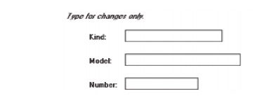
Use a mixed-case font.
Capitalize the first letter of each significant word.
End each caption with a colon (:).
Choose distinct captions that can be easily distinguished from other
captions.
Minimal
differences (one letter or word) cause confusion.
Data Fields
For entry or modifiable data fields, display data within:
-
A line box.
-
A reverse polarity box.
For inquiry or display/read-only screens, display data on the normal
screen background.
Visually emphasize the data fields.
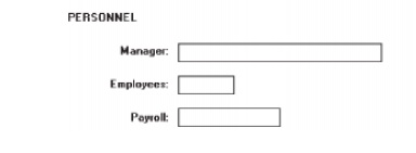
Control Captions/Data Fields
Differentiate captions from data fields by using:
Contrasting
features, such as different intensities, separating columns, boxes, and so
forth.
Consistent
physical relationships.
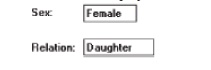
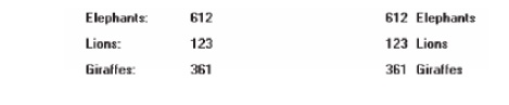
For single data fields:
Place the
caption to left of the data field.

Align the
caption with the control’s data.
Alternately,
place the caption above the data field.
—Align
captions justified, upper left to the data field.

Maintain
consistent positional relations within a screen, or within related screens,
whenever possible.
For
multiple listings of columnar-oriented data, place the caption above the
columnized data fields.

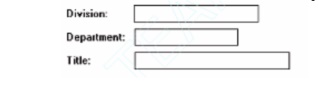
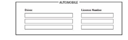
Control Caption/Data Field
Justification
1. First Approach
-
Left-justify both captions and data fields.
-
Leave one space between the longest caption and the
data field column.
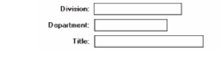
2. Second Approach
-
Left-justify data fields and right-justify captions
to data fields.
-
Leave one space between each.
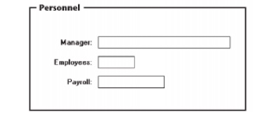
Control Section Headings
Provide a meaningful heading that clearly describes the relationship of
the grouped controls.
Locate
section headings above their related screen controls, separated by one space
line.
-
Alternately, headings may be located within a
border surrounding a grouping, justified to the upper-left corner.
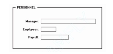
Indent the control captions to the right of the start of the heading.
Fully spell out in an uppercase font.
Display in normal intensity.
-
Alternately, if a different font size or style
exists, the heading may be displayed in mixed case, using the headline style.
Control Subsection or Row
Headings
Provide a meaningful heading that clearly describes the relationship of
the grouped controls.
Locate to the left of the:
Row of
associated fields.
Topmost
row of a group of associated fields.
Separate from the adjacent caption through the use of a unique symbol,
such as one or two greater than signs or a filled-in arrow.
Separate the symbol from the heading by one space and from the caption
by a minimum of three spaces.
Subsection or row headings may be left- or right-aligned.
Fully spell out in an uppercase font.
Display in normal intensity.
-
Alternately, if a different font size or style exists,
the heading may be displayed in mixed-case using the headline style.

Field Group Headings
Provide a
meaningful heading that clearly describes the relationship of the grouped
controls.
Center the field group heading above the captions to which it applies.
Relate it to the captions by a solid line.
Fully spell it out in an uppercase font.
Display it in normal intensity.
Alternately,
if a different font size or style exists and is used, the heading may be
displayed in mixed-case, using the headline style.
Web Page Headings
- Control
Headings:
For
groupings of controls, follow the control heading guidelines.
- Page and
Text Headings:
Provide a
meaningful page heading that clearly describes the content and nature of the
page that follows.
Provide
meaningful text headings and subheadings that clearly describe the content and
nature of the text that follows.
Establish
a hierarchy of font styles, sizes, and weights dependent upon the organization
created and the importance of the text content.
Settle on
as few sizes and styles as necessary to communicate page content and
organization to the user.
Do not
randomly mix heading levels or skip heading levels.
Instructions
Incorporate instructions on a screen, as necessary:
-
In a position just preceding the part, or parts, of
a screen to which they apply.
-
In a manner that visually distinguishes them, such
as:
·
Displaying them in a unique type style.
·
Displaying them in a unique color.
-
In a position that visually distinguishes them by:
·
Left-justifying the instruction and indenting the
related field captions,
·
headings, or text a minimum of three spaces to the
right.
·
Leaving a space line, if possible, between the
instructions and the related control, heading, or text.
Using a
mixed-case font.
Completion Aids
Incorporate completion aids on a screen, as necessary:
·
In a position to the right of the text entry
control to which they apply.
·
In a manner that visually distinguishes them,
including:
o
Displaying them within a parentheses ( ).
o
Possibly displaying them in a unique font style.
·
If the controls are arrayed on the screen in a
columnar format, position the
·
completion aid, or aids:
o
Far enough to the right so as to not detract from
the readability of the
o
entry controls within the column.
o
But close enough to the related control so that
they easily maintain an
o
association with the related control.
·
Left-alignment of completion aids in a column of
controls is desirable but not absolutely necessary.
Information Entry and
Modification (Conversational) Screens
Organization:
·
Logical and clear.
·
Most frequently used information:
§ On the
earliest screens.
§ At the
top of screens.
·
Required information:
§ On the
earliest screens.
§ At the
top of screens.
Captions:
·
Meaningful.
·
Consistently positioned in relation to data field
controls.
·
Left- or right-aligned.
·
Mixed case using headline style.
Text boxes/selection controls:
·
Designate by boxes.
Spacing and groupings:
·
create logical groupings.
·
Make them medium in size, about 5 to 7 lines.
Headings:
·
Upper case or headline-style mixed case.
·
Set off from related controls.
Control arrangement:
·
Align into columns.
·
Organize for top-to-bottom completion.
Required and optional input:
·
Consider distinguishing between required and
optional data input through:
-
Placing required and optional information within
different screens, windows, or groups.
-
Identifying information as required or optional in
a completion aid.
-
Identifying required information with a unique font
or symbol.
Instructions and completion aids:
·
Include as necessary.
-
Position instructions before the controls to which
they apply.
-
Position completion aids to the right of the
controls to which they apply.
Grids
Usage:
·
To enter large amounts of related data or
information.
Design guidelines:
·
provide descriptive headings and, where
appropriate, subheadings for columns and rows.
Do not include colons (:) after the headings.
·
Justify column headings according to the data
presented in the table cells.
-
Left-justify headings for columns containing text.
-
Right-justify headings for columns containing
numbers.
·
Left-justify row headings.
·
Organize the data or information to be entered
logically and clearly.
-
Place similar information together.
-
Place most important or frequently used information
at the top.
-
Arrange information chronologically or
sequentially.
Use light
backgrounds.
Provide
consistent spacing between columns and rows.
If more
than seven rows are presented, insert white space after every fifth row.
Data Presentation
Provide visual emphasis to the data.
Give the data a meaningful structure.
-
Spell out any codes in full.
-
Include natural splits or predefined breaks in
displaying data.
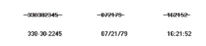
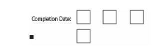
For data strings of five or more numbers or alphanumeric characters with
no natural breaks, display in groups of three or four characters with a blank
between each group.

Data Display
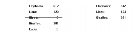
Consider
not displaying data whose values are none, zero, or blank.
Consider
creating “data statements,” in which the caption and data are combined.
Tables
Usage:
-
To present and/or compare large amounts of data or
information.
Design guidelines:
-
Provide descriptive headings and, where
appropriate, subheadings for columns
and rows.
Do not include colons (:) after the headings.
-
Justify column headings according to the data
presented in the table cells.
Left-justify for columns containing text.
Right-justify for columns containing numbers.
-
Left-justify row headings.
-
Organize the presented data or information
logically and clearly.
Place similar information together.
Place most important or frequently used at the top.
Arrange chronologically or sequentially.
-
Justify the data presented in a column according to
its content.
Left-justify
textual data.
Right-justify numeric data.
-
Length should not exceed the depth of a screen.
-
Use light backgrounds.
Highlight a particular cell, column, or row using a
contrasting display
technique.
-
Provide consistent spacing between columns and
rows.
-
If more than seven rows are presented, insert white
space after every fifth row.
-
Use caution in placing borders around cells.
Intranet Design Guidelines
Provide a single home page containing at least:
-
A directory hierarchy.
-
A search facility.
-
Current news.
Present a visual style that is:
-
Different.
-
Distinguishing.
-
Unified.
Orient the intranet Web site toward tasks.
Include many options and features.
Develop a strong navigational system.
Extranet Design Guidelines
To distinguish the extranet from the Internet, provide a subtle
difference in:
-
Visual style.
-
Navigation.
Provide links to the public Internet site
Related Topics