Chapter: Java The Complete Reference : Introducing GUI Programming with Swing : Exploring Swing
The Swing Buttons - Swing
The
Swing Buttons
Swing defines four types of
buttons: JButton, JToggleButton, JCheckBox, and JRadioButton.
All are subclasses of the AbstractButton
class, which extends JComponent.
Thus, all buttons share a set of common traits.
AbstractButton contains many methods that allow you to control the behavior of
buttons. For example, you can define
different icons that are displayed for the button when it is disabled, pressed,
or selected. Another icon can be used as a rollover
icon, which is displayed when the mouse is positioned over a button. The
following methods set these icons:
void setDisabledIcon(Icon di) void setPressedIcon(Icon pi) void setSelectedIcon(Icon si) void setRolloverIcon(Icon ri)
Here, di, pi, si, and ri are
the icons to be used for the indicated purpose.
The text associated with a
button can be read and written via the following methods:
String getText( )
void setText(String str)
Here, str is the text to be associated with the button.
The model used by all buttons
is defined by the ButtonModel
interface. A button generates an action event when it is pressed. Other events
are possible. Each of the concrete button classes is examined next.
JButton
The JButton class provides the functionality of a push button. You have
already seen a simple form of it in the preceding chapter. JButton allows an icon, a string, or both to be associated with the
push button. Three of its constructors are shown here:
JButton(Icon icon) JButton(String str) JButton(String str, Icon icon)
Here, str and icon are the
string and icon used for the button.
When the button is pressed,
an ActionEvent is generated. Using
the ActionEvent object passed to the
actionPerformed( ) method of the
registered ActionListener, you can
obtain the action command string
associated with the button. By default, this is the string displayed inside the
button. However, you can set the action command by calling setActionCommand( ) on the button. You can obtain the action
command by calling getActionCommand( )
on the event object. It is declared like this:
String getActionCommand( )
The action command identifies
the button. Thus, when using two or more buttons within the same application,
the action command gives you an easy way to determine which button was pressed.
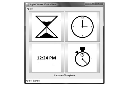
In the preceding chapter, you
saw an example of a text-based button. The following demonstrates an icon-based
button. It displays four push buttons and a label. Each button displays an icon
that represents a timepiece. When a button is pressed, the name of that
timepiece is displayed in the label.
// Demonstrate an icon-based JButton.
import java.awt.*;
import java.awt.event.*; import javax.swing.*;
/*
<applet code="JButtonDemo"
width=250 height=750> </applet>
*/
public class JButtonDemo extends JApplet
implements ActionListener {
JLabel jlab;
public void init() { try {
SwingUtilities.invokeAndWait(
new Runnable() {
public void run() { makeGUI();
}
}
);
} catch (Exception exc) {
System.out.println("Can't create because
of " + exc);
}
}
private void makeGUI() {
Change to flow layout. setLayout(new
FlowLayout());
Add buttons to content pane.
ImageIcon hourglass = new
ImageIcon("hourglass.png"); JButton jb = new JButton(hourglass);
jb.setActionCommand("Hourglass"); jb.addActionListener(this);
add(jb);
ImageIcon analog = new
ImageIcon("analog.png"); jb = new JButton(analog); jb.setActionCommand("Analog
Clock"); jb.addActionListener(this);
add(jb);
ImageIcon digital = new
ImageIcon("digital.png"); jb = new JButton(digital);
jb.setActionCommand("Digital Clock"); jb.addActionListener(this);
add(jb);
ImageIcon stopwatch = new
ImageIcon("stopwatch.png"); jb = new JButton(stopwatch);
jb.setActionCommand("Stopwatch"); jb.addActionListener(this);
add(jb);
// Create and add the label to content pane.
jlab = new JLabel("Choose a
Timepiece"); add(jlab);
}
// Handle button events.
public void actionPerformed(ActionEvent ae) {
jlab.setText("You selected " + ae.getActionCommand());
}
}
Output from the button
example is shown here:
JToggleButton
A useful variation on the
push button is called a toggle button.
A toggle button looks just like a push button, but it acts differently because
it has two states: pushed and released. That is, when you press a toggle
button, it stays pressed rather than popping back up as a regular push button
does. When you press the toggle button a second time, it releases (pops up).
Therefore, each time a toggle button is pushed, it toggles between its two
states.
Toggle buttons are objects of
the JToggleButton class. JToggleButton implements AbstractButton. In addition to creating
standard toggle buttons, JToggleButton is
a superclass for two other Swing
components that also represent two-state controls. These are JCheckBox and JRadioButton, which are described later in this chapter. Thus, JToggleButton defines the basic
functionality of all two-state components.
JToggleButton defines several constructors. The one used by the example in this
section is shown here:
JToggleButton(String str)
This creates a toggle button
that contains the text passed in str.
By default, the button is in the off position. Other constructors enable you to
create toggle buttons that contain images, or images and text.
JToggleButton uses a model defined by a nested class called JToggleButton.Toggle-ButtonModel. Normally, you won’t need to
interact directly with the model to use a
standard toggle button.
Like JButton, JToggleButton
generates an action event each time it is pressed. Unlike JButton, however,
JToggleButton also generates an item event. This event is used by those components that support the concept of
selection. When a JToggleButton is
pressed in, it is selected. When it is popped out, it is deselected.
To handle item events, you
must implement the ItemListener
interface. Recall from Chapter 24, that each time an item event is generated,
it is passed to the itemStateChanged( )
method defined by ItemListener.
Inside itemStateChanged( ), the getItem( ) method can be called on the ItemEvent object to obtain a reference
to the JToggleButton instance that
generated the event. It is shown here:
Object getItem( )
A reference to the button is
returned. You will need to cast this reference to JToggleButton. The easiest way to determine a toggle button’s state
is by calling the isSelected( )
method
(inherited from AbstractButton) on the button that
generated the event. It is shown here: boolean isSelected( )
It returns true if the button is selected and false otherwise.
Here is an example that uses
a toggle button. Notice how the item listener works. It simply calls isSelected( ) to determine the button’s
state.
// Demonstrate JToggleButton.
import java.awt.*;
import java.awt.event.*; import javax.swing.*;
/*
<applet code="JToggleButtonDemo"
width=200 height=80> </applet>
*/
public class JToggleButtonDemo extends JApplet
{
JLabel jlab;
JToggleButton jtbn;
public void init() { try {
SwingUtilities.invokeAndWait(
new Runnable() {
public void run() { makeGUI();
}
}
);
} catch (Exception exc) {
System.out.println("Can't create because
of " + exc);
}
}
private void makeGUI() {
//Change to flow layout.
setLayout(new FlowLayout());
//Create a label.
jlab = new JLabel("Button is off.");
// Make a toggle button.
jtbn = new JToggleButton("On/Off");
// Add an item listener for the toggle button.
jtbn.addItemListener(new ItemListener() {
public void itemStateChanged(ItemEvent ie) {
if(jtbn.isSelected())
jlab.setText("Button is on."); else
jlab.setText("Button is off.");
}
});
// Add the toggle button and label to the
content pane.
add(jtbn);
add(jlab);
}
}
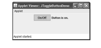
The output from the toggle
button example is shown here:
Check
Boxes
The JCheckBox class provides the functionality of a check box. Its
immediate superclass is JToggleButton,
which provides support for two-state buttons, as just described. JCheckBox defines several
constructors. The one used here is
JCheckBox(String str)
It creates a check box that
has the text specified by str as a
label. Other constructors let you specify the initial selection state of the
button and specify an icon.
When the user selects or
deselects a check box, an ItemEvent
is generated. You can obtain a reference to the JCheckBox that generated the event by calling getItem( ) on the
ItemEvent passed to the
itemStateChanged( ) method defined by
ItemListener. The easiest way to
determine the selected state of a check box is to call isSelected( ) on the JCheckBox
instance.
The following example
illustrates check boxes. It displays four check boxes and a label. When the
user clicks a check box, an ItemEvent
is generated. Inside the itemStateChanged(
) method, getItem( ) is called
to obtain a reference to the JCheckBox
object that generated the event. Next, a call to isSelected( ) determines if the box was selected or cleared. The getText( ) method gets the text for
that check box and uses it to set the text inside the label.
// Demonstrate JCheckbox.
import java.awt.*; import java.awt.event.*;
import javax.swing.*;
/*
<applet code="JCheckBoxDemo"
width=270 height=50> </applet>
*/
public class JCheckBoxDemo extends JApplet
implements ItemListener {
JLabel jlab;
public void init() { try {
SwingUtilities.invokeAndWait(
new Runnable() {
public void run() { makeGUI();
}
}
);
} catch (Exception exc) {
System.out.println("Can't create because
of " + exc);
}
}
private void makeGUI() {
//Change to flow layout.
setLayout(new FlowLayout());
//Add check boxes to the content pane.
JCheckBox cb = new JCheckBox("C");
cb.addItemListener(this);
add(cb);
cb = new JCheckBox("C++");
cb.addItemListener(this); add(cb);
cb = new JCheckBox("Java");
cb.addItemListener(this); add(cb);
cb = new JCheckBox("Perl");
cb.addItemListener(this); add(cb);
// Create the label and add it to the content
pane.
jlab = new JLabel("Select
languages");
add(jlab);
}
// Handle item events for the check boxes.
public void itemStateChanged(ItemEvent ie) {
JCheckBox cb = (JCheckBox)ie.getItem();
if(cb.isSelected())
jlab.setText(cb.getText() + " is
selected"); else
jlab.setText(cb.getText() + " is
cleared");
}
}
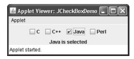
Output from this example is
shown here:
Radio
Buttons
Radio buttons are a group of
mutually exclusive buttons, in which only one button can be selected at any one
time. They are supported by the JRadioButton
class, which extends JToggleButton. JRadioButton provides several
constructors. The one used in the example
is shown here:
JRadioButton(String str)
Here, str is the label for the button. Other constructors let you specify
the initial selection state of the button and specify an icon.
In order for their mutually
exclusive nature to be activated, radio buttons must be configured into a
group. Only one of the buttons in the group can be selected at any time. For
example, if a user presses a radio button that is in a group, any previously
selected button in that group is automatically deselected. A button group is
created by the ButtonGroup class.
Its default constructor is invoked for this purpose. Elements are
then added to the button
group via the following method: void add(AbstractButton ab)
Here, ab is a reference to the button to be added to the group.
A JRadioButton generates action events, item events, and change
events each time the button selection changes. Most often, it is the action event
that is handled, which means that you will normally implement the ActionListener interface. Recall that
the only method defined by ActionListener
is actionPerformed( ). Inside this
method, you can use a number of different ways to determine which button was
selected. First, you can check its action command by calling getActionCommand( ). By default, the
action command is the same as the button label, but you can set the action
command to something else by calling setActionCommand(
) on the radio button. Second, you can call getSource( ) on the
ActionEvent object and check that reference against the buttons. Third, you
can check each radio button to find
out which one is currently selected by calling isSelected( ) on each button. Finally, each button could use its
own action event handler implemented as either an anonymous inner class or a
lambda expression. Remember, each time an action event occurs, it means that
the button being selected has changed and that one and only one button will be
selected.
The following example
illustrates how to use radio buttons. Three radio buttons are created. The
buttons are then added to a button group. As explained, this is necessary to
cause their mutually exclusive behavior. Pressing a radio button generates an
action event, which is handled by actionPerformed(
). Within that handler, the getActionCommand(
) method gets the text that is associated with the radio button and uses it
to set the text within a label.
// Demonstrate JRadioButton
import java.awt.*;
import java.awt.event.*; import javax.swing.*;
/*
<applet code="JRadioButtonDemo"
width=300 height=50> </applet>
*/
public class JRadioButtonDemo extends JApplet
implements ActionListener {
JLabel jlab;
public void init() { try {
SwingUtilities.invokeAndWait(
new Runnable() {
public void run() { makeGUI();
}
}
);
} catch (Exception exc) {
System.out.println("Can't create because
of " + exc);
}
}
private void makeGUI() {
//Change to flow layout.
setLayout(new FlowLayout());
//Create radio buttons and add them to content
pane.
JRadioButton b1 = new
JRadioButton("A");
b1.addActionListener(this);
add(b1);
JRadioButton b2 = new
JRadioButton("B"); b2.addActionListener(this);
add(b2);
JRadioButton b3 = new JRadioButton("C");
b3.addActionListener(this);
add(b3);
//Define a button group.
ButtonGroup bg = new ButtonGroup(); bg.add(b1);
bg.add(b2);
bg.add(b3);
//Create a label and add it to the content
pane.
jlab = new JLabel("Select One");
add(jlab);
}
// Handle button selection.
public void actionPerformed(ActionEvent ae) {
jlab.setText("You selected " + ae.getActionCommand());
}
}
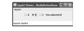
Output from the radio button
example is shown here:
Related Topics