Chapter: User Interface Design : Windows and controls
Selection Controls
Selection
Controls
A selection control presents on the screen all the
possible alternatives, conditions, or choices that may exist for an entity,
property, or value.
The relevant item or items are selected from those
displayed.
Selection controls include radio buttons, check
boxes, list boxes, drop-down/pop-up list boxes, and palettes.
Radio
Buttons
Description:
A
two-part control consisting of the following:
—
Small circles, diamonds, or rectangles.
—
Choice descriptions.
When a
choice is selected:
—
The option is highlighted.
—
Any existing choice is automatically unhighlighted
and deselected.
Purpose:
To set
one item from a small set of mutually exclusive options (2 to 8).
Advantages:
Easy-to-access
choices.
Easy-to-compare
choices.
Preferred
by users.
Disadvantages:
Consume
screen space.
Limited
number of choices.
Proper
usage:
For
setting attributes, properties, or values.
For
mutually exclusive choices (that is, only one can be selected).
Where
adequate screen space is available.
Most
useful for data and choices that are:
—
Discrete.
—
Small and fixed in number.
—
Not easily remembered.
—
In need of a textual description to meaningfully
describe the alternatives.
— Most
easily understood when the alternatives can be seen together and
— compared
to one another.
—
Never changed in content.
Do not
use:
—
For commands.
—
Singly to indicate the presence or absence of a
state.
Choice
Descriptions
Provide meaningful, fully spelled-out choice descriptions clearly
describing the values or effects set by the radio buttons.
Display in a single line of text.
Display using mixed-case letters, using the sentence style.
Position descriptions to the right of the button. Separate them by at
least one space from the button.
When a choice is conditionally unavailable for selection, display the
choice description grayed out or dimmed.
Include a none choice if it adds clarity.
Size
Show a minimum of two choices, a maximum of eight.
Defaults
When the control possesses a state or affect that has been predetermined
to have a higher probability of selection than the others, designate it as the
default and display its button filled in.
When the control includes choices whose states cannot be predetermined,
display all the buttons without setting a dot, or in the indeterminate state.
When a multiple selection includes choices whose states vary, display
the buttons in another unique manner, or in the mixed value state.
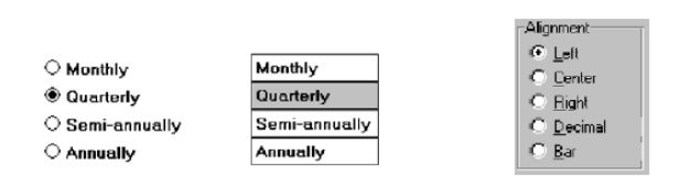
Structure
A columnar orientation is the preferred manner of presentation.
Left-align the buttons and choice descriptions.
If vertical space on the screen is limited, orient the buttons
horizontally.
Provide adequate separation between choices so that the buttons are
associated with the proper description.
— A
distance equal to three spaces is usually sufficient.
Enclose the buttons in a border to visually strengthen the relationship
they possess.
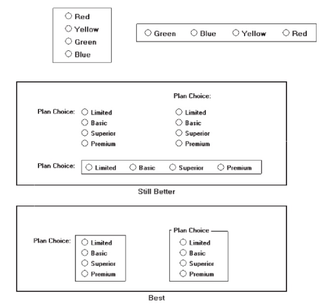
Organization
Arrange selections in expected order or follow other patterns such as
frequency of occurrence, sequence of use, or importance.
For
selections arrayed top to bottom, begin ordering at the top.
For
selections arrayed left to right, begin ordering at the left.
If, under
certain conditions, a choice is not available, display it subdued or less
brightly than the available choices.
Related Topics