Chapter: User Interface Design : Windows and controls
Combination Control
Combination
Control
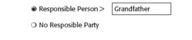
Position any control related to a radio button
immediately to the right of the choice description.
If the radio button choice description also acts as
the label for the control that follows it, end the label with an arrow (>).
Captions
Structure:
Provide a caption for each radio button control.
Exception: In screens containing only one radio
button control, the screen title may serve as the caption.
Display:
Fully spelled out.
In mixed-case letters, capitalizing the first letter
of all significant words.
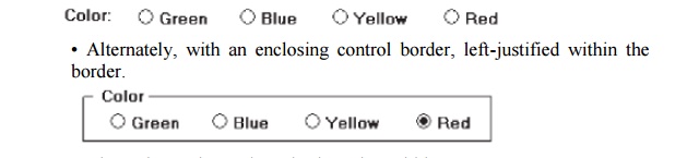
Columnar orientation:
With a control border, position the caption:
Upper-left-justified within the border.
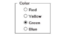
Alternately, the caption may be located to the left
of the topmost choice description.
Without an enclosing control border, position the
caption:
Left-justified above the choice descriptions,
separated by one space line.
Alternately, the caption may be located to the left
of the topmost choice description.
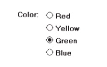
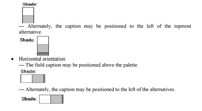
Horizontal orientation:
Position the caption to the left of the choice descriptions.
Be consistent in caption style and orientation within a screen.
Keyboard Equivalents
Assign a keyboard mnemonic to each choice description.

Designate the mnemonic by underlining the applicable letter in the choice description.
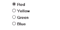
Selection Method and Indication
Pointing:
The
selection target area should be as large as possible.
Include the button and the choice description text.
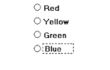
Highlight
the selection choice in some visually distinctive way when the cursor’s resting
on it and the choice is available for selection.
This cursor should be as long as the longest choice
description plus one
space at
each end. Do not place the cursor over the small button.
Activation:
When a
choice is selected, distinguish it visually from the unselected choices.
A radio button should be filled in with a solid
dark dot or made to look
depressed
or higher through use of a shadow.
When a
choice is selected, any other selected choice must be deselected.
Defaults:
If a
radio button control is displayed that contains a choice previously selected or
a default choice, display the selected choice as set in the control
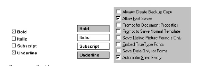
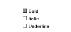
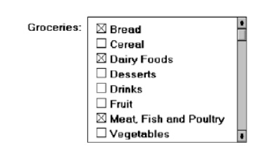
Check Boxes
Description:
A
two-part control consisting of a square box and choice description.
Each
option acts as a switch and can be either “on” or “off.”
—
When an option is selected (on), a mark such as an
“X” or “check” appears within the square box, or the box is highlighted in some
other manner.
—
Otherwise the square box is unselected or empty
(off).
Each box
can be:
Switched on or off independently.
Used alone or grouped in sets.
Purpose:
To set
one or more options as either on or off.
Advantages
Easy-to-access
choices.
Easy-to-compare
choices.
Preferred
by users.
Disadvantages:
Consume
screen space.
Limited
number of choices.
Single
check boxes difficult to align with other screen controls.
Proper
usage:
For
setting attributes, properties, or values.
For
nonexclusive choices (that is, more than one can be selected).
Where
adequate screen space is available.
Most
useful for data and choices that are:
·
Discrete.
·
Small and fixed in number.
·
Not easily remembered.
·
In need of a textual description to describe
meaningfully.
·
Most easily understood when the alternatives can be
seen together and
·
compared to one another.
·
Never changed in content.
Can be
used to affect other controls.
Use only
when both states of a choice are clearly opposite and unambiguous.
Choice
Descriptions
Provide meaningful, fully spelled-out choice descriptions clearly
describing the values or effects set by the check boxes.
Display them in a single line of text.
Display them using mixed-case letters in sentence style.
Position descriptions to the right of the check box. Separate by at
least one space from the box.
When a choice is unavailable for selection under a certain condition,
display the choice description visually dimmed.
Size
Show a minimum of one choice, a maximum of eight.
Defaults
When the control possesses a state or affect that has been preset,
designate it as the default and display its check box marked.
When a multiple selection includes choices whose states vary, display
the buttons in another unique manner, or the mixed value state.
Structure
Provide groupings of related check boxes.
A columnar orientation is the preferred manner of presentation for
multiple related check boxes.
Left-align the check boxes and choice descriptions.
If vertical space on the screen is limited, orient the boxes
horizontally.
Provide adequate separation between boxes so that
the buttons are associated with the proper description.
·
A distance equal to three spaces is usually
sufficient.
Enclose the boxes in a border to visually strengthen the relationship
they possess.
Organization
Arrange selections in logical order or follow other patterns such as
frequency of occurrence, sequence of use, or importance.
·
For selections arrayed top to bottom, begin ordering
at the top.
·
For selections arrayed left to right, begin
ordering at the left.
If, under certain conditions, a choice is not available, display it
subdued or less brightly than the available choices.
Related
Control
Position any control related to a check box immediately to the right of
the choice description.
·
If a the check box choice description also acts as
the label for the control that follows it , end the label with an arrow (>).
Captions
and Keyboard Equivalents
Same as
Radio Button
Selection
Method and Indication
Pointing:
The
selection target area should be as large as possible.
Include the check box and the choice description
text.
Highlight
the selection choice in some visually distinctive way when the cursor’s resting
on it and the choice is available for selection.
This cursor should be as long as the longest choice
description plus one
space at
each end. Do not place the cursor over the check box.
Activation:
When a
choice is selected,
distinguish it visually
from the non-selected
choices.
A check
box should be filled in or made to look depressed or higher through use of a
shadow.
Defaults:
If a
check box is displayed that contains a choice previously selected or default
choice, display the selected choice as set in the control.
Select/deselect
all:
Do not
use Select All and Deselect All check boxes.
Mixed-value
state:
When a check box represents a value, and a multiple
selection encompasses multiple value occurrences set in both the on and off
state, display the check box in a mixed
value state.
Fill the check box with another easily
differentiable symbol or pattern.
Toggle
the check box as follows:
Selection 1: Set the associated value for all
elements. Fill the check box with an “X” or “check.”
Selection 2: Unset the value for all associated
elements. Blank-out the
check
box.
Selection
3: Return all elements to their original state. Fill the check box
with the
mixed value symbol or pattern.
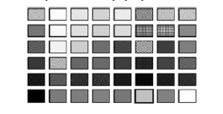
Palettes
Description:
A control
consisting of a series of graphical alternatives. The choices themselves are
descriptive, being composed of colors, patterns, or images.
In addition to being a standard screen control, a
palette may also be presented on a pull-down or pop-up menu or a toolbar.
Purpose:
To set
one of a series of mutually exclusive options presented graphically or
pictorially.
Advantages:
Pictures
aid comprehension.
Easy-to-compare
choices.
Usually
consume less screen space than textual equivalents.
Disadvantages:
A limited
number of choices can be displayed.
Difficult
to organize for scanning efficiency.
Requires
skill and time to design meaningful and attractive graphical representations.
Proper
usage:
For
setting attributes, properties, or values.
For
mutually exclusive choices (that is, only one can be selected).
Where
adequate screen space is available.
Most useful for data and choices that are:
·
Discrete.
·
Frequently selected.
·
Limited in number.
·
Variable in number.
·
Not easily remembered.
·
Most easily understood when the alternatives may be
seen together and
·
compared to one another.
·
Most meaningfully represented pictorially or by
example.
·
Can be clearly represented pictorially.
·
Rarely changed in content.
Do not use:
Where the alternatives cannot be meaningfully and
clearly represented
pictorially.
Where words are clearer than images.
Where the choices are going to change.
Graphical Representations
Provide meaningful, accurate, and clear illustrations or representations
of choices.
Create images large enough to:
·
Clearly illustrate the available alternatives.
·
Permit ease in pointing and selecting.
Create images of equal size.
Always test illustrations before implementing them.
Size
Present all available alternatives within the limits imposed by:
The size
of the graphical representations.
The
screen display’s capabilities.
Layout
Create boxes large enough to:
Effectively
illustrate the available alternatives.
Permit
ease in pointing and selecting.
Create boxes of equal size.
Position the boxes adjacent to, or butted up against, one another.
A columnar orientation is the preferred manner.
If vertical space on the screen is limited, orient the choices
horizontally.
Organization
Arrange palettes in expected or normal order.
·
For palettes arrayed top to bottom, begin ordering
at the top.
·
For palettes arrayed left to right, begin ordering
at the left.
If an expected or normal order does not exist, arrange choices by
frequency of occurrence, sequence of use, importance, or alphabetically (if
textual).
If, under certain conditions, a choice is not available, display it
subdued or less brightly than the other choices.
Captions
Provide a caption for each palette.
-
On screens containing only one palette, the screen
title may serve as the caption.
Display the caption fully spelled out using mixed-case letters.
Columnar orientation:
-
The field caption may be positioned left-aligned
above the palette.
Selection
Method and Indication
Pointing:
Highlight
the choice in some visually distinctive way when the pointer or cursor is
resting on it and the choice is available for selection.
Activation:
When a
choice is selected, distinguish it visually from the unselected choices by
highlighting it in a manner different from when it is pointed at, or by placing
a bold border around it.
Defaults:
If a
palette is displayed with a choice previously selected or a default choice,
display the currently active choice in the manner used when it was selected.
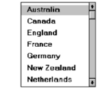
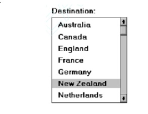
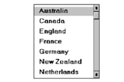
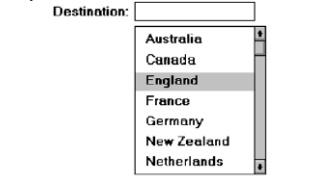
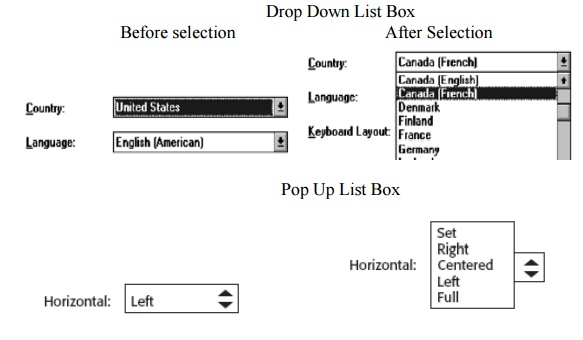
List Boxes
Description:
A
permanently displayed box-shaped control containing a list of attributes or
objects
from which:
-
A single selection is made (mutually exclusive), or
-
Multiple selections are made
(non-mutually-exclusive).
The
choice may be text, pictorial representations, or graphics.
Selections
are made by using a mouse to point and click.
Capable
of being scrolled to view large lists of choices.
No text
entry field exists in which to type text.
A list
box may be may be associated with a summary
list box control, which allows the selected choice to be displayed or an
item added to the list.
Purpose:
To
display a collection of items containing:
-
Mutually exclusive options.
-
Non-mutually-exclusive options.
Advantages:
Unlimited
number of choices.
Reminds
users of available options.
Box always
visible.
Disadvantages:
Consumes
screen space.
Often
requires an action (scrolling) to see all list choices.
The list
content may change, making it hard to find items.
The list
may be ordered in an unpredictable way, making it hard to find items.
Proper
usage:
For
selecting values or setting attributes.
For
choices that are:
-
Mutually exclusive (only one can be selected).
-
Non-mutually-exclusive (one or more may be
selected).
Where
screen space is available.
For data
and choices that are:
·
Best represented textually.
·
Not frequently selected.
·
Not well known, easily learned, or remembered.
·
Ordered in an unpredictable fashion.
·
Frequently changed.
·
Large in number.
·
Fixed or variable in list length.
When screen space or layout considerations make
radio buttons or check boxes impractical.
List Box
General Guidelines
Selection
Descriptions
Clearly and meaningfully describe the choices available. Spell them out
as fully as possible.
-
Graphical representations must clearly represent
the options.
Present in mixed case, using the sentence style structure.
Left-align into columns.
List Size
Not actual limit in size.
Present all available alternatives.
Require no more than 40 page-downs to search a list.
-
If more are required, provide a method for using
search criteria or scoping the options.
Box Size
Must be long enough to display 6 to 8 choices
without requiring scrolling.
Exceptions:
-
If screen space constraints exist, the box may be
reduced in size to display at
least three items.
-
If it is the major control within a window, the box
may be larger.
If more
items are available than are visible in the box, provide vertical
scrolling to display all items.
Must be wide enough to display the longest possible
choice.
When box cannot be made wide enough to display the
longest entry:
Make it wide enough to permit entries to be
distinguishable, or,
Break the long entries with an ellipsis (...) in
the middle, or,
Provide horizontal scrolling.
Organization
Order in a logical and meaningful way to permit
easy browsing.
-
Consider using separate controls to enable the user
to change the sort order or
filter items displayed
in the list.
If a particular choice is not available in the
current context, omit it from the list.
-
Exception: If it is important that the existence
and unavailability of a particular list item be communicated,
display the choice dimmed or grayed out instead of
deleting
it.
Layout
and Separation
Enclose the choices in a box with a solid border.
-
The border should be the same color as the choice
descriptions.
Leave one blank character position between the
choice descriptions and the left border.
Leave one blank character position between the
longest choice description in the list and the right border, if possible.
Captions
Use mixed-case letters.
The preferred position of the control caption is above the upper-left
corner of the list box.
Alternately, the caption may be located to the left
of the topmost choice description.
Be consistent in caption style and orientation within a screen, and
related screens.
Disabling
When a list box is disabled, display its caption and show its entries as
grayed out or dimmed.
Selection Method and Indication
Pointing:
Highlight
the selection choice in some visually distinctive way when the pointer or
cursor is resting on it and the choice is available for selection.
Selection:
Use a
reverse video or reverse color bar to surround the choice description when it
is selected.
The cursor should be as wide as the box itself.
Mark the
selected choice in a distinguishing way.
Activation:
Require
the pressing of a command button when an item, or items, is selected.
Single-Selection List Boxes
Purpose:
To permit
selection of only one item from a large listing.
Design
guidelines:
Related
text box
If
presented with an associated text box control:
Position
the list box below and as close as possible to the text box.
The list
box caption should be worded similarly to the text box caption.
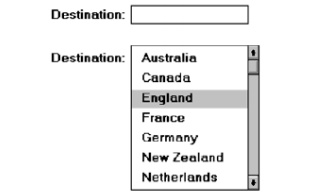
If the related text box and the list box are very
close in proximity, the caption may be omitted from the list box.
Use the
same background color for the text box as is used in the list box.
Defaults:
When the
list box is first displayed:
Present
the currently active choice highlighted or marked with a circle or d diamond to
the left of the entry.
If a
choice has not been previously selected, provide a default choice and display
it in the same manner that is used in selecting it.
If the
list represents mixed values for a multiple selection, do not highlight an
entry.
Other:
—Follow
other relevant list box guidelines.
Extended
and Multiple-Selection List Boxes
Purpose:
To permit
selection of more than one item in a long listing.
-
Extended list box: Optimized for individual item or
range selection.
-
Multiple-selection list box: Optimized for
independent item selection.
Design
guidelines:
Selection
indication:
-
Mark the selected choice with an X or check mark to
the left of the entry.
-
Consider providing a summary list box.
-
Position it to the right of the list box.
-
Use the same colors for the summary list box as are
used in the list box.
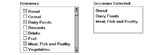
-
Provide command buttons to Add (one item) or Add All
(items) to the summary list box, and Remove
(one item) or Remove All (items) from
the summary list box.
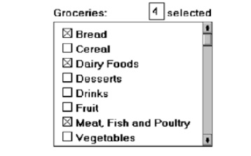
Consider providing a display-only text control indicating how many
choices have been selected.
-
Position it justified upper-right above the list
box.
-
Select all and Deselect All buttons
-
Provide command buttons to accomplish fast Select All and Deselect All actions, when these actions must be frequently or
quickly performed.
Defaults:
When the list box is first displayed:
Display
the currently active choices highlighted.
Mark with
an X or check mark to the left of the entry.
If the
list represents mixed values for a multiple selection, do not highlight an
entry.
Other:
Follow
other relevant list box guidelines.
List View
Controls
Description:
A special
extended-selection list box that displays a collection of items, consisting of
an icon and a label.
The
contents can be displayed in four different views:
-
Large Icon: Items appear as a full-sized icon with
a label below.
-
Small Icon: Items appear as a small icon with label
to the right.
-
List: Items appear as a small icon with label to
the right.
o
Arrayed in a columnar, sorted layout.
Report: Items appear as a line in a multicolumn
format.
-
Leftmost column includes icon and its label.
-
Subsequent columns include application-specific
information.
Purpose and usage:
-
Where the representation of objects as icons is
appropriate.
-
To represent items with multiple columns of
information.
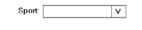
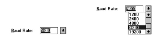
Drop-down/Pop-up
List Boxes
Description
A single
rectangular control that shows one item with a small button to the
right
side.
The
button provides a visual cue that an associated selection box is available but
hidden.
When the
button is selected, a larger associated box appears, containing a list of
choices from which one may be selected.
Selections
are made by using the mouse to point and click.
Text may
not be typed into the control.
Purpose:
To select
one item from a large list of mutually exclusive options when screen space is
limited.
Advantages:
Unlimited
number of choices.
Reminds
users of available options.
Conserves
screen space.
Disadvantages:
Requires
an extra action to display the list of choices.
When
displayed, all choices may not always be visible, requiring scrolling.
The list
may be ordered in an unpredictable way, making it hard to find items.
Proper
usage:
For selecting values or setting attributes.
For choices
that are mutually exclusive (only one can be selected).
Where
screen space is limited.
For data
and choices that are:
Best represented textually.
Infrequently selected.
Not well known, easily learned, or remembered.
Ordered in a unpredictable fashion.
Large in number.
Variable or fixed in list length.
Use
drop-down/pop-up lists when:
Screen space or layout considerations make radio
buttons or single-
selection
list boxes impractical.
The first, or displayed, item will be selected most
of the time.
Do not
use a drop-down list if it important that all options be seen together.
Prompt
Button
Provide a visual cue that a box is hidden by including a downward
pointing arrow, or other meaningful image, to the right side of the selection
field.
Position the button directly against, or within,
the selection field.
Selection Descriptions
Clearly and meaningfully describe the choices available. Spell them out
as fully as possible.
-
Graphical representations must clearly represent
the options.
-
Left-align them in columns.
-
Display the descriptions using mixed-case letters.
List Size
Not limited in size.
Present all available alternatives.
Box Size
Long enough to display 6 to 8 choices without scrolling.
-
If more than eight choices are available, provide
vertical scrolling to display all items.
Wide enough to display the longest possible choice.
When a box cannot be made wide enough to display the longest entry:
-
Make it wide enough to permit entries to be
distinguishable, or,
-
Break long entries with ellipses (...) in the
middle, or,
-
Provide horizontal scrolling.
Organization
Order in a logical and meaningful way to permit easy browsing.
If a particular choice is not available in the current context, omit it
from the list.
-
Exception: If it is important that the existence
and unavailability of a particular
list item be communicated,
display the choice dimmed or grayed out instead of
deleting
it.
Layout and Separation
Enclose the choices in a box composed of a solid line border.
-
The border should be the same color as the choice
descriptions.
-
Leave one blank character position between the
choices and the left border.
-
Leave one blank character position between the
longest choice description in the list and the right border, if possible.
Captions
Display using mixed-case letters.
Position the caption to the left of the box.
-
Alternately, it may be positioned left-justified
above the box.
Defaults
When the drop-down/pop-up listing is first presented, display the
currently set value.
If a choice has not been previously selected,
provide a default choice.
Disabling
When a drop-down/pop-up list box is disabled,
display its caption and entries as disabled or dimmed.
Selection Method and Indication
Pointing:
Highlight
the selection choice in some visually distinctive way when the
pointer or cursor is resting on it and the choice is available for selection.
Activation:
Close the
drop-down/pop-up list box when an item is selected.
Combination
Entry/Selection Controls
It is possible for a control to possess the
characteristics of both a text field and a selection field.
The types of combination entry/selection fields are
spin boxes, attached combination boxes, and drop-down/pop-up combination boxes.
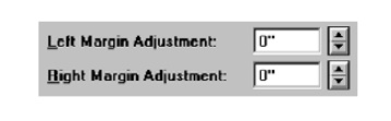
Spin
Boxes
Description:
A
single-line field followed by two small, vertically arranged buttons.
-
The top button has an arrow pointing up.
-
The bottom button has an arrow pointing down.
Selection/entry
is made by:
-
Using the mouse to point at one of the directional
buttons and clicking.
-
Items will change by one unit or step with each
click.
-
Keying a value directly into the field itself.
Purpose:
To make a
selection by either scrolling through a small set of meaningful predefined
choices or typing text.
Advantages:
Consumes
little screen space.
Flexible,
permitting selection or typed entry.
Disadvantages:
Difficult
to compare choices.
Can be
awkward to operate.
Useful
only for certain kinds of data.
Proper
usage:
For
setting attributes, properties, or values.
For
mutually exclusive choices (only one can be selected).
When the
task requires the option of either key entry or selection from a list.
When the
user prefers the option of either key entry or selection from a list.
Where
screen space is limited.
Most
useful for data and choices that are:
-
Discrete.
-
Infrequently selected.
-
Well known, easily learned or remembered, and
meaningful.
-
Ordered in a predictable, customary, or consecutive
fashion.
-
Infrequently changed.
-
Small in number.
-
Fixed or variable in list length.
List Size
Keep the list of items relatively short.
To reduce the size of potentially long lists, break
the listing into subcomponents, if possible.
List Organization
Order the list in the customary, consecutive, or expected order of the
information contained within it.
-
Ensure that the user can always anticipate the next
(not-yet-visible) choice.
When first displayed, present a default choice in the box.
Other Spin Box Guidelines
Box size:
The spin
box should be wide enough to display the longest entry or choice.
Caption:
Display
it using mixed-case letters.
Position
the caption to the left of the box.
-
Alternately, it may be positioned left-justified
above the box.
Entry and
selection methods:
Permit
completion by:
-
Typing directly into the box.
-
Scrolling and selecting with a mouse.
-
Scrolling and selecting with the up/down arrow
keys.
For
alphabetical values:
-
Move down the order using the down arrow.
-
Move up the order using the up arrow.
-
For numeric values or magnitudes:
-
Show a larger value using the up arrow.
-
Show a smaller value using the down arrow.
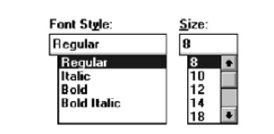
Combo
Boxes
Description:
A single
rectangular text box entry field, beneath which is a larger rectangular list
box (resembling a drop-down list box) displaying a list of options.
The text
box permits a choice to be keyed within it.
The
larger box contains a list of mutually exclusive choices from which one
may be
selected for placement in the entry field.
Selections are made by using a mouse to point and
click.
As text
is typed into the text box, the list scrolls to the nearest match.
When an
item in the list box is selected, it is placed into the text box, replacing the
existing content.
Information
keyed may not necessarily have to match the list items.
Purpose:
To allow
either typed entry in a text box or selection from a list of options in a
permanently displayed list box attached to the text box.
Advantages:
Unlimited
number of entries and choices.
Reminds
users of available options.
Flexible,
permitting selection or typed entry.
Entries
not necessarily restricted to items selectable from list box.
List box
always visible.
Disadvantages:
Consumes
some screen space.
All list
box choices not always visible, requiring scrolling.
Users may
have difficulty recalling sufficient information to type entry, making text box
unusable.
The list
may be ordered in an unpredictable way, making it hard to find items.
Proper
usage:
For
entering or selecting objects or values or setting attributes.
For
information that is mutually exclusive (only one can be entered or selected).
When
users may find it practical to, or prefer to, type information rather than
selecting it from a list.
When
users can recall and type information faster than selecting it from a list.
When it
is useful to provide the users a reminder of the choices available.
Where
data must be entered that is not contained in the selection list.
Where
screen space is available.
For data
and choices that are:
-
Best represented textually.
-
Somewhat familiar or known.
-
Ordered in an unpredictable fashion.
-
Frequently changed.
-
Large in number.
-
Variable or fixed in list length.
Combo Box Guidelines
For the
text box entry field, see “Text Box/Single Line” guidelines. For the list box,
see “Drop-down/Pop-up List Box” guidelines.
Drop-down/Pop-up
Combo Boxes
Description:
A single
rectangular text box with a small button to the side and an associated
hidden list of options.
The
button provides a visual cue that an associated selection box is available but
hidden.
When
requested, a larger associated rectangular box appears, containing a scrollable
list of choices from which one is selected.
Selections
are made by using the mouse to point and click.
Information
may also be keyed into the field.
As text
is typed into the text box, the list scrolls to the nearest match.
When an
item in the list box is selected, it is placed into the text box, replacing
the existing content.
The
information keyed does not necessarily have to match list items.
Combines
the capabilities of both a text box and a drop-down/pop-up list box.
Purpose:
To allow
either typed entry or selection from a list of options in a list box that may
be closed and retrieved as needed.
Advantages:
Unlimited
number of entries and choices.
Reminds
users of available options.
Flexible,
permitting selection or typed entry.
Entries
not restricted to items selectable from list box.
Conserves
screen space.
Disadvantages:
Requires
an extra step to display the list of choices.
When displayed,
all box choices may not always be visible, requiring scrolling.
User may
have difficulty in recalling what to type.
The list
content may change, making it hard to find items.
The list
may be ordered in an unpredictable way, making it hard to find items.
Proper
usage:
For entering or selecting objects or values or
setting attributes.
For
information that is mutually exclusive (only one can be entered or selected).
When
users may find it practical to, or prefer to, type information rather than
selecting it from a list.
When
users can recall and type information faster than selecting from a list.
When it
is useful to provide the users with an occasional reminder of the choices
available.
Where
data must be entered that is not contained in the selection list.
Where
screen space is limited.
For data
and choices that are:
-
Best represented textually.
-
Somewhat familiar or known.
-
Ordered in an unpredictable fashion.
-
Frequently changed.
-
Large in number.
-
Variable or fixed in list length.
Prompt Button
Provide a visual cue that a list box is hidden by including a
downward-pointing arrow to the right of the text box.
Separate the button from the text box by a small space.

Other Guidelines
For the
text box entry field, see the “Text Box/Single Line” guidelines. For the box
and selection components, see the “Drop-down/Pop-up List Box” guidelines.
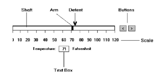
Slider
Description:
A scale
exhibiting degrees of a quality on a continuum.
Includes
the following:
-
A shaft or bar.
-
A range of values with appropriate labels.
-
An arm indicating relative setting through its
location on the shaft.
-
Optionally, a pair of buttons to permit incremental
movement of the slider arm.
-
Optionally, a text box for typing or displaying an
exact value.
-
Optionally, a detent position for special values.
May be
oriented vertically or horizontally.
Selected
by using the mouse to:
-
Drag a slider across the scale until the desired
value is reached.
-
Point at the buttons at one end of the scale and
clicking to change the
-
value.
-
Keying a value in the associated text box.
Purpose:
To make a
setting when a continuous qualitative adjustment is acceptable, it is useful to
see the current value relative to the range of possible values.
Advantages:
Spatial
representation of relative setting.
Visually
distinctive.
Disadvantages:
Not as
precise as an alphanumeric indication.
Consumes
screen space.
Usually
more complex than other controls.
Proper
usage:
To set an
attribute.
For
mutually exclusive choices.
When an
object has a limited range of possible settings.
When the
range of values is continuous.
When
graduations are relatively fine.
When the
choices can increase or decrease in some well-known, predictable, and easily
understood way.
When a
spatial representation enhances comprehension and interpretation.
— When using a slider provides sufficient accuracy.
General
Use standard sliders whenever available.
Caption
and Labels
Caption:
Provide
meaningful, clear, and consistent captions.
Display
them using mixed-case letters.
Position
the caption to the left of the box.
Alternately, it may be positioned left-justified
above the slider.
Labels:
Provide
meaningful and descriptive labels to aid in interpreting the scale.
Scale
Show a complete range of choices.
Mark the low, intermediate, and high ends of the scale.
Provide scale interval markings, where possible.
Provide consistent increments.
Permit the user to change the units of measure.
If the precise value of a quantity represented is important, display the
value set in an adjacent text box.
Slider
Arm
If the user cannot change the value shown in a
slider, do not display a slider arm.
Slider
Buttons
Provide slider buttons to permit movement by the
smallest increment.
If the user cannot change the value shown in a
slider, do not display slider buttons.
Detents
Provide detents to set values that have special meaning.
Permit the user to change the detent value.
Proportions
To indicate the proportion of a value being
displayed, fill the slider shaft in some visually distinctive way.
Fill
horizontal sliders from left to right.
Fill
vertical sliders from bottom to top.
Tabs
Description:
A window
containing tabbed dividers that create pages or sections.
Navigation
is permitted between the pages or sections.
Purpose:
To
present information that can be logically organized into pages or sections
within the same window.
Advantages:
Resembles
their paper-based cousins.
Visually
distinctive.
Effectively
organize repetitive, related information.
Disadvantages:
Visually
complex.
Proper
usage:
To
present discrete, logically structured, related, information.
To
present the setting choices that can be applied to an object.
When a
short tab label can meaningfully describe the tab’s contents.
When the
order of information use varies.
Sections and Pages
Place related information within a page or section.
Order them meaningfully.
Arrange pages so they appear to go deeper, left to
right and top to bottom.
Provide pages of equal size.
Location, Size, and Labels
Place the tabs at the top of the page or section.
Provide fixed-width tabs for pages or sections of related information.
Provide textual labels.
-
Use system fonts.
-
Keep information brief and the same general length.
o
Nouns are usually better than verbs.
-
Use mixed case, capitalizing each significant word.
-
Assign a keyboard equivalent for keyboard access.
Center the labels within the tabs.
Restrict tabs to only one row.
Arrange tabs so that they appear to go deeper, left to right and top to
bottom.
Command Buttons
If they affect only a page or section, locate the buttons on the page or
section.
If they affect the entire tabbed control, locate the buttons outside the
tabbed pages
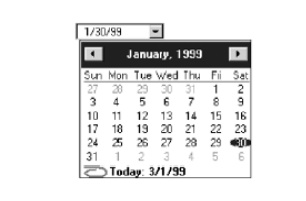
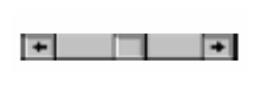
Date-Picker
Description:
A
drop-down list box that displays a 1-month calendar in the drop-down list box.
The
displayed month can be changed through pressing command buttons with
left- and
right-pointing arrows.
The left arrow moves backward through the monthly
calendars.
The right arrow moves forward through the monthly
calendars.
A date
for the list box can be selected from the drop-down calendar.
Purpose:
To select
a date for inscribing in a drop-down list box.
Advantages:
Provides
a representation of a physical calendar, a meaningful entity.
The
calendar listing is ordered in a predictable way.
Visually
distinctive.
Disadvantages:
Requires
an extra step to display the calendar.
When
displayed, all month choices are not visible, requiring a form of scrolling to
access the desired choice.
Proper
usage:
To select and display a single date in close
monthly proximity to the default month presented on the drop-down list box.
Tree View
Description:
A special
list box control that displays a set of objects as an indented outline, based
on the objects’ logical hierarchical relationship.
Includes,
optionally, buttons that expand and collapse the outline.
A button inscribed with a plus ( + ) expands the
outline.
A button inscribed with a minus ( - ) collapses the
outline.
Elements
that can optionally be displayed are:
Icons.
Graphics, such as a check box.
Lines to illustrate hierarchical relationships.
Purpose
and proper usage:
To display a set of objects as an indented outline
to illustrate their logical hierarchical relationship.
Scroll
Bars
Description:
An
elongated rectangular container consisting of:
A scroll area.
A slider box or elevator inside.
Arrows or anchors at either end.
Available,
if needed, in primary and secondary windows, some controls, and Web pages.
May be
oriented vertically or horizontally at the window or page edge.
Purpose:
To find
and view information that takes more space than the allotted display space.
Advantages:
Permits viewing
data of unlimited size.
Disadvantages:
Consumes
screen space.
Can be
cumbersome to operate.
Proper
use:
When more
information is available than the window space for displaying it.
Do not
use to set values.
Scroll
Bar Design Guidelines
General:
Provide a
scroll bar when invisible information must be seen.
Scroll
area or container:
To
indicate that scrolling is available, a scroll area or container should be
provided.
Construct
it of a filled-in bar displayed in a technique that visually contrasts with the
window and screen body background.
Scroll
slider box or handle:
To
indicate the location and amount of information being viewed, provide a
slider box or handle.
Constructed
of a movable and sizable open area of the scroll area,
displayed
in a technique that contrasts with the scroll area.
By its
position, spatially indicate the relative location in the file of the
information
being viewed.
By its
size, indicate, proportionately, the percentage of the available
information
in the file being viewed.
Scroll
directional arrows:
To indicate the direction in which scrolling may be
performed, directional arrows should be provided.
Construct
them as arrows in small boxes, with backgrounds that contrast with the scroll
area.
Selection:
When the
slider box/handle has been selected, highlight it in some visually distinctive
way.
Location:
Position
a vertical (top-to-bottom) scroll bar to the right of the window.
Position
a horizontal (left-to-right) scroll bar at the bottom of the window.
Size:
A
vertical scroll bar should be the height of the scrollable portion of the
window body.
A
horizontal scroll bar should be at least one-half the width of the scrollable
portion of the window body.
Current
state indication:
Whenever
the window’s size or the position of the information changes, the
scroll
bar components must also change, reflecting the current state.
Include
scroll bars in all sizable windows.
If no information is currently available by
scrolling in a particular
direction,
the relevant directional arrow should be subdued or grayed out.
Scroll Bar Usage Guidelines
Scroll
bar style:
Stick
with standard, proven design styles.
Directional
preference:
Use
vertical (top-to-bottom) scrolling.
Avoid
horizontal (left-to-right) scrolling.
Media Controls
For all playable files provide the following
controls.
-
Play.
-
Pause/Resume.
-
Stop.
-
Rewind.
-
Fast Forward.
-
Volume.
Custom
Controls
Implement custom controls with caution.
If used, make the look and behavior of custom
controls different from that of standard controls.
Related Topics