Chapter: Java The Complete Reference : The Java Library : Using AWT Controls, Layout Managers, and Menus
Applying Check Boxes - AWT Controls
Applying Check Boxes
A check box is a control
that is used to turn an option on or off. It consists of a small box that can
either contain a check mark or not. There is a label associated with each check
box that describes what option the box represents. You change the state of a
check box by clicking on it. Check boxes can be used individually or as part of
a group. Check boxes are objects of the Checkbox
class.
Checkbox supports these constructors:
Checkbox( ) throws HeadlessException Checkbox(String str) throws HeadlessException
Checkbox(String str,
boolean on) throws HeadlessException
Checkbox(String str,
boolean on, CheckboxGroup cbGroup) throws HeadlessException
Checkbox(String str, CheckboxGroup cbGroup, boolean on) throws HeadlessException
The first form creates a check box whose label is initially blank.
The state of the check box is unchecked. The second form creates a check box
whose label is specified by str. The
state of the check box is unchecked. The third form allows you to set the
initial state of the check box. If on
is true, the check box is initially
checked; otherwise, it is cleared. The fourth and fifth forms create a check
box whose label is specified by str
and whose group is specified by cbGroup.
If this check box is not part of a group, then cbGroup must be null. (Check box groups are described in the next section.) The value of on determines the initial state of the
check box.
To retrieve the current state of a check box, call getState( ). To set its state, call setState( ). You can obtain the current
label associated with a check box by calling getLabel( ). To set the label, call setLabel( ). These methods are as follows:
boolean getState( )
void setState(boolean on)
String getLabel( )
void setLabel(String str)
Here, if on is true, the box is checked. If it is false, the box is cleared. The string
passed in str becomes the new label
associated with the invoking check box.
Handling Check Boxes
Each time a check box is selected or deselected, an item event is
generated. This is sent to any listeners that previously registered an interest
in receiving item event notifications from that component. Each listener
implements the ItemListener
interface. That interface defines the itemStateChanged(
) method. An ItemEvent object is
supplied as the argument to this method.
It contains information about the event (for example, whether it was a
selection or deselection).
The following program creates four check boxes. The initial state
of the first box is checked. The status of each check box is displayed. Each
time you change the state of a check box, the status display is updated.
//
Demonstrate check boxes.
import
java.awt.*;
import
java.awt.event.*; import java.applet.*; /*
<applet
code="CheckboxDemo" width=240 height=200> </applet>
*/
public
class CheckboxDemo extends Applet implements ItemListener { String msg =
"";
Checkbox
windows, android, solaris, mac;
public
void init() {
windows
= new Checkbox("Windows", null, true); android = new
Checkbox("Android");
solaris
= new Checkbox("Solaris"); mac = new Checkbox("Mac OS");
add(windows);
add(android);
add(solaris);
add(mac);
windows.addItemListener(this);
android.addItemListener(this);
solaris.addItemListener(this);
mac.addItemListener(this);
}
public
void itemStateChanged(ItemEvent ie) { repaint();
}
//
Display current state of the check boxes.
public
void paint(Graphics g) {
msg =
"Current state: "; g.drawString(msg, 6, 80);
msg =
" Windows: " + windows.getState(); g.drawString(msg, 6, 100);
msg =
" Android: " + android.getState(); g.drawString(msg, 6, 120);
msg =
" Solaris: " + solaris.getState(); g.drawString(msg, 6, 140);
msg =
" Mac OS: " + mac.getState(); g.drawString(msg, 6, 160);
}
}
Sample output is shown in Figure 26-2.
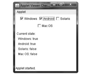
Figure 26-2 Sample output from the CheckboxDemo applet
Related Topics