Chapter: Java The Complete Reference : The Java Library : Using AWT Controls, Layout Managers, and Menus
Understanding Layout Managers - AWT
Understanding Layout Managers
All of the components that we have shown so far have been
positioned by the default layout manager. As we mentioned at the beginning of
this chapter, a layout manager automatically arranges your controls within a
window by using some type of algorithm. If you have programmed for other GUI
environments, such as Windows, then you may have laid out your controls by
hand. While it is possible to lay out Java controls by hand, too, you generally
won’t want to, for two main reasons. First, it is very tedious to manually lay
out a large number of components. Second, sometimes the width and height
information is not yet available when you need to arrange some control, because
the native toolkit components haven’t been realized. This is a chicken-and-egg
situation; it is pretty confusing to figure out when it is okay to use the size
of a given component to position it relative to another.
Each Container object
has a layout manager associated with it. A layout manager is an instance of any
class that implements the LayoutManager
interface. The layout manager is set by the setLayout( ) method. If no call to setLayout( ) is made, then the default layout manager is used.
Whenever a container is resized (or sized for the first time), the layout
manager is used to position each of the components within it.
The setLayout( ) method
has the following general form: void setLayout(LayoutManager layoutObj)
Here, layoutObj is a
reference to the desired layout manager. If you wish to disable the layout
manager and position components manually, pass null for layoutObj. If
you do this, you will need to determine the shape and position of each
component manually, using the setBounds(
) method defined by Component.
Normally, you will want to use a layout manager.
Each layout manager keeps track of a list of components that are
stored by their names. The layout manager is notified each time you add a
component to a container. Whenever the container needs to be resized, the
layout manager is consulted via its minimumLayoutSize(
) and preferredLayoutSize( )
methods. Each component that is being managed by a layout manager contains the getPreferredSize( ) and getMinimumSize( ) methods. These return
the preferred and minimum size required to display each component. The layout
manager will honor these requests if at all possible, while maintaining the
integrity of the layout policy. You may override these methods for controls
that you subclass. Default values are provided otherwise.
Java has several predefined LayoutManager
classes, several of which are described next. You can use the layout manager
that best fits your application.
FlowLayout
FlowLayout is the default layout
manager. This is the layout manager that the preceding examples have used. FlowLayout
implements a simple layout style, which is similar to how words flow in a text
editor. The direction of the layout is governed by the container’s component
orientation property, which, by default, is left to right, top to bottom.
Therefore, by default, components are laid out line-by-line beginning at the
upper-left corner. In all cases, when a line is filled, layout advances to the
next line. A small space is left between each component, above and below, as
well as left and right. Here are the constructors for FlowLayout:
FlowLayout( ) FlowLayout(int how)
FlowLayout(int how, int horz, int vert)
The first form creates the default layout, which centers components
and leaves five pixels of space between each component. The second form lets
you specify how each line is aligned. Valid values for how are as follows:
FlowLayout.LEFT
FlowLayout.CENTER
FlowLayout.RIGHT
FlowLayout.LEADING
FlowLayout.TRAILING
These values specify left, center, right, leading edge, and
trailing edge alignment, respectively. The third constructor allows you to
specify the horizontal and vertical space left between components in horz and vert, respectively.
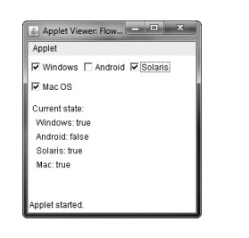
Here is a version of the CheckboxDemo
applet shown earlier in this chapter, modified so that it uses left-aligned
flow layout:
// Use
left-aligned flow layout.
import
java.awt.*;
import
java.awt.event.*; import java.applet.*; /*
<applet
code="FlowLayoutDemo" width=240 height=200> </applet>
*/
public
class FlowLayoutDemo extends Applet implements ItemListener {
String
msg = "";
Checkbox
windows, android, solaris, mac;
public
void init() {
// set
left-aligned flow
layout setLayout(new
FlowLayout(FlowLayout.LEFT));
windows
= new Checkbox("Windows", null, true); android = new
Checkbox("Android");
solaris
= new Checkbox("Solaris"); mac = new Checkbox("Mac OS");
add(windows);
add(android);
add(solaris);
add(mac);
// register
to receive item events
windows.addItemListener(this);
android.addItemListener(this);
solaris.addItemListener(this);
mac.addItemListener(this);
}
//Repaint when status of a check box changes.
public void itemStateChanged(ItemEvent ie) {
repaint();
}
//Display current state of the check boxes.
public void paint(Graphics g) {
msg =
"Current state: "; g.drawString(msg, 6, 80);
msg =
" Windows: " + windows.getState(); g.drawString(msg, 6, 100);
msg =
" Android: " + android.getState(); g.drawString(msg, 6, 120);
msg =
" Solaris: " + solaris.getState(); g.drawString(msg, 6, 140);
msg =
" Mac: " + mac.getState(); g.drawString(msg, 6, 160);
}
}
Here is sample output generated by the FlowLayoutDemo applet. Compare this with the output from the CheckboxDemo applet, shown earlier in
Figure 26-2.
BorderLayout
The BorderLayout class implements a common layout style for
top-level windows. It has four narrow, fixed-width components at the edges and
one large area in the center. The four sides are referred to as north, south,
east, and west. The middle area is called the center. Here are the constructors
defined by BorderLayout:
BorderLayout( ) BorderLayout(int horz, int vert)
The first form creates a default border layout. The second allows
you to specify the horizontal and vertical space left between components in
horz and vert, respectively.
BorderLayout defines the following constants that specify the
regions:
BorderLayout.CENTER
BorderLayout.EAST
BorderLayout.NORTH
BorderLayout.SOUTH
BorderLayout.WEST
When adding components, you will use these constants with the
following form of add( ), which is
defined by Container:
void add(Component compRef,
Object region)
Here, compRef is a
reference to the component to be added, and region
specifies where the component will be added.
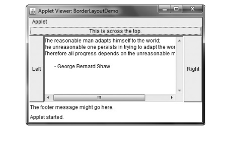
Here is an example of a BorderLayout
with a component in each layout area:
//
Demonstrate BorderLayout.
import
java.awt.*;
import
java.applet.*;
import
java.util.*; /*
<applet
code="BorderLayoutDemo" width=400 height=200> </applet>
*/
public
class BorderLayoutDemo extends Applet { public void init() {
setLayout(new
BorderLayout());
add(new
Button("This is across the top."), BorderLayout.NORTH);
add(new
Label("The footer message might go here."), BorderLayout.SOUTH);
add(new
Button("Right"), BorderLayout.EAST); add(new
Button("Left"), BorderLayout.WEST);
String
msg = "The reasonable man adapts " + "himself to the
world;\n" +
"the
unreasonable one persists in " + "trying to adapt the world to
himself.\n" + "Therefore all progress depends " +
"on
the unreasonable man.\n\n" +
" - George
Bernard Shaw\n\n";
add(new
TextArea(msg), BorderLayout.CENTER);
}
}
Sample output from the BorderLayoutDemo
applet is shown here:
Using Insets
Sometimes you will want to leave a small amount of space between
the container that holds your components and the window that contains it. To do
this, override the getInsets( )
method that is defined by Container.
This method returns an Insets object
that contains the top, bottom, left, and right inset to be used when the
container is displayed. These values are used by the layout manager to inset
the components when it lays out the window. The constructor for Insets is shown here:
Insets(int top, int left, int bottom, int right)
The values passed in top,
left, bottom, and right specify
the amount of space between the container and its enclosing window.
The getInsets( ) method
has this general form: Insets getInsets( )
When overriding this method, you must return a new Insets object that contains the inset
spacing you desire.
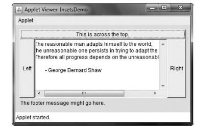
Here is the preceding BorderLayout
example modified so that it insets its components ten pixels from each border.
The background color has been set to cyan to help make the insets more visible.
//
Demonstrate BorderLayout with insets.
import
java.awt.*;
import
java.applet.*; import java.util.*; /*
<applet
code="InsetsDemo" width=400 height=200> </applet>
*/
public
class InsetsDemo extends Applet { public void init() {
// set background
color so insets can be easily seen
setBackground(Color.cyan);
setLayout(new
BorderLayout());
add(new
Button("This is across the top."), BorderLayout.NORTH);
add(new
Label("The footer message might go here."), BorderLayout.SOUTH);
add(new
Button("Right"), BorderLayout.EAST); add(new
Button("Left"), BorderLayout.WEST);
String
msg = "The reasonable man adapts " + "himself to the
world;\n" + "the unreasonable one persists in " + "trying
to adapt the world to himself.\n" + "Therefore all progress depends
" + "on the unreasonable man.\n\n" +
" - George Bernard Shaw\n\n";
add(new
TextArea(msg), BorderLayout.CENTER);
}
// add
insets
public
Insets getInsets() {
return
new Insets(10, 10, 10, 10);
}
}
Sample output from the InsetsDemo
applet is shown here:
GridLayout
GridLayout lays out components in a
two-dimensional grid. When you instantiate a GridLayout, you define the number of rows and columns. The
constructors supported by GridLayout are
shown here:
GridLayout( )
GridLayout(int numRows,
int numColumns) GridLayout(int numRows, int numColumns, int horz, int
vert)
The first form creates a single-column grid layout. The second form
creates a grid layout with the specified number of rows and columns. The third
form allows you to specify the horizontal and vertical space left between
components in horz and vert, respectively. Either numRows or numColumns can be zero. Specifying numRows as zero allows for unlimited-length columns. Specifying numColumns as zero allows for unlimited-length
rows.
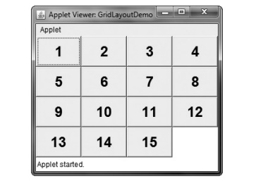
Here is a sample program that creates a 4×4 grid and fills it in
with 15 buttons, each labeled with its index:
//
Demonstrate GridLayout
import
java.awt.*; import java.applet.*;
/*
<applet
code="GridLayoutDemo" width=300 height=200> </applet>
*/
public
class GridLayoutDemo extends Applet { static final int n = 4;
public
void init() {
setLayout(new
GridLayout(n, n));
setFont(new
Font("SansSerif", Font.BOLD, 24));
for(int
i = 0; i < n; i++) { for(int j = 0; j < n; j++) {
int k =
i * n + j; if(k > 0)
add(new
Button("" + k));
}
}
}
}
Following is sample output generated by the GridLayoutDemo applet:
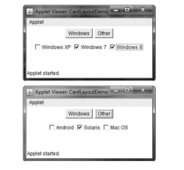
CardLayout
The CardLayout class is
unique among the other layout managers in that it stores several different
layouts. Each layout can be thought of as being on a separate index card in a
deck that can be shuffled so that any card is on top at a given time. This can
be useful for user interfaces with optional components that can be dynamically
enabled and disabled upon user input. You can prepare the other layouts and
have them hidden, ready to be activated when needed.
CardLayout provides these two
constructors:
CardLayout( ) CardLayout(int horz,
int vert)
The first form creates a default card layout. The second form
allows you to specify the horizontal and vertical space left between components
in horz and vert, respectively.
Use of a card layout requires a bit more work than the other
layouts. The cards are typically held in an object of type Panel. This panel must have CardLayout
selected as its layout manager. The cards that form the deck are also typically
objects of type Panel. Thus, you
must create a panel that contains the deck and a panel for each card in the
deck. Next, you add to the appropriate panel the components that form each
card. You then add these panels to the panel for which CardLayout is the layout manager. Finally, you add this panel to
the window. Once these steps are complete, you must provide some way for the
user to select between cards. One common approach is to include one push button
for each card in the deck.
When card panels are added to a panel, they are usually given a
name. Thus, most of the time, you will use this form of add( ) when adding cards to a panel:
void add(Component panelRef,
Object name)
Here, name is a string
that specifies the name of the card whose panel is specified by panelRef.
After you have created a deck, your program activates a card by
calling one of the following methods defined by CardLayout:
void first(Container deck)
void last(Container deck) void
next(Container deck) void
previous(Container deck)
void show(Container deck,
String cardName)
Here, deck is a reference
to the container (usually a panel) that holds the cards, and cardName is the name of a card. Calling first(
) causes the first card in the
deck to be shown. To show the last
card, call last( ). To show the next
card, call next( ). To show the
previous card, call previous( ).
Both next( ) and previous( ) automatically cycle back to
the top or bottom of the deck, respectively. The show( ) method displays the card whose name is passed in cardName.
The following example creates a two-level card deck that allows the
user to select an operating system. Windows-based operating systems are displayed
in one card. Mac OS and Solaris are displayed in the other card.
//
Demonstrate CardLayout.
import
java.awt.*;
import
java.awt.event.*; import java.applet.*; /*
<applet
code="CardLayoutDemo" width=300 height=100> </applet>
*/
public
class CardLayoutDemo extends Applet implements ActionListener, MouseListener {
Checkbox
windowsXP, windows7, windows8, android, solaris, mac; Panel osCards;
CardLayout
cardLO; Button Win, Other;
public
void init() {
Win =
new Button("Windows"); Other = new Button("Other");
add(Win);
add(Other);
cardLO =
new CardLayout(); osCards = new Panel();
osCards.setLayout(cardLO);
// set panel layout to card layout
windowsXP
= new Checkbox("Windows XP", null, true); windows7 = new
Checkbox("Windows 7", null, false); windows8 = new
Checkbox("Windows 8", null, false); android = new
Checkbox("Android");
solaris
= new Checkbox("Solaris"); mac = new Checkbox("Mac OS");
//add Windows check boxes to a panel
Panel winPan = new Panel();
winPan.add(windowsXP); winPan.add(windows7); winPan.add(windows8);
//Add other OS check boxes to a panel
Panel otherPan = new Panel();
otherPan.add(android); otherPan.add(solaris); otherPan.add(mac);
//add panels to card deck
panel osCards.add(winPan, "Windows");
osCards.add(otherPan, "Other");
//add cards to main applet
panel add(osCards);
//register to receive action events
Win.addActionListener(this);
Other.addActionListener(this);
register mouse events addMouseListener(this);
}
// Cycle
through panels.
public
void mousePressed(MouseEvent me) { cardLO.next(osCards);
}
//
Provide empty implementations for the other MouseListener methods.
public
void mouseClicked(MouseEvent me) {
}
public
void mouseEntered(MouseEvent me) {
}
public
void mouseExited(MouseEvent me) {
}
public
void mouseReleased(MouseEvent me) {
}
public
void actionPerformed(ActionEvent ae) { if(ae.getSource() == Win) {
cardLO.show(osCards,
"Windows");
}
else {
cardLO.show(osCards,
"Other");
}
}
}
Here is sample output generated by the CardLayoutDemo applet. Each card is activated by pushing its
button. You can also cycle through the cards by clicking the mouse.
GridBagLayout
Although the preceding layouts are perfectly acceptable for many
uses, some situations will require that you take a bit more control over how
the components are arranged. A good way to do this is to use a grid bag layout,
which is specified by the GridBagLayout
class. What makes the grid bag useful is that you can specify the relative
placement of components by specifying their positions within cells inside a
grid. The key to the grid bag is that each component can be a different size,
and each row in the grid can have a different number of columns. This is why
the layout is called a grid bag. It’s
a collection of small grids joined together.
The location and size of each component in a grid bag are
determined by a set of constraints linked to it. The constraints are contained
in an object of type GridBagConstraints.
Constraints include the height and width of a cell, and the placement of a
component, its alignment, and its anchor point within the cell.
The general procedure for using a grid bag is to first create a new
GridBagLayout object and to make it
the current layout manager. Then, set the constraints that apply to each
component that will be added to the grid bag. Finally, add the components to
the layout manager. Although GridBagLayout
is a bit more complicated than the other layout managers, it is still quite
easy to use once you understand how it works.
GridBagLayout defines only one constructor,
which is shown here:
GridBagLayout( )
GridBagLayout defines several methods, of
which many are protected and not for general use. There is one method, however, that you must use: setConstraints( ). It is shown here:
void setConstraints(Component comp,
GridBagConstraints cons)
Here, comp is the
component for which the constraints specified by cons apply. This method sets the constraints that apply to each
component in the grid bag.
The key to successfully using GridBagLayout
is the proper setting of the constraints, which are stored in a GridBagConstraints object. GridBagConstraints defines several
fields that you can set to govern the size, placement, and spacing of a
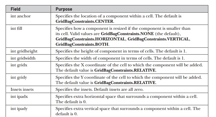
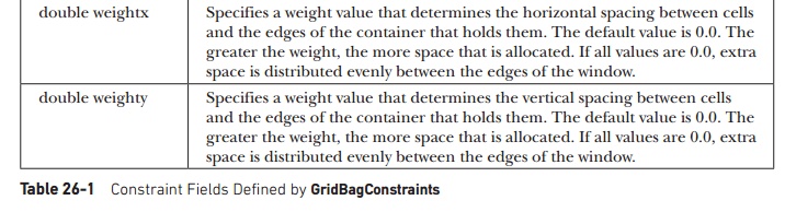
component. These are shown in Table 26-1. Several are described in greater
detail in the following discussion.
GridBagConstraints also defines several static
fields that contain standard constraint values,
such as GridBagConstraints.CENTER
and GridBagConstraints.VERTICAL.
When a component is smaller than its cell, you can use the anchor field to specify where within
the cell the component’s top-left corner will be located. There are three types
of values that you can give to anchor.
The first are absolute:
GridBagConstraints.CENTER
GridBagConstraints.EAST
GridBagConstraints.NORTH
GridBagConstraints.NORTHEAST
GridBagConstraints.NORTHWEST
GridBagConstraints.SOUTH
GridBagConstraints.SOUTHEAST
GridBagConstraints.SOUTHWEST
GridBagConstraints.WEST
As their names imply, these values cause the component to be placed
at the specific locations. The second type of values that can be given to anchor is relative, which means the
values are relative to the container’s orientation, which might
differ for non-Western languages. The relative values are shown here:
GridBagConstraints.FIRST_LINE_END
GridBagConstraints.FIRST_LINE_START
GridBagConstraints.LAST_LINE_END
GridBagConstraints.LAST_LINE_START
GridBagConstraints.LINE_END
GridBagConstraints.LINE_START
GridBagConstraints.PAGE_END
GridBagConstraints.PAGE_START
Their names describe the placement.
The third type of values that can be given to anchor allows you to position components relative to the baseline
of the row. These values are shown here:
GridBagConstraints.BASELINE
GridBagConstraints.BASELINE_TRAILING
GridBagConstraints.ABOVE_BASELINE_LEADING
GridBagConstraints.BELOW_BASELINE
GridBagConstraints. BELOW_BASELINE_TRAILING
GridBagConstraints.BASELINE_LEADING
GridBagConstraints.ABOVE_BASELINE
GridBagConstraints.ABOVE_BASELINE_TRAILING
GridBagConstraints.BELOW_BASELINE_LEADING
The horizontal position can be either centered, against the leading
edge (LEADING), or against the trailing edge (TRAILING).
The weightx and weighty fields are both quite important
and quite confusing at first glance. In general, their values determine how
much of the extra space within a container is allocated to each row and column.
By default, both these values are zero. When all values within a row or a
column are zero, extra space is distributed evenly between the edges of the
window. By increasing the weight, you increase that row or column’s allocation
of space proportional to the other rows or columns. The best way to understand
how these values work is to experiment with them a bit.
The gridwidth variable
lets you specify the width of a cell in terms of cell units. The default is 1.
To specify that a component use the remaining space in a row, use GridBagConstraints.REMAINDER. To
specify that a component use the next-to-last cell in a row, use GridBagConstraints.RELATIVE.
The gridheight constraint works the
same way, but in the vertical direction.
You can specify a padding value that will be used to increase the
minimum size of a cell. To pad horizontally, assign a value to ipadx. To pad vertically, assign a
value to ipady.
Here is an example that uses GridBagLayout
to demonstrate several of the points just discussed:
// Use
GridBagLayout.
import
java.awt.*; import java.awt.event.*; import java.applet.*; /*
<applet
code="GridBagDemo" width=250 height=200> </applet>
*/
public
class GridBagDemo extends Applet implements ItemListener {
String
msg = "";
Checkbox
windows, android, solaris, mac;
public
void init() {
GridBagLayout
gbag = new GridBagLayout(); GridBagConstraints gbc = new GridBagConstraints();
setLayout(gbag);
//
Define check boxes.
windows
= new Checkbox("Windows ", null, true); android = new
Checkbox("Android");
solaris
= new Checkbox("Solaris"); mac = new Checkbox("Mac OS");
//Define the grid bag.
Use
default row weight of 0 for first row. gbc.weightx = 1.0;
// use a
column weight of 1
gbc.ipadx
= 200; // pad by 200 units
gbc.insets
= new Insets(4, 4, 0, 0); // inset slightly from top left
gbc.anchor
= GridBagConstraints.NORTHEAST;
gbc.gridwidth
= GridBagConstraints.RELATIVE; gbag.setConstraints(windows, gbc);
gbc.gridwidth
= GridBagConstraints.REMAINDER; gbag.setConstraints(android, gbc);
// Give
second row a weight of 1.
gbc.weighty
= 1.0;
gbc.gridwidth
= GridBagConstraints.RELATIVE; gbag.setConstraints(solaris, gbc);
gbc.gridwidth
= GridBagConstraints.REMAINDER; gbag.setConstraints(mac, gbc);
Add the components. add(windows); add(android);
add(solaris); add(mac);
Register to receive item events.
windows.addItemListener(this); android.addItemListener(this);
solaris.addItemListener(this); mac.addItemListener(this);
}
Repaint when status of a check box changes.
public void itemStateChanged(ItemEvent ie) {
repaint();
}
Display current state of the check boxes.
public void paint(Graphics g) {
msg =
"Current state: "; g.drawString(msg, 6, 80);
msg =
" Windows: " + windows.getState(); g.drawString(msg, 6, 100);
msg =
" Android: " + android.getState(); g.drawString(msg, 6, 120);
msg =
" Solaris: " + solaris.getState(); g.drawString(msg, 6, 140);
msg =
" Mac: " + mac.getState(); g.drawString(msg, 6, 160);
}
}
Sample output produced by the program is shown here.
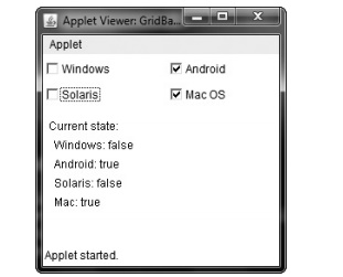
In this layout, the operating system check boxes are positioned in
a 2×2 grid. Each cell has a horizontal padding of 200. Each component is inset
slightly (by 4 units) from the top left. The column weight is set to 1, which
causes any extra horizontal space to be distributed evenly between the columns.
The first row uses a default weight of 0; the second has a weight of 1. This
means that any extra vertical space is added to the second row.
GridBagLayout is a powerful layout manager.
It is worth taking some time to experiment
with and explore. Once you understand what the various settings do, you can use
GridBagLayout to position components
with a high degree of precision.
Related Topics