Chapter: User Interface Design : Windows and controls
Text Boxes
Text
Boxes
Description:
A
control, usually rectangular in shape, in which:
·
Text may be entered or edited.
·
Text may be displayed for read-only purposes.
Usually
possesses a caption describing the kind of information contained within it.
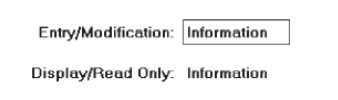
An
outline field border:
·
Is included for enterable/editable text boxes.
·
Is not included for read-only text boxes.
Two types
exist:
·
Single line.
·
Multiple line.
When
first displayed, the box may be blank or contain an initial value.
Purpose:
To permit
the display, entering, or editing of textual information.
To
display read-only information.
Advantages:
Very
flexible.
Familiar.
Consumes
little screen space.
Disadvantages:
Requires
use of typewriter keyboard.
Requires
user to remember what must be keyed.
Proper
usage:
Most
useful for data that is:
·
Unlimited in scope.
·
Difficult to categorize.
·
Of a variety of different lengths.
When
using a selection list is not possible.
Types of
text box
Two types of text boxes exist.
One consists of a rectangular box into which information is typed. It may also
be referred to as an edit control.
The
second is also rectangular in shape but contains text displayed purely for
read-only purposes. The former type has historically been referred to as an entry field, the latter as an
inquiry or display field.
Two forms
of Text Box
Single-Line
and Multiple-Line Text Boxes
Single line:
Description:
A control consisting of no more than one line of
text.
Purpose:
To make textual entries when the information can be
contained within
one line
of the screen.
Typical uses:
Typing the name of a file to save.
Typing the path of a file to copy.
Typing variable data on a form.
Typing a command.
Multiple line:
Description:
A control consisting of a multiline rectangular box
for multiple lines of
text.
Purpose:
To type, edit, and read passages of text.
Typical uses:
Creating or reading an electronic mail message.
Displaying and editing text files.
Captions
Structure
and size:
Provide a
descriptive caption to identify the kind of information to be typed, or
contained within, the text box.
Use a
mixed-case font.
Display
the caption in normal intensity or in a color of moderate brightness.
Formatting:
Single
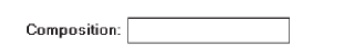
fields:
Position the field caption to the left of the text
box.
·
Place a colon (:) immediately following the
caption.
·
Separate the colon from the text box by one space.
Alternately, the caption may be placed above the
text box.
·
Place a colon (:) immediately following the
caption.
·
Position above the upper-left corner of the box,
flush with the left edge.
·
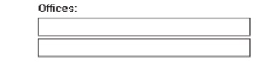
Multiple occurrence fields:

For entry/modification text boxes:
—
Position the caption left-justified one line above
the column of entry fields.
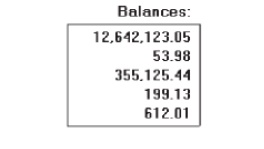
For display/read-only boxes:
— If the
data field is long and fixed-length, or the displayed data is about the same
length, center the caption above the displayed text box data.
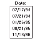
— If the
data displayed is alphanumeric, short, or quite variable in length,
left-justify the caption above the displayed text box data.
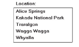
— If the
data field is numeric and variable in length, right-justify the caption above
the displayed text box data.
Fields
Structure:
Identify
entry/modification text boxes with a line border or reverse polarity
rectangular
box.
To
visually indicate that it is an enterable field, present the box in a
recessed
manner.
Present display/read-only text boxes on the window
background.
Break up
long text boxes through incorporation of slashes ( / ), dashes (-), spaces, or
other common delimiters.
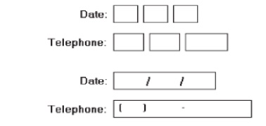
Size:
Size to
indicate the approximate length of the field.
Text
boxes for fixed-length data must be large enough to contain the entire entry.
Text
boxes for variable-length data must be large enough to contain the majority of
the entries.
Where
entries may be larger than the entry field, scrolling must be provided to
permit keying into, or viewing, the entire field.
Employ
word wrapping for continuous text in multiple-line text boxes.
Highlighting:
Call
attention to text box data through a highlighting technique.
Higher intensity.
If
color is used,
choose one that
both complements the
screen
background
and contrasts well with it.
Unavailable
fields:
Gray-out
temporarily unavailable text boxes.
Fonts:
To
support multiple fonts, use a Rich-Text
Box.
Related Topics