Chapter: User Interface Design : Windows and controls
Operate Controls
Operate
Controls
Operable controls are those that permit the entry,
selection, changing, or editing of a particular value, or cause a command to be
performed.
Classes include buttons, text entry/read-only,
selection, combination entry/selection, and other specialized controls.
Buttons
Description:
A square
or rectangular-shaped control with a label inside that indicates action to be
accomplished.
The label
may consist of text, graphics, or both.
Purpose:
To start
actions.
To change
properties.
To
display a pop-up menu.
Advantages:
Always
visible, reminding one of the choices available.
Convenient.
Can be
logically organized in the work area.
Can
provide meaningful descriptions of the actions that will be performed.
Larger
size generally provides faster selection target.
Can
possess 3-D appearance:
·
Adds an aesthetically pleasing style to the screen.
·
Provides visual feedback through button movement
when activated.
May
permit use of keyboard equivalents and accelerators.
Faster
than using a two-step menu bar/pull-down sequence.
Disadvantages:
Consumes
screen space.
Size
limits the number that may be displayed.
Requires
looking away from main working area to activate.
Requires
moving the pointer to select.
Proper
usage:
Use for
frequently used actions that are specific to a window.
·
To cause something to happen immediately.
·
To display another window.
·
To display a menu of options.
·
To set a mode or property value.
A button comes in three styles.
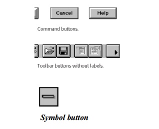
Command Buttons
Command
button guidelines include the following.
Usage
For windows with a menu bar:
·
Use to provide fast access to frequently used or
critical commands.
For windows without a menu bar:
·
Use to provide access to all necessary commands.
Structure
Provide a rectangular shape with the label
inscribed within it.
Give the button a raised appearance.
Maintain consistency in style throughout an
application.
Labels
Use standard button labels when available.
Provide meaningful descriptions of the actions that
will be performed.
Use single-word labels whenever possible.
·
Use two-three words for clarity, if necessary.
Use mixed-case letters with the first letter of
each significant label word capitalized.
Display labels:
·
In the regular system font.
·
In the same size font.
Do not number labels.
Center the label within the button borders, leaving
at least two pixels between the text and the button border.
Provide consistency in button labeling across all
screens.
Size
Provide as large a button as feasible.
Maintain consistent button heights and widths.
Exception: Buttons containing excessively long
labels may be wider.
Number
Restrict the number of buttons on a window to six
or fewer.
Location
and Layout
Maintain
consistency in button location between windows.
Never simply “fit” buttons in available space.
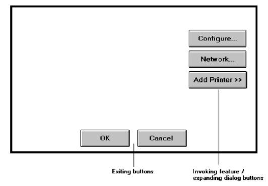
If buttons are for exiting the dialog:
·
Position them centered and aligned horizontally at
the bottom.
If buttons are used for invoking a dialog feature
or expanding the dialog:
·
Position them centered and aligned vertically on
the right side.
If a button has a contingent relationship to
another control:
·
Position it adjacent to the related control.
If a button has a contingent relationship to a
group of controls:
Position
it at the bottom or to right of related controls.
·
If, due to space constraints, exiting and
expanding/invoking feature buttons must be placed together:
·
If at the bottom, place exiting buttons to the
right, separating the groupings by one button’s width.
If along
the right side, place exiting buttons at the bottom, separating the groupings
by one button’s height.
For exiting and expanding/invoking feature buttons,
do not:
·
Align with the other screen controls.
·
Present displayed within a line border.
Provide equal and adequate spacing between adjacent
buttons.
Provide
adequate spacing between buttons and the screen body controls.
Organization
Organize standard buttons in the manner recommended by the platform
being used.
·
For other buttons, organize them in common and
customary grouping schemes.
For
buttons ordered left to right, place those for most frequent actions to the
left.
·
For buttons ordered top to bottom, place those for
most frequent actions at the top.
Keep related buttons grouped together.
Separate potentially destructive buttons from frequently chosen
selections.
Buttons found on more than one window should be consistently positioned.
The order should never change.
For mutually exclusive actions, use two buttons; do not dynamically
change the text.
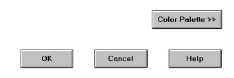
Windows recommends the following:
·
An affirmative action to the left (or above).
·
The default first.
·
OK and Cancel next to each other.
·
Help last, if supported.
Intent
Indicators
When a
button causes an action to be immediately performed, no intent indicator is
necessary.
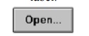
When a
button leads to a cascading dialog, include an ellipsis (...) after the label.
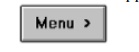
When a
button leads to a menu, include a triangle pointing in the direction the menu
will appear after the label.
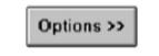
When a
button leads to an expanding dialog, include a double arrow (>>) with the
label.
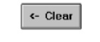
When a
button has a contingent relationship to another control that must be indicated,
include a single arrow (->) pointing at the control.
Expansion
Buttons
Gray them out after expansion.
Provide a contraction button, if necessary.
·
Locate it beneath, or to right of, the expansion
button.
·
Gray it out when not applicable.
Defaults
Intent:
When a
window is first displayed, provide a default action, if practical.
Selection:
A default
should be the most likely action:
A confirmation.
An application of the activity being performed.
A positive action such as OK, unless the result is
catastrophic.
If a
destructive action is performed (such as a deletion), the default should be
Cancel.
Presentation:
Indicate
the default action by displaying the button with a bold or double border.
Procedures:
The
default can be changed as the user interacts with the window.
When the
user navigates to a button, it can temporarily become the default.
Use the
Enter key to activate a default button.
If
another control requires use of the Enter key, temporarily disable the default
while the focus is on the other control.
Permit
double-clicking on a single selection control in a window to also carry out the
default command.
Unavailable
Choices
Temporarily unavailable choices should be dimmed or
grayed out.
Keyboard
Equivalents and Accelerators
Equivalents:
Assign a
keyboard equivalent mnemonic to each button to facilitate
keyboard
selection.
The
mnemonic should be the first character of the button’s label.
If duplication exists in first characters, for
duplicate items, use
another
character in the label.
Preferably, choose the first succeeding consonant.
Designate
the mnemonic character by underlining it.
Maintain
the same mnemonic on all identical buttons on other screens.
Accelerators:
— Assign a keyboard accelerator to each button to
facilitate keyboard selection.
Scrolling
If a window can be scrolled, do not scroll the
command buttons.
Exception:
if the screen cannot scroll independently of the buttons.
Use buttons to move between multipage forms, not
scroll bars.
Label
buttons Next and Previous.
Button
Activation
Pointing:
Highlight
the button in some visually distinctive manner when the pointer is resting on
it and the button is available for selection.
Activation:
Call
attention to the button in another visually distinctive manner when it has been
activated or pressed.
If a
button can be pressed continuously, permit the user to hold the mouse button
down and repeat the action.
Toolbars
Toolbars are
compilations of commands, actions, or functions, usually graphical in structure but sometimes textual, grouped together for
speedy access.
Toolbars may also be called button bars, control bars,
or access bars. Specialized toolbars
may also be referred to as ribbons, toolboxes, or palettes. Toolbars may also appear in palette windows.
Usage
To provide easy and fast access to most frequently
used commands or options across multiple screens.
To invoke a sub application within an application.
To use in place of certain menu items.
Structure
Images:
Provide
buttons of equal size.
Create a
meaningful and unique icon.
·
Design them using icon design guidelines.
Center
the image within the button.
Give the
button a raised appearance.
Ensure
that toolbar images are discernible from Web page graphical images.
Text:
Create a
meaningful label, adhering to label guidelines for command buttons.
Create
toolbar buttons of equal size, following the size guidelines recently
described.
Consistency:
Use the
same icon throughout an application and between applications.
Size
Button:
24 (w) by
22 (h) pixels, including border.
32 (w) by
30 (h) pixels, including border.
Larger
buttons can be used on high-resolution displays.
Label:
16 (w) by
16 (h) pixels.
14 (w) by
24 (h) pixels.
Default:
Provide
the smaller size as the default size with a user option to change it.
Image:
Center
the image in the button.
Organization
Order the buttons based on common and customary grouping schemes.
For
buttons ordered left to right, place those for the most frequently used actions
to the left.
For
buttons ordered top to bottom, place those for the most frequently used actions
at the top.
Keep related buttons grouped together.
Separate potentially destructive buttons from frequently chosen
selections.
Permit user reconfiguration of button organization.
Location
Position main features and functions bar horizontally across top of
window just below menu bar.
Position subtask and sub features bars along sides of window.
Permit the location of the bar to be changed by the user.
Permit display of the bar to be turned on or off by the user.
Also
provide access through standard menus.
Active
Items
Make only currently available toolbar items available.
Temporarily not available items may be displayed grayed out.
Customization
Permit toolbars to be turned off by the user.
Allow the customizing of toolbars.
·
Provide a default, however.
Keyboard
Equivalents and Accelerators
Equivalents:
Assign
keyboard equivalents to facilitate keyboard selection.
Maintain
the same mnemonic on all identical buttons on all screens.
Accelerators:
Assign a
keyboard accelerator to facilitate keyboard selection.
Button
Activation
Pointing:
Highlight
the button in some visually distinctive manner when the pointer is resting on
it and the button is available for selection.
Activation:
Call
attention to the button in another visually distinctive manner when it has been
activated or pressed.
Text
Entry/Read-Only Controls
A Text Entry/Read-Only control contains text that
is exclusively entered or modified through the keyboard.
It may also contain entered text being presented
for reading or display purposes only.
Related Topics