Geography - Ombrothermic Diagram | 11th Geography : Chapter 10 : Representation of Relief Features and Climatic Data
Chapter: 11th Geography : Chapter 10 : Representation of Relief Features and Climatic Data
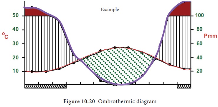
Ombrothermic Diagram
Ombrothermic
Diagram
Climate diagrams are diagrams that
summarize trends in temperature and precipitation for at least 30 years. They
allow to establish the relationship between temperature and precipitation and
to determine the length of dry, wet, and extremely wet periods.
Ombrothermic diagram also called as
Walter Lieth diagram is one such climatic diagram used to compare the average
wetness and dryness for an area of interest. The data must be average for
nearly thirty years.
•
On graph paper, draw the x-axis marking each of the months starting with
the coldest month. Remember to start in January if you are plotting data
collected in the northern hemisphere or in July if the data is from the
southern hemisphere.
•
Label the months on the x-axis.
•
Draw two y axes one for temperature in degree Celsius and another for
rainfall in mm.
•
The scale must be chosen in such a way that line marking 10°C should be
equal to 20 mm of rainfall in the other axis. Rainfall scale should be twice
the value of temperature scale selected.
•
Draw a graph with red colour corresponding to the temperature data.
•
Draw a graph with blue colour corresponding to the rainfall data.
•
When the temperature line runs above the precipitation line there is a dry
season and the area
between the lines should be illustrated by filling it with dots
•
When the temperature line runs below the precipitation line there is a wet season and the area between the lines should
be illustrated by filling it with vertical lines
•
There is a practice of colouring the portions which exceed 100 mm,
precipitation as a period with excess water with black colour.
•
The station name and its elevation should be mentioned in the top left,
average temperature and average rainfall in the top right, extremes of
temperature in the second line should be shown.
Inference:
The station has the
dry season between April and October; wet season from October to April and excess
water between November and February.
Exercise 3
Draw ombrothermic diagram for the
following stations and identify the dry, wet and excess water season for the
following.
http://www.indiawaterportal.org/met_data/
This website provides climatic data for 100 years.
Related Topics