Chapter: User Interface Design : Interface Testing
Organize and Layout Windows and Pages
Organize and Layout Windows and Pages
In graphical user interfaces, components to be included on
windows include a title, screen controls, headings, other screen content, and
possibly instructional messages.
On Web pages, components to be included consist of
elements such as the page title, textual content, graphics, headings, screen
controls, links, and other necessary components.
General Guidelines
Amount of information:
·
Present the proper amount of
information on each screen.
o
Too little is inefficient.
o
Too much is confusing.
·
Present all information necessary for
performing an action or making a decision on one screen, whenever possible.
Organization:
·
Provide an ordering that:
o
Is logical and sequential.
o
Is rhythmic, guiding a person’s eye
through the display.
o
Encourages natural movement sequences.
o
Minimizes pointer and eye movement
distances.
Control placement:
·
Position the most important and
frequently used controls at the top left.
·
Maintain a top-to-bottom,
left-to-right flow.
·
If one control enables or affects
another, the enabling control should be above or to the left of the enabled
control.
·
Place the command buttons that affect
the entire window horizontally, and centered, at the window’s bottom.
Navigation:
The flow of interaction should:
·
Require as little cursor and pointer
travel as possible.
·
Minimize the number of times a
person’s hand has to travel between the keyboard and the mouse.
Assist users in navigating through a screen by:
·
Aligning elements.
·
Grouping elements.
·
Using line borders.
Aesthetics:
Provide a visually pleasing composition through:
·
Adequate use of white space.
·
Balance.
·
Groupings.
·
Alignment of elements.
Visual clutter:
Avoid visual clutter by:
·
Maintaining low screen density
levels.
·
Maintaining distinctiveness of
elements.
Focus and emphasis:
·
Provide visual emphasis to the most
important screen elements, its data or information.
·
Sequentially, direct attention to
items that are:
1. Critical.
2. Important.
3. Secondary.
4. Peripheral.
Consistency:
Provide consistency.
·
With a person’s experiences and
cultural conventions.
·
Internally within a system.
·
Externally across systems.
Organization
Guidelines
Organizational guidelines to be addressed include those relating
to groupings, borders, dependent controls, alignment, and balance.
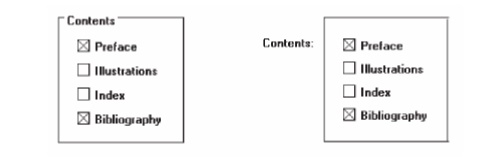
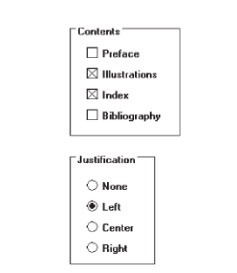
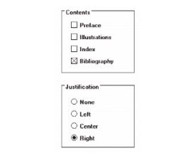
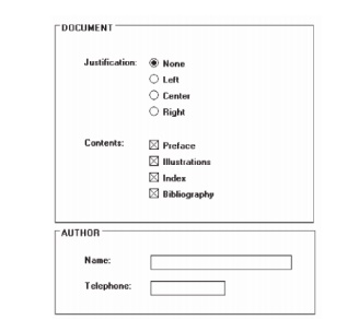
Creating Groupings
General:
Provide groupings of associated elements.
Elements of a radio button or check
box control.
Two or more related fields or controls.
Create groupings as close as possible to 5 degrees of visual
angle.
White space:
Provide adequate separation of groupings through the liberal use
of white space.
Leave adequate space:
Around groups of related controls.
Between groupings and window borders.
The space between groupings should be greater than the space
between fields within a grouping.
Headings:
Provide section headings and subsection headings for multiple
control groupings.
Provide headings that meaningfully and concisely describe the
nature of the group of related fields.
Borders:
Enhance groupings through incorporation of borders around:
Elements of a single control.
Groups of related controls or fields.
Individual control borders should be visually differentiable
from borders
delineating groupings of fields or controls.
Provide a border consisting of a thin line around single controls.
Provide a border consisting of a
slightly thicker line around groups
of fields or controls.
Do not place individual field or control borders around:
Single entry fields.
Single list boxes.
Single combination boxes.
Single spin boxes.
Single sliders.
Do not place borders around command buttons.
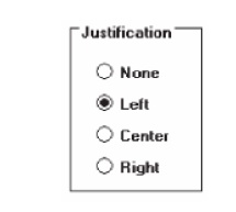
Borders
Groupings can be further enhanced through the use of
borders. Inscribe line borders around elements of a single control such as a
radio button or check box and/or groups of related controls or fields.
Individual control borders should be visually
differentiable from borders delineating groupings of fields or controls.
Provide a border consisting of a thin line around single
controls and a slightly thicker line around groups of fields or controls.
Control Borders
Incorporate a thin single-line border around the elements
of a selection control.
For spacing:
Vertically, leave one line space above and below the control
elements.
Horizontally:
Leave at least two character
positions between the border and the left
side of the control elements.
Leave at least two character positions between the border and
the right
side of the longest control element.
Locate the control caption in the top border, indented one
character position from the left border.
Alternately, locate the caption at the upper left of the box.
If the control caption exceeds the length of the choice
descriptions, extend the border two character positions to the right of the
caption.
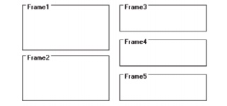
Section Borders
Incorporate a thicker single-line border around groups of
related entry or selection controls.
For spacing:
Vertically, leave one line space between the top and bottom row
of the entry or
selection control
elements.
Horizontally, leave at least four character positions to the
left and right of the
longest caption and/or entry field.
Locate the section heading in the top border, indented two
character positions from the left border.
Dependent Controls
Position a conditional control, or controls:
To the right of the control to which it relates.
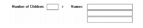
Alternately, position it below the control to which it relates.
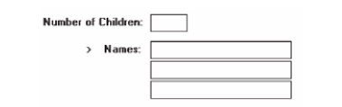
Either:
Display these conditional controls in a subdued or grayed out
manner.
When a control is relevant, return it
to a normal intensity.
Do not display a conditional control until the information to
which it relates is set.
Inscribe a filled-in arrow between the selected control
and its dependent
controls to visually relate them to each other.
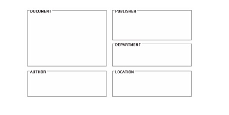
Aligning Screen Elements
Minimize alignment points on a window.
Vertically.
Horizontally.
Vertical
Orientation and Vertical Alignment
Radio buttons/check boxes:
Left-align choice descriptions, selection indicators, and
borders.
Captions:
Those inscribed within borders must be left-aligned.
Those located at the left may be
left- or right-aligned.
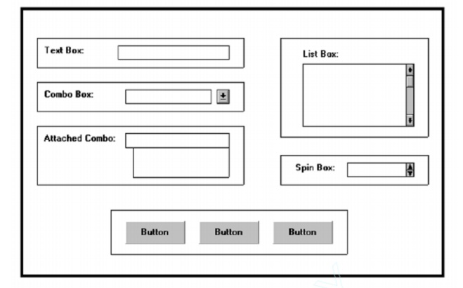
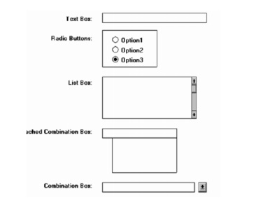
Text boxes:
Left-align the boxes. If the screen will be used for inquiry or
display purposes, numeric fields should be right-aligned.
Captions may be left- or right-aligned.

List boxes:
Left-align fixed list boxes.
Captions:
Those located above the boxes must be left-aligned.
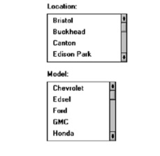
Those located at the left may be
left- or right-aligned.
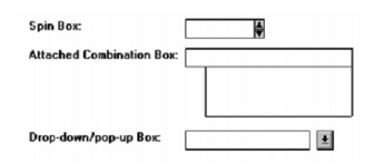
Drop-down/pop-up boxes, spin boxes, combo boxes:
Left-align control boxes.
Field captions may be left- or right-aligned.
Mixed controls
Left-align vertically arrayed:
Text boxes.
Radio buttons.
Check box boxes.
Drop-down/pop-up list boxes.
Spin boxes.
Combination control boxes.
List boxes.
Captions may be left- or right-aligned.
Balancing Elements
General:
Create balance by:
Equally distributing controls,
spatially, within a window.
Aligning borders whenever possible.
Individual control borders:
If more than one control with a border is incorporated within a column on a screen:
Align the controls following the guidelines for multiple-control alignment.
Align the left and right borders of
all groups.
Establish the left and right border positions according to the spacing required for the widest element within the groups.
With multiple groupings and multiple columns, create a balanced screen by:
Maintaining equal column widths as
much as practical.
Maintaining equal column heights as
much as practical.
Section borders:
— If more than one section with borders is incorporated within a column on a screen:
Align the left and right borders of
all groups.
Establish the left and right border positions according to the spacing required by the widest element within the groups.
With multiple groupings and multiple columns, create a balanced screen by:
Maintaining equal column widths as
much as practical.
Maintaining equal column heights as much as practical.
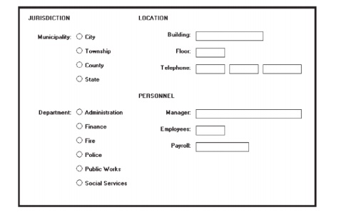
Window Guidelines
Organization:
Organize windows to support user tasks.
Present related information in a single window whenever
possible.
Support the most common tasks in the most efficient sequence of
steps.
Use:
Primary windows to:
Begin an interaction and provide top-level context for dependent
windows.
Perform a major interaction.
Secondary windows to:
Extend the interaction.
Obtain or display supplemental information related to the
primary
window.
Dialog boxes for:
Infrequently used or needed information.
— “Nice-to-know” information.
Number:
— Minimize the number of windows needed to accomplish an
objective.
Size:
Provide large enough windows to:
Present all relevant and expected information for the task.
Not hide important information.
Not cause crowding or visual confusion.
Minimize the need for scrolling.
Less than the full size of the entire screen.
If a window is too large, determine:
Is all the information needed?
Is all the information related?
Test, Test, and Retest
Testing
steps to be reviewed are:
Identifying
the purpose and scope of testing.
Understanding the importance of testing.
Developing a prototype.
Developing the right kind of test plan.
Designing a test to yield relevant data.
Soliciting, selecting, and scheduling users to
participate.
Providing the proper test facility.
Conducting tests and collecting data.
Analyzing the data and generating design
recommendations.
Modifying the prototype as necessary.
Testing the system again.
Evaluating the working system.
The Purpose of Usability Testing
First, it establishes a communication bridge
between developers and users.
Through
testing, the developer learns about the user’s goals, perceptions, questions,
and problems.
Second, testing is used to evaluate a product. It
validates design decisions. It also can identify potential problems in design
at a point in the development process where they can be more easily addressed.
The Importance of Usability
Testing
A
thorough usability testing process is important for many reasons,
Developers and users possess different models.
Developer’s intuitions are not always correct.
There is no average user.
It’s impossible to predict usability from
appearance.
Design standards and guidelines are not sufficient.
Informal feedback is inadequate.
Problems found late are more difficult and
expensive to fix.
Advantages over a competitive product can be
achieved.
Scope of Testing
Testing should begin in the earliest stages of
product development and continue throughout the development process.
It should include as many of the user’s tasks, and
as many of the product’s components, as reasonably possible.
Prototypes
A
prototype is primarily a vehicle for exploration, communication, and
evaluation. Its purpose is to obtain user input in design, and to provide
feedback to designers.
A prototype is a simulation of an actual system that can be quickly
created.
A prototype may be a rough approximation, such as a simple hand-drawn
sketch, or it may be interactive, allowing the user to key or select data using
controls, navigate through menus, retrieve displays of data, and perform basic
system functions.
A prototype may have great breadth, including as many features as
possible to present concepts and overall organization, or it might have more
depth, including more detail on a given feature or task to focus on individual
design aspects.
Hand Sketches and Scenarios
Description:
Screen
sketches created by hand.
Focus is
on the design, not the interface mechanics.
A
low-fidelity prototype.
Advantages:
Can be
used very early in the development process.
Suited
for use by entire design team.
No large
investment of time and cost.
No
programming skill needed.
Easily
portable.
Fast to
modify and iterate.
A rough
approximation often yields more substantive critical comments.
Easier to
comprehend than functional specifications.
Can be
used to define requirements.
Disadvantages:
Only a
rough approximation.
Limited
in providing an understanding of navigation and flow.
A
demonstration, not an exercise.
Driven by
a facilitator, not the user.
Limited
usefulness for a usability test.
A poor
detailed specification for writing the code.
Usually
restricted to most common tasks.
Sketch
Creation Process
Sketch (storyboard) the screens while determining:
The
source of the screen’s information.
The
content and structure of individual screens.
The
overall order of screens and windows.
Use an erasable medium.
Sketch
the screens needed to complete each workflow task. o Try out selected metaphors and
change them as necessary.
First, storyboard common/critical/frequent
scenarios.
Follow
them from beginning to end.
Then, go
back and build in exceptions.
Don’t get too detailed; exact control positioning
is not important, just overall order and flow.
Storyboard
as a team, including at least one user.
Only develop online prototypes when everyone agrees
that a complete set of screens has been satisfactorily sketched.
Interactive Paper Prototypes
Description:
Interface
components (menus, windows, and screens) constructed of common paper
technologies (Post-It notes, transparencies, and so on).
The
components are manually manipulated to reflect the dynamics of the software.
A
low-fidelity prototype.
Advantages:
More
illustrative of program dynamics than sketches.
Can be
used to demonstrate the interaction.
Otherwise,
generally the same as for hand-drawn sketches and scenarios.
Disadvantages:
Only a
rough approximation.
A
demonstration, not an exercise.
Driven by
a facilitator, not the user.
Limited
usefulness for usability testing.
Programmed Facades
Description:
Examples
of finished dialogs and screens for some important aspects of the system.
Created
by prototyping tools.
Medium-fidelity
to high-fidelity prototypes.
Advantages:
Provide a
good detailed specification for writing code.
A vehicle
for data collection. o Disadvantages:
May
solidify the design too soon.
May
create the false expectation that the “real thing” is only a short time away.
More
expensive to develop.
More
time-consuming to create.
Not
effective for requirements gathering.
Not all
of the functions demonstrated may be used because of cost, schedule
limitations, or lack of user interest.
Not
practical for investigating more than two or three approaches.
Prototype-Oriented Languages
Description:
An
example of finished dialogs and screens for some important aspects of the
system.
Created
through programming languages that support the actual programming process.
A
high-fidelity prototype.
Advantages:
May
include the final code.
Otherwise,
generally the same as those of programmed facades.
Disadvantages:
Generally
the same as for programmed facades.
Related Topics