Chapter: Java The Complete Reference : Introducing GUI Programming with JavaFX : Introducing JavaFX Menus
Create a Toolbar - JavaFX
Create
a Toolbar
A toolbar is a component that
can serve as both an alternative and as an adjunct to a menu. Typically, a
toolbar contains a list of buttons that give the user immediate access to
various program options. For example, a toolbar might contain buttons that
select various font options, such as bold, italics, highlight, or underline.
These options can be selected without the need to drop through a menu. As a
general rule, toolbar buttons show images rather than text, although either or
both are allowed. Furthermore, often tooltips are associated with image-based
toolbar buttons.
In JavaFX, toolbars are
instances of the ToolBar class. It
defines the two constructors, shown here:
ToolBar( ) ToolBar(Node ... nodes)
The first constructor creates
an empty, horizontal toolbar. The second creates a horizontal toolbar that
contains the specified nodes, which are usually some form of button. If you
want to create a vertical toolbar, call setOrientation(
) on the toolbar. It is shown here:
final void setOrientation(Orientation
how)
The value of how must be either Orientation.VERTICAL or Orientation.HORIZONTAL.
You add buttons (or other controls) to a toolbar in much the same way that you
add
them to a menu bar: call add( ) on the reference returned by the
getItems( ) method. Often, however,
it is easier to specify the items in the ToolBar
constructor, and that is the approach used in this chapter. Once you have
created a toolbar, add it to the scene graph. For example, when using a border
layout, it could be added to the bottom location. Of course, other approaches
are commonly used. For example, it could be added to a location directly under
the menu bar or at the side of the window.
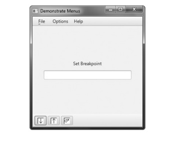
To illustrate a toolbar, we
will add one to the MenuDemo
program. The toolbar will present three debugging options: Set Breakpoint,
Clear Breakpoint, and Resume Execution. We will also add tooltips to the menu
items. Recall from the previous chapter, a tooltip is a small message that
describes an item. It is automatically displayed if the mouse hovers over the
item for moment. You can add a tooltip to the menu item in the same way as you
add it to a control: by calling setTooltip(
). Tooltips are especially useful when applied to image-based toolbar
controls because sometimes it’s hard to design images that are intuitive to all
users.
First, add the following
code, which creates the debugging toolbar:
// Define a toolbar. First, create toolbar
items.
Button btnSet = new Button("Set
Breakpoint",
new ImageView("setBP.gif"));
Button btnClear = new Button("Clear
Breakpoint",
new ImageView("clearBP.gif"));
Button btnResume = new Button("Resume
Execution",
new ImageView("resume.gif"));
// Now, turn off text in the buttons.
btnSet.setContentDisplay(ContentDisplay.GRAPHIC_ONLY);
btnClear.setContentDisplay(ContentDisplay.GRAPHIC_ONLY);
btnResume.setContentDisplay(ContentDisplay.GRAPHIC_ONLY);
// Set tooltips.
btnSet.setTooltip(new Tooltip("Set a
breakpoint."));
btnClear.setTooltip(new Tooltip("Clear a
breakpoint."));
btnResume.setTooltip(new Tooltip("Resume
execution."));
// Create the toolbar.
ToolBar tbDebug = new ToolBar(btnSet, btnClear,
btnResume);
Let’s look at this code
closely. First, three buttons are created that correspond to the debug actions.
Notice that each has an image associated with it. Next, each button deactivates
the text display by calling setContentDisplay(
). As a point of interest, it would have been possible to leave the text
displayed, but the toolbar would have had a somewhat nonstandard look. (The
text for each button is still needed, however, because it will be used by the
action event handler for the buttons.) Tooltips are then set for each button.
Finally, the toolbar is created, with the buttons specified as the contents.
Next, add the following
sequence, which defines an action event handler for the toolbar buttons:
// Create a handler for the toolbar buttons.
EventHandler<ActionEvent> btnHandler =
new EventHandler<ActionEvent>() { public void handle(ActionEvent ae) {
response.setText(((Button)ae.getTarget()).getText());
}
};
// Set the toolbar button action event
handlers.
btnSet.setOnAction(btnHandler);
btnClear.setOnAction(btnHandler); btnResume.setOnAction(btnHandler);
Finally, add the toolbar to
the bottom of the border layout by using this statement:
rootNode.setBottom(tbDebug);
After making these additions,
each time the user presses a toolbar button, an action event is fired, and it
is handled by displaying the button’s text in the response label. The following output shows the toolbar in action.
Related Topics