Textiles and Dress Designing - Principles of Design in Clothing | 12th Textiles and Dress Designing : Chapter 6 : Designing of Clothing
Chapter: 12th Textiles and Dress Designing : Chapter 6 : Designing of Clothing
Principles of Design in Clothing
Principles of Design in Clothing
The principles of design refer to the organization of a work of
art. The principles of designs are said to be yard sticks as these help us to
assess a design. These assist a designer which textile or garment to create and
enhance in a very pleasing, attractive and effective manner. The principles of
design are as follows.
·
Harmony
·
Balance
·
Emphasis
·
Proportion
·
Rhythm
1. Harmony
Harmony means unity. It is very much essential and fundamental
while creating a design. It results from a combination of related elements in
art. Using related and repeated elements of art this is obtained. Harmony is an
art principle that expresses unity through selected and arranged consistent
objects.
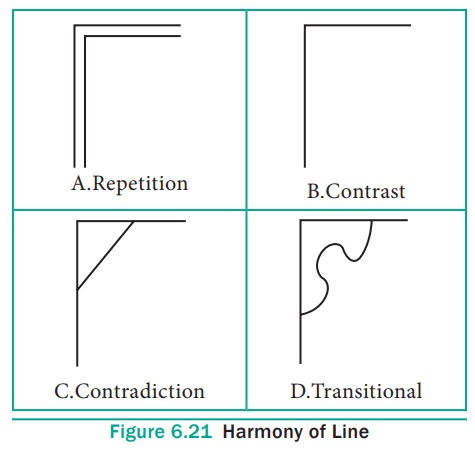
Harmony of Line
When a set of lines are drawn within a corner following the lines
of the corner, repetition occurs.
When a horizontal and vertical line come together in a right angle
or a corner, these lines are in opposition to each other and form contrast.
Any line that cuts across a corner from one opposition line to
another is a transitional line, but when a straight line drawn
across a corner is so sudden and sharp that it cuts off corner harshly is
called contradiction (Figure 6.21).
Harmony of Shape
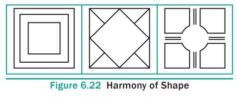
A combination of lines results in shapes. Transitional lines have
a graceful, softening effect and have the power to bring together shapes which
might in themselves be inharmonious.
Harmony of Texture
Textural surface ranges from smooth to rough. An example of poor
texture combination sometimes seen in the shops is cane furniture upholstered
in lustrous rayon. These textures are entirely unsuited to each other. Harmony
in texture is brought in a garment by combining satin with lace or netted
materials.
Harmony of Ideas
It is not enough that sizes, shapes, colours and textures should
have something in common, but there must be harmony in the ideas presented
together. For example, an apron and hood may have motifs of a cup and saucer.
Harmony in Colour
Colour schemes are like musical chords, structuring colour groups
according to certain visual relationships among their attributes of hue, value
and intensity. The guidelines for creating colour harmonies are
Warm colours should be combined with warm colour and cool colour
with cool ones.
Colour harmonies are divided as expressed in Figure 6.23.
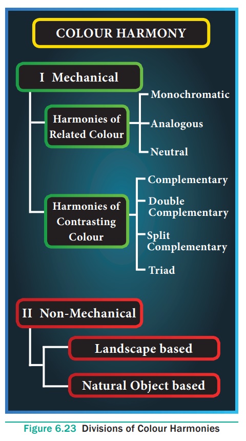
Colour harmonies can be created in two ways, namely, mechanical
and nonmechanical. The colour harmonies under the first category are further
divided as related and contrasting colour harmonies. The related colour
harmonies include mono-chromatic, analogous and neutral, and these types of
colour harmonies give a lot of freedom to its creator. A large number of
objects with a variety of tints and shades are available in the market these
days. Therefore one can successfully combine them to create ‘ready-made’ or
non-mechanical colour harmonies. Non-mechanical are nature-based and
ready-made. Landscape and other natural object based colour harmonies are
included in this category.
I. Mechanical Standard Colour Scheme
These schemes are based on the Prang Colour wheel, and are the
most easy to use. The mechanical standard colour schemes / harmonies may be of
two types;
Harmonies of related colours and Harmonies of contrasting colours.
I. A) Harmonies of Related Colours
Related colour schemes are based on common hues and tend to create
a restful, quiet effect as these colour combinations give the most pleasing
effect and are likely to be those schemes having harmony or unity. They are based
on either a single hue or a series of analogous hues, and promote harmony and
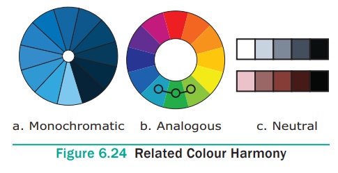
unity. The related colour schemes are Monochromatic, Analogous and Neutral
colour harmonies (Figure 6.24).
I. A. i) Monochromatic
Colour Scheme / One Hue Colour Harmony
Mono-chromatic scheme is the simplest of all other schemes to use,
because they are based on only one hue. Monochromatic means ‘of one colour’.
Under this scheme only one hue is used with different values and intensities.
The popular scheme of beige brown, and orange is a truly, monochromatic scheme,
because the tans and browns are simply tints and shades of grayed orange. A
brilliant form of orange may be used as an accent or even for larger areas, but
if any other hue is introduced here, the harmony is no longer monochromatic.
Another example is that red can be used with its various intensities giving
vermilion, carmine, crimson, etc. and various values in high-key giving Alps
red, peach, flesh tint, Indian red, brown, burnt sienna etc. The range may vary
from almost white to almost black and from very bright colours to dull colours.
Black and white are neutrals that can be used to add spice and interest to the
scheme. While using a mono-chromatic colour scheme, one can create a feeling of
warmth or cold in a room.
Normally the lightest of the colour (highest value) should cover
the largest area and at the highest level, the mid value of the colour at the
middle and the darkest at the lower level and so on.
I. A. ii) Analogous Colour Scheme / Adjacent Colour Scheme
Analogous colour scheme is one that combines colours that are
adjacent to one another in the colour wheel. In this colour scheme, colours
situated next to each other on the colour wheel of a Prang colour system, are
used. It generally uses one colour as its major force with the two neighbouring
colours as secondary forces, Example, yellow with yellow- green and green or
blue with blue- green and blue-purple. Because of their position on the colour
wheel, they are often referred to as related colour schemes.
A combination of yellow, yellow orange, orange and red orange
combine to make warm adjacent colour scheme. A combination of blue purple,
blue, blue green and green provides a cool adjacent colour scheme. At the same
time, a combination of both warm and cool colour scheme is also possible in an
adjacent colour scheme. When the adjacent colours of blue green, green, yellow
green and yellow or blue purple, purple, red purple and red are combined, they
provide a colour scheme which has both warm and cool colours.
I. A. iii) Neutral Colour Scheme
The neutrals are black, white and grey. A neutral colour such as
beige or brown with an accent colour for breaking the monotony can be used in
this colour scheme. Colour schemes built entirely around neutrals are very
restful, but texture and patterns must be used to prevent the design from
becoming dull, boring or monotonous. Therefore, this colour scheme should be
used in limited areas or for limited periods in any dress. Black-and-white schemes
are highly dramatic because of their strong contrast.
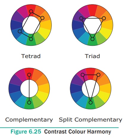
I. B Harmony of Contrasting Colours
Contrasting colour schemes are based on opposing hues and tend to
be stimulating and balanced because they include both warm and cool hues. They
are grouped as Complementary, Double Complementary and Triad. Two colours,
which are placed extremely opposite on the colour wheel, one might be cool, and
the other warm, are chosen for the colour scheme. Examples; Red and green, blue
and orange, yellow and purple. (Figure 6.25)
I. B. i) Complementary Colour Scheme
It is based on two colours found opposite to each other in the
colour wheel. These colours need not necessarily be used in their pure form and
they can be used in many values or intensities to have variety. A complementary
colour scheme can be developed from a monochromatic colour scheme accentuated
with a complementary colour or an even balance of two colours.
On a Prang the complementary colours are
·
Yellow and Purple
·
Red and Green
·
Blue and Orange
·
Yellow Green and Red Purple
·
Blue Green and Red Orange
·
Blue Purple and Yellow Orange
Thus, in all, they make six complementary colour schemes.
A complementary colour scheme is a stimulating, vivid and bright
colour scheme. It provides a combination of both a warm and a cool colour.
Their tints such as the pink and light green lack character when placed
together.
I. B. ii) Double Complementary Colour Scheme or Tetrad
Four in a double complementary is called a tetrad. If a narrow ‘X’
is superimposed on the colour wheel, then there will be two sets of
complementary colours with which to work. Two adjacent colours and their
complements when used together form double complementary harmonies like the
combination of – purple and red purple with yellow and yellow-green. In using a
double complementary harmony, there should be an outstanding hue which should
be in largest amount and be the dullest of all colour. For example, as in the
case of the above example, purple can be considered to the line having these
qualities. Use a brilliant form of one, like yellow, in a small area as an
accent on a garment say collar or yoke. The remaining two colours i.e., red
purple and yellow green can be used in the remaining area of the garment like
top and bottom.
This colour scheme is exciting, lively and sophisticated. It also
provides more variety than a simple complementary colour scheme. Since this
colour scheme provides a combination of both warm and cool colours, they can be
successfully used in a garment whether for a stout or thin figure. Some of the
examples of a double complementary colour scheme are :
·
Yellow and yellow orange with purple and blue purple
·
Yellow orange and orange with blue and blue purple
·
Orange and red orange with blue and blue green
·
Red and red purple with green and yellow green.
I. B. iii) Split Complementary Harmony
In this colour scheme, one colour is combined with the two colours
on each side of its complement. One might select a hue and combine it with the
colours that are on either side of its complement as though placing a
narrow-angled “Y” on the colour wheel. As the term implies, one “splits” or
divides the complement of a hue into its component parts, and while using these
parts the complement is omitted. A true split complementary scheme is a harmony
of similar colours with a note of a contrasting colour. The amounts of the
different values and intensities should be adjusted as in any other contrasting
colour harmony.
This provides three colours to work with an odd number of colours
combined together always yield a good effect as a colour scheme in a garment.
By varying their intensities and values some interesting combinations can be
worked out. Following combinations can also be worked out to prepare split
complementary colour schemes.
·
Yellow with blue purple and red purple
·
Yellow green with purple and red
·
Green with red purple and red orange
·
Blue green with red and orange.
The warm hues in combination with the cool hues need careful
handling because of their strong and advancing effects. When executed properly,
this colour harmony would produce a pleasing effect.
I. B. iv) Triads
An equilateral triangle placed on the Prang colour wheel will point to three equi-distant colours that form the triad. Turning the triangle will point out different combinations. In the Prang Chart, there is a Primary triad – when the three primary colours fall at the tips of the triangle (red, blue and yellow) and a binary or secondary triad (green, orange and purple). There are two intermediate triads – yellow-orange, blue -green and red-purple while the other is yellow-green, blue-purple and red-orange.
II. Non-Mechanical
The non mechanical colours ae readymade or nature based ones. The
nature based colours are of two types namely Landscape-Based Colour Scheme and
Nature Object-Based Colour Scheme.
II A) Landscape-Based
Colour Scheme
The colour of sea, sky, clouds, mountains, land covered with
plants, trees, earth or barren land. We find that they do not have sharp
colours and are large in area. The sky occupying the largest area is light
blue; water in the sea / river / canal also has the reflection of the same
light blue ; mountains are generally covered with either snow or light brown ;
trees and plants covered with green leaves. Earth is of dull brown or ochre and
trees are green.
II B) Natural Object-Based Colour Scheme
We observe a butterfly, or a fish, or a flower that give the hue
to a colour scheme. A butterfly might give a colour scheme of lemon / golden
yellow, brown, black and white. Or a flower might lead to a colour scheme of
lilac and white accentuated with violet and green.
2. Proportion
The word “proportion” means one part in relation to another.
Proportion is defined as the relation between parts of the same thing or
between different things of the same kind. The principle of proportion is
sometimes called the “law of relationship”. It deals with relationship
in size, shape, colour, texture and pattern. Greeks, after centuries of
striving for beauty, arrived at a point where nearly everything they made
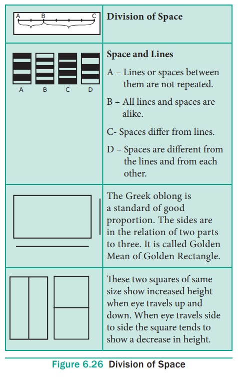
exhibited good spacing. The oblong which they used as a basis of their space
divisions is called the “golden oblong” and is a recognized standard for
space relationships. This Greek oblong measured approximately two units on the
short side and three on the long. While the ratio of about 2:3 or 3:5 is the
relationships used by the Greeks for their flat surfaces, their standard for
solids is a ratio of about 5:7:11.
Division of Space
One of the most important problems faced by the designer is that
of organizing the total areas into five space relations. (Figure 6.26)
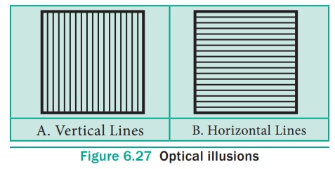
Creating Optical Illusions
A change in appearance of an area by means of proportion might
involve the lengthening or broadening effects of vertical and horizontal lines.
Lines running in a vertical direction tend to slenderize and make an object
appear taller, whereas lines running in a horizontal direction would make an
object appear shorter and broader. (Figure 6.27)
Scale
The third aspect of proportions is called scale. It is the
capacity to select designs and arrange them so that they look well together.
The design principles of scale is related to proportion. Both proportion and
scale deal with the relative’s sizes of things. Proportion pertains to the
relationship between the parts of a composition and scale refers specially to
the size of something, relative to some known standard or recognized constant.
Scale, in this sense means, that the size of all the elements making up the structure
have a consistent, pleasing relationship to the structure and to each other,
and that the size of the structure is in good proportion to the different
objects combined with it.
A very small object will never look so small as when it is placed
near a very large one. That is because the two sizes are not consistent. In a
consistent scale, it is possible to create illusion that causes astonishment
when the actual sizes of objects are realized.
Proportion in Colour
This principle applies to colour as much as to sizes. Colour
combinations are more beautiful when the amounts are varied, than when they are
equal. Proportion holds good here but if the colours are very different in
their forcefulness, they should be arranged according to the “Law of Areas”, and
the brighter colours used in smaller amounts.
3. Rhythm
Rhythm is a very important art principle. According to Beitler and
Lockhart,’a sense of order, a quality of gracefulness, a feeling of easy
movement’ – all lead to a principle of design; which is called as “rhythm”.
Rhythm is related movement or the sense of leading the eye from
one part of a design to another in an easy, flowing manner. Rhythm is organized
movement in continuity. It occurs in regular, repeated movement and also in
variable transitional movement.
Rhythm may be defined as a form of movement. But not all movement
in design is rhythmic. Rhythm means an easy, connected path, along which the
eye may travel in any arrangement of lines, forms or colours. Rhythmic
movements can be achieved through repetition of shapes, progression of sizes,
continuous line movement, radiation and gradation
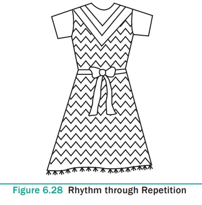
3a. Rhythm through Repetition
A feeling of rhythm may be expressed by repetition of lines,
colours and shapes. When a shape is regularly repeated at proper intervals, a
movement is created which carries the eye from one unit to the next in such a
way that one is not conscious of separate units, but of a rhythmic advancement
making it easy for the eye to pass along the entire length of the space. While
doing so one must also keep in mind the principles of proportion that deal with
the same spacing between each, would give us an example of repetition so to
avoid monotony in spacing, good proportion is a necessary accompaniment.
Stitching rows of braids, or pleats or tucks on a dress, placing groups of
buttons, repeating dots, circles, squares or any shape of spot in embroidery
brings a nice rhythm in a garment (Figure 6.28).
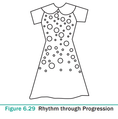
3b. Rhythm through Progression of Sizes and Gradation
Rhythm is brought through a progression of sizes. A regular
progression of sizes may be satisfying enough for scallops on lace and
embroidery; one enjoys a more varied, progression when large objects are
involved. Progressing sizes create a rapid movement of the eye, and they are
often badly used. A gradual change in the length or thickness of lines may give
variety says Beitler. Change in amounts overlapped in a composition, change in
texture from smooth to rough, shiny to dull etc. (Figure 6.29).
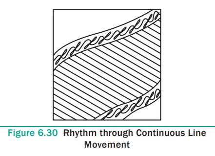
3c. Rhythm through Continuous Line Movement
This enlargement of the spiral of a spell brings out the beauty in
the sequence of its line movement and in the rhythmical gradations of its
spaces. In some designs it is not evident that any element is repeated or that
there is a progressive change from one part of the design to another and yet we
have a sense of easy movement throughout the design. The related movement may
be literally having breaks in the line but spaces that are small enough so the
eye still moves over to the next section of the line in the rhythmical manner.
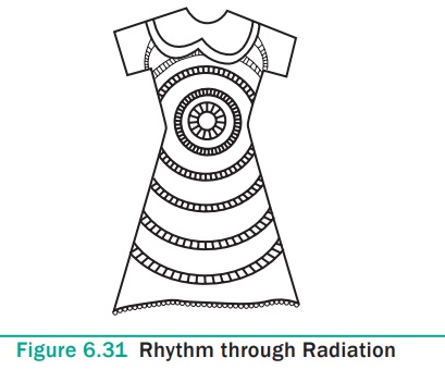
3d. Rhythmthrough Radiation
Radiation is a method of obtaining organized movement. It is a
type of movement that grows out of a central point or axis. Radiation means
lines or parts of a design growing out of or an extending from a line or a
point. The designs should be kept or arranged in such a way that the eye
travels from one corner to the other corner of that particular area of a dress
easily or rhythmically. Restful effect can be gained through proper placing of
all these decorative things. Rhythm plays an important role in window display,
and advertising too. (Figure 6.31).
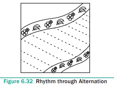
3e. Rhythm through Alternation
Rhythm is brought through alternation of shape, line, form or
texture. The eye is taken in a direction through alternation of the motifs in a
design. (Figure 6.32).
3f. Rhythm in colour
In colour, rhythm and balance through crossing or repetition
implies an arrangement of colours along which the eye can move easily from one
colour to another. Rhythmic colour results for the use of gradations in hue,
value or intensity. Gradation is a sequence in which the contrasting extremes
are bridged by a series of similar or harmonious steps. Gradation therefore, is
a particular combination of contrast and harmony. Gradation is clearly
illustrated by the value scale; in which black and white, the contrasting
extremes, are connected by a continuous sequence in which the adjoining grays
are similar or harmonious. The word ‘scale’ derives from the Latin word
‘Scala’ which means steps, stairs or a ladder. Gradation of hue, value and
chroma that progresses from the pale, warm-green horizon haze to the dark, cold
blue.
4. Emphasis
The dictionary meaning of the word “Emphasis” is to stress, to
give importance or significance. Emphasis is the art principle by which the eye
is carried first to the most important thing in any arrangement and from that
point to every other detail in order of its importance. While doing emphasis in
a dress one should understand the following aspects.
·
What to emphasize?
·
How to emphasize?
·
How much to emphasize?
·
Where to place emphasize?
4a. What to emphasize?
We need to be aware of the many possibilities of what to emphasize.
Backgrounds should be less conspicuous than the objects to be seen against
them.
4b. How to emphasize?
On deciding what to emphasize the next step is how to give
emphasis to that particular portion in a garment. How it should be done? How to
place an emphasis? There are several ways by which one may create emphasis by
grouping or placing of objects, using contrast colour, using decoration, having
sufficient plain background space around objects and by using unusual lines,
shapes or sizes.
Grouping or placing of objects
Grouping or placing of objects can be achieved by grouping objects
which are similar in usage, materials, idea, size, etc. while arranging a
particular area. In a garment, grouping may be done for decoration at one
particular area. For example in a single piece garment, a bow and decoration
using beads may be done.
Emphasis through contrast of colour
An eye is quickly attracted by strong contrasts of light and dark
or by contrasting colour. A striking contrast of light and dark are to be used
in any decorative scheme of a considerable size. This application on garment
emphasizes and makes the garment more attractive.
Emphasis through the use of decoration
Structural as well as decorative design should be so beautiful
that it will enhance the beauty. A surface pattern that is good for a
background has two main characteristics, first the design covers the surface
rather closely, and second there is very little contrast between the lights and
the dark. The garment may be decorated with embroidery, sequins, beads or lace.
By unusual lines, shapes or sizes
Emphasis can be gained by means of contrasts or unusual lines and
colours. In garment designing and decoration, while making use of different
lines like straight or curve, unusual lines are used to create emphasis. This
is brought through princess lines, yoke designs etc.
4c. How much to Emphasize?
Emphasis may be regarded as a graded scale, and the greatest
amount of force that can be used with good taste for each of these types will
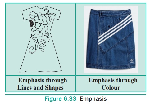
come at a different point on these imaginary scales. Levels of emphasis may be
Emphatic, Dominance, Sub dominance and Subordinate The emphasis on garment
should be made in such a way that it doesn’t dominate too much. It should
emphasize the whole garment but should not spoil the effects through its
domination. (Figure 6.33).
4d. Where to emphasis?
Emphasis should be done at the reqiured points in the garment.
Example: Waist line, sleeve edge etc.
4e. Emphasis in Colour
It can be achieved by contrast of hue, light and dark and
brightness, the effect of every other colour used. In the arrangement, the
emphasizing colour should be subordinated to the main colour to prevent
confusion.
5. Balance
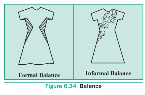
Balance in design is so natural that one is not even aware of it
when it is present, but when it is violated there is a sense of discomfort or
annoyance. (Figure 6.34).
5a. Formal balance
If objects are alike or are equally forceful in appearance they
will attract the same amount of attention, therefore should be equidistant from
the centre.
5b. Informal balance
If, however, objects do not attract the same amount of attention,
they must be placed at different distances from the centre. This second type of
balance is called informal, or occult, or asymmetric balance. Informal balance
is more subtle than formal balance and affords greater opportunity for variety
in arrangements. Its success depends upon training the eye to recognize a
restful composition.
Whether one uses formal or informal balance depends largely upon
the following conditions.
·
The spirit of the age in which one lives
·
The use to which the garment is to be put
·
The type of people for whom the dress is planned
·
One’s own personality
Balance in Colour
Balance or the feeling of rest underlines the well known “Law of
Areas”. The law of areas is also known as “The law of backgrounds”. This law
states large areas of colour should be quite in effect, while small amounts may
show strong contrast; the larger the areas quieter the colour and smaller the
area the more striking the contrasts may become. This contrast may be done due
to a decided difference in hue, in value or in intensity.
A small quantity of light value will balance a large amount of a
dark value or small amounts of dark can balance large areas of light.
The hues which are directly opposite to each other in the chart form a natural balance because they complement each other in the eye. Balance of colours can also be achieved by selecting the varied amounts of bright and dull colours and by arrangement of these colours. By repeating some of the colours, colours or values can be balanced, in various parts of an arrangement this is also called a ‘crossing’ which has tendency to give a feeling of rest.
Related Topics