Textiles and Dress Designing - Form | 12th Textiles and Dress Designing : Chapter 6 : Designing of Clothing
Chapter: 12th Textiles and Dress Designing : Chapter 6 : Designing of Clothing
Form
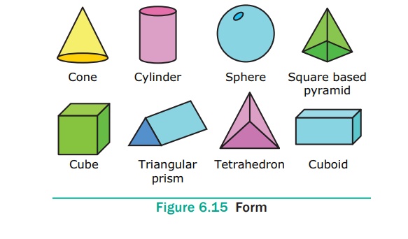
Form
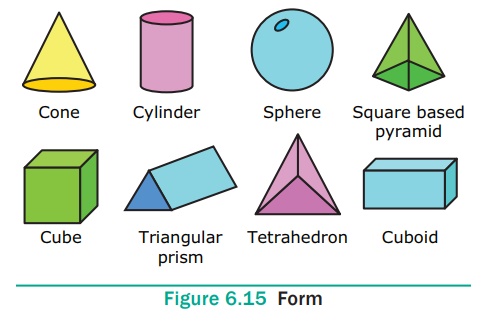
Form is three dimensional. Examples are sphere, cube, cone etc.
(Figure 6.15).
1. Colour
Colour is produced when light strikes on an object and reflects
back in your eyes. It stirs enthusiasm. There are three properties of colour.
They are:
1. Hue
Hue is the name of a colour. Examples – red, yellow and blue. The
warm hues are known as advancing colours as they create illusion of moving
forward. These also emphasize the body size contours. There are many theories,
to explain the role of colours. Some of the common colour theories were devised
by Munsell, Ostwal, Rood and Prang. The widely used theories are Munsell colour
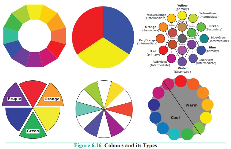
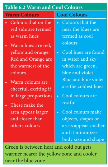
systems and the Prang colour systems. Hue may be warm or cool. (Figure 6.16 and
Table 6.2).
Prang Colour System
This was developed by David Breweser based on three primary
colours.
a) Primary Colours
The colours such as red (R) yellow (Y) and blue (B) are the
fundamental colours as they cannot be obtained by mixing any other colours. All
other colours are obtained by mixing these three colours.
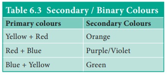
b) Secondary / Binary Colours
When two primary colours are mixed in equal amounts a different
hue is obtained. This new hue is called binary/secondary colour. They are
purple (P) (R+B), Green (G) (Y+B) and Orange (O) (R+Y) (Table 6.3).
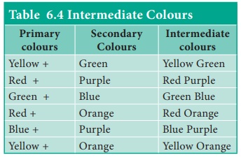
c. Intermediate Colours
It is made by mixing a primary with its adjoining secondary
colour. These are called standard colours (Table 6.4).
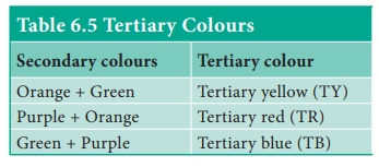
d. Tertiary Colours
It is a combination of two binary colours. The resulting colour in
a tertiary colour. (Table 6.5)
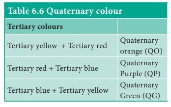
e. Quaternary Colour
It is obtained by mixing two tertiary colours. (Table 6.6)
2. Value
It gives the lightness or darkness of a colour. To change the
value of colour, white or black must be added. The value of any colour
gradually changes with the highest at the top and darkest at the bottom.
Tints and Shades
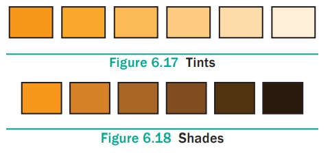
A value that is lighter than the normal colour is called a tint
and the one that is darker than the normal in called a shade.
Values are changed by adding white or water to lighten them and by
adding more pigment or black to darken them. (Figures 6.17 and 6.18)
Intensity or Chroma
It shows purity and strength of colour. The brightness or dullness
of a colour denotes the strength and weakness of a colour. Example –
bright red or dull red.
Intensity or chroma describe the degree of saturation of a colour,
chroma and intensity are interchangeable. High chroma are pure, strong,
brilliant saturated colours while low chroma colours are muted, weak grayed and
dull. Bright, strong, high– chroma colours are conspicuous and make the body of
the wearer appear larger. (Figure 6.19)

2. Texture
It is tactile which refers to the surface quality and is assessed
through feel of a fabric. The fabric is said to be smooth, rough, soft or hard
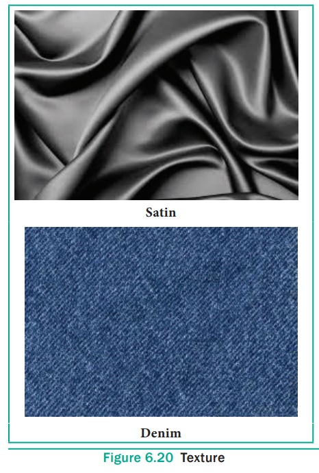
to touch. Visual texture is the illusion of 3 dimension surface. Imagine
running hand on denim or satin fabric. The denim fabric gives a rough texture
where as a satin gives a soft and smooth texture. The rough texture absorbs
more light and smooth surface reflects light. (Figure 6.20)
Related Topics
