Thematic Map - Choropleth Method | 12th Geography : Chapter 11 : Thematic Mapping
Chapter: 12th Geography : Chapter 11 : Thematic Mapping
Choropleth Method
Choropleth Method
The choropleth map uses shades or tints
to show intensity or distribution of a particular element. It takes into account
administrative units which form the basis of spatial distribution of data. That
is why shading conforms to administrative units. The density patterns are highlighted
by light shading (low density) and dark shading (high density).
Uses of choropleth map
Choropleth maps are drawn to represent
densities per unit area within political divisions. Thus, these maps show population
per square kilometre or yield per hectare.
The choropleth maps are also drawn to
depict the data characteristics as they are related to the administrative units.
These maps are used to represent the density of population, literacy, growth rates,
sex ratio, etc.
These maps also show percentages, for
example, percentage of area under wheat cultivation to the total cropped area.
How to interpret a choropleth
1. Identify the geographic feature or
phenomena being mapped.
2. Verify the value of each shade used
on the map. This can be done by reading the map’s legend.
3. Identify the scale of the administrative
regions shown on the map.
4. Using the key as a guide, identify
the areas of the map that share the same colour shading and the same quantity volume
of the feature being mapped.
5. Describe the density or concentration
of the feature within and between different areas of the map.
Requirement for drawing Choropleth Map
a. A map of the area depicting different
administrative units.
b. Appropriate statistical data according
to administrative units.
Steps to be followed
a. Arrange the data in ascending or descending
order.
b. Group the data into 5 categories to
represent very high, high, medium, low and very low concentrations.
c. The interval between the categories
may be identified on the following formulae i.e., Range/5 (Range = maximum value
– minimum value).
d. Patterns, shades or colour to be used
to depict the chosen categories should be marked in an increasing or decreasing
order.
Example
Construct a Choropleth
map to represent the literacy rates in Tamil Nadu as given in Table 11.2.
Table 11.2 Original Data
Literacy rate of Tamilnadu – 2011
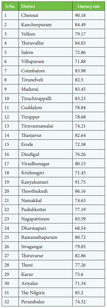
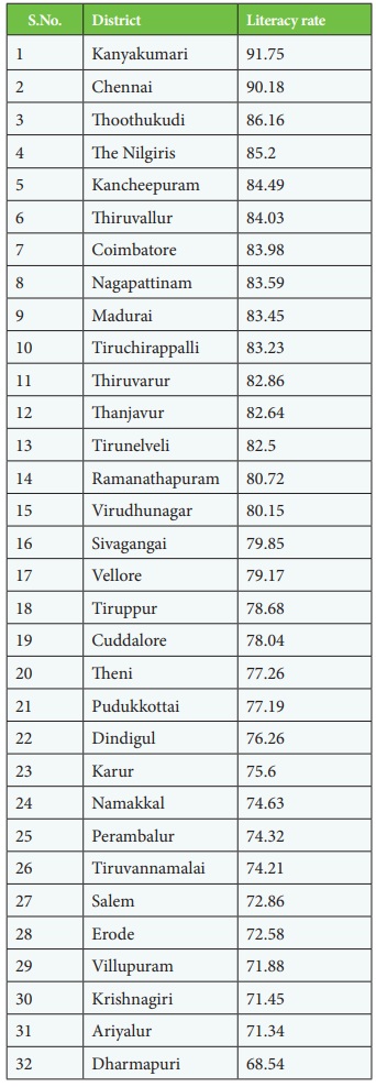
Table 11.3
Table arranged in descending order
Construction
a. Arrange the data in descending order
as shown above.
b. Identify the range within the data.
In the present case, the districts with record of the highest and lowest literacy
rates are Kanyakumari (91.75%) and Dharmapuri (68.54%) respectively. Hence, the
range would be 91.75 – 68.54 =23.21.
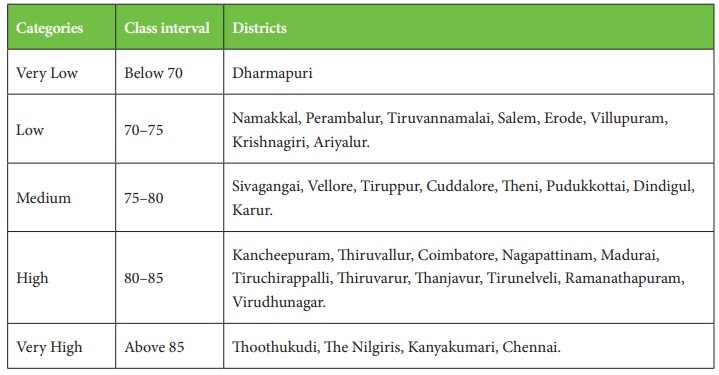
c. Divide the range in to 5 to get categories
from very low to very high.
d. Determine the number of the categories along with the range of each category.
We will finally get following categories
e. Assign
shades/pattern to each category ranging from lower to higher values.
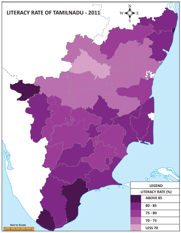
f. Prepare the map as shown in Figure.
Related Topics