Chapter: Information Architecture on the World Wide Web : Conceptual Design
Architectural Page Mockups
Architectural Page Mockups
Information architecture blueprints are most
useful for presenting a bird's-eye view of the web site. However, they do not
work well for helping people to envision the contents of any particular page.
They are also not straightforward enough for most graphic designers to work
from. In fact, no single format does a perfect job of conveying all aspects of
an information architecture to all audiences. Because information architectures
are multi-dimensional, it's important to show them in multiple ways.
For these reasons, architectural page mockups
are useful tools during conceptual design for complementing the blueprint view
of the site. Mockups are quick and dirty textual documents that show the
content and links of major pages on the web site. They enable you to clearly
(yet inexpensively) communicate the implications of the architecture at the
page level. They are also extremely useful when used in conjunction with
scenarios. They help people to see the site in action before any code is
written. Finally, they can be employed in some basic usability tests to see if
users actually follow the scenarios as you expect. Keep in mind that you only
need to mockup major pages of the web site. These mockups and the designs that derive
from them can serve as templates for the design of subsidiary pages.
Figure 8.4. In this architectural mockup of a combination
search/browse page, we show an area for entering queries and an area for
browsing. We typically use a word processor like Microsoft Word to create these
mockups quickly. However, you can also create quick and dirty HTML mockups, and
even work quite interactively with the graphic designer.
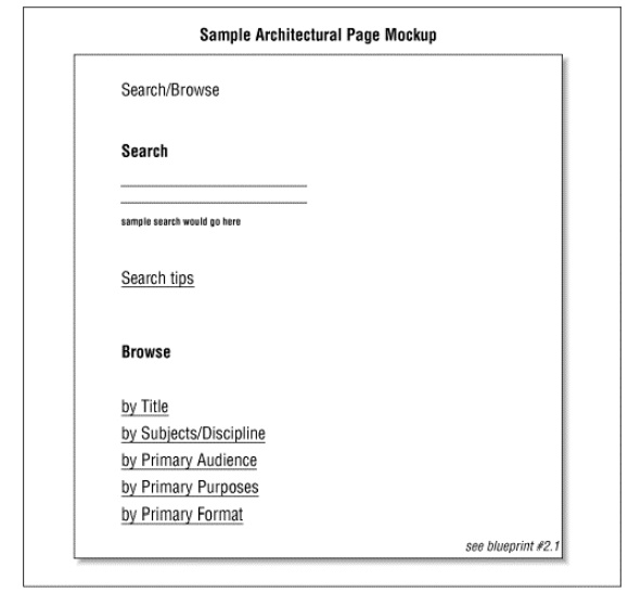
In the example in Figure
8.4, you see that mockups are easier to read than blueprints. By
integrating aspects of the organization, labeling, and navigation systems into
one view, they will help your colleagues to understand the architecture. In
laying out the content on a page mockup, you should try to show the logical
visual grouping of content items. In this example, the search interface and the
browsing options are two separate content groups. You can also indicate
prominence in these mockups. Placing a content group at the top of the page or
using a larger font size indicate the relative importance of that content.
While the graphic designer will make the final and more detailed layout
decisions, you can make a good start with these mockups.
Related Topics