Solved Example Problems | Statistics - Types of Graphs | 11th Statistics : Chapter 4 : Diagrammatic and Graphical Representation of Data
Chapter: 11th Statistics : Chapter 4 : Diagrammatic and Graphical Representation of Data
Types of Graphs
Types of
Graphs
Graphical representation can be advantageous to bring out the
statistical nature of the frequency distribution of quantitative variable,
which may be discrete or continuous.
The most commonly used graphs are
1.
Histogram
2.
Frequency Polygon
3.
Frequency Curve
4.
Cumulative Frequency Curves (Ogives)
1. Histogram
A histogram is an attached bar chart or graph displaying the distribution of a frequency distribution in visual form. Take classes along the X-axis and the frequencies along the Y-axis. Corresponding to each class interval, a vertical bar is drawn whose height is proportional to the class frequency.
Limitations:
We cannot construct a histogram for distribution with open-ended
classes. The histogram is also quite misleading, if the distribution has
unequal intervals.
Example 4.9
Draw the histogram for the 50 students in a class whose heights
(in cms) are given below.
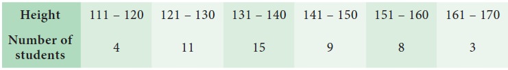
Find the range, whose height of students are maximum.
Solution:
Since we are displaying the distribution of Height and Number of students in visual form, the histogram is drawn.
Step 1 : Heights are marked along the X-axis and labeled as “Height(in cms)”.
Step 2 : Number of students are marked along the Y-axis and labeled as “No. of students”.
Step 3 : Corresponding to each Heights, a vertical attached bar is drawn whose height is proportional to the number of students.
The Histogram is presented in Fig 4.7.
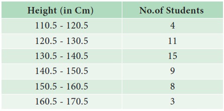
For drawing a histogram, the frequency distribution should be
continuous. If it is not continuous, then make it continuous as follows.
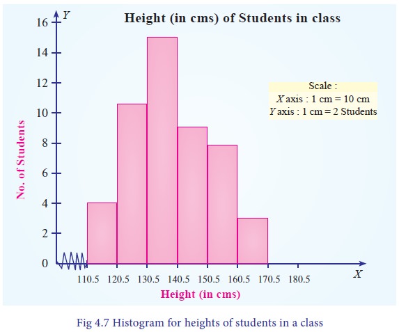
The tallest bar shows that maximum number of students height are
in the range 130.5 to 140.5 cm
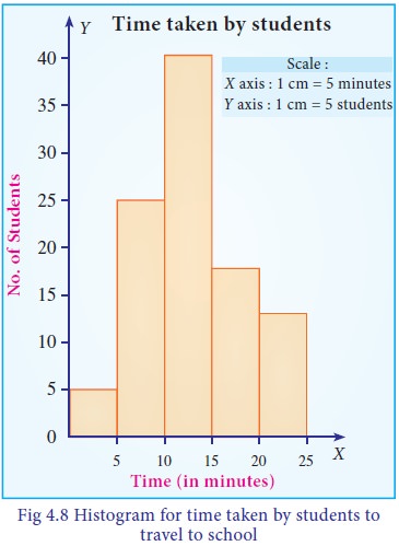
Example 4.10
The following table shows the time taken (in minutes) by 100
students to travel to school on a particular day
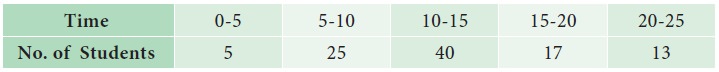
Draw the histogram. Also find:
i. The number of students who travel to school within 15
minutes.
ii. Number of students whose travelling time is more than 20
minutes.
Solution:
Since we are displaying the distribution of time taken (in
minutes) by 100 students to travel to school on a particular day in visual
form, the histogram is drawn.
Step 1 : Time taken are marked along the X-axis and labeled as “Time (in minutes)”.
Step 2 : Number of students are marked along the Y-axis and labeled as “No. of students”.
Step 3 : Corresponding to each time taken, a vertical attached bar is drawn whose height is proportional to the number of students.
The Histogram is presented in Fig 4.8.
i. 5+25+40=70 students travel to school within 15 minutes
ii. 13 students travelling time is more than 20 minutes
Example 4.11
Draw a histogram for the following 100 persons whose daily wages
(in `) are given below.
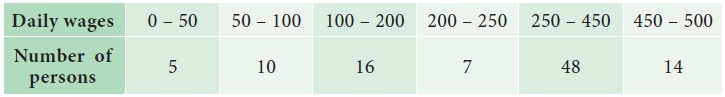
Also find:
i. Number of persons who gets daily wages less than or equal to ` 200?
ii. Number of persons whose daily wages are more than ` 250?
Solution:
Since we are displaying the distribution of 100 persons whose daily wages in rupees in visual form, the histogram is drawn.
Step 1 : Daily
wages are marked along the X-axis and
labeled as “Daily Wages (in `)”.
Step 2 : Number of Persons are marked along the Y-axis and labeled as “No. of Persons”.
Step 3 : Corresponding to each daily wages, a vertical attached bar is drawn whose height is proportional to the number of persons.
The Histogram is presented in Fig 4.9.
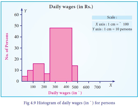
i. 5+10+16=31 persons get daily wages less than or equal to ` 200.
ii. 48+14=62 persons get more than Rs 250.
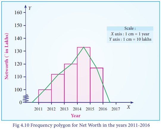
2. Frequency Polygon
Frequency polygon is drawn after drawing histogram for a given frequency distribution. The area covered under the polygon is equal to the area of the histogram. Vertices of the polygon represent the class frequencies. Frequency polygon helps to determine the classes with higher frequencies. It displays the tendency of the data. The following procedure can be followed to draw frequency polygon:
i. Mark the midpoints at the top of each vertical bar in the histogram representing the classes.
ii. Connect the midpoints by line segments.
Example 4.12
A firm reported that its Net Worth in the years 2011-2016 are as
follows:
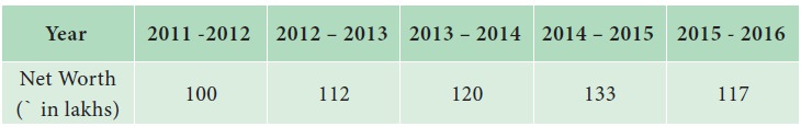
Draw the frequency polygon for the above data
Solution:
Since we are displaying the distribution of Net worth in the years 2011-2016, the Frequency polygon is drawn to determine the classes with higher frequencies. It displays the tendency of the data.
The following procedure can be followed to draw frequency polygon:
Step 1 : Year are marked along the X-axis and labeled as ‘Year’.
Step 2 : Net worth are marked along the Y-axis and labeled as ‘Net Worth (in lakhs of `)’.
Step 3 : Mark the midpoints at the top of each vertical bar in the histogram representing the year.
Step 4 : Connect the midpoints by line segments.
The Frequency polygon is presented in Fig 4.10.
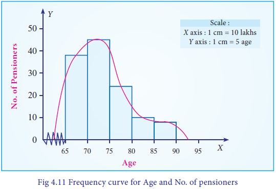
3. Frequency Curve
Frequency curve is a smooth and free-hand curve drawn to
represent a frequency distribution. Frequency curve is drawn by smoothing the
vertices of the frequency polygon. Frequency curve provides better
understanding about the properties of the data than frequency polygon and
histogram.
Example 4.13
The ages of group of pensioners are given in the table below.
Draw the Frequency curve to the following data.
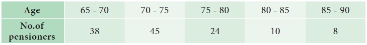
Solution:
Since we are displaying the distribution of Age and Number of Pensioners, the Frequency curve is drawn, to provide better understanding about the age and number of pensioners than frequency polygon.
The following procedure can be followed to draw frequency curve:
Step 1 : Age are marked along the X-axis and labeled as ‘Age’.
Step 2 : Number of pensioners are marked along the Y-axis and labeled as ‘No. of Pensioners’.
Step3 : Mark the midpoints at the top of each vertical bar in the histogram representing the age.
Step 4 : Connect the midpoints by line segments by smoothing the vertices of the frequency polygon
The Frequency curve is presented in Fig 4.11.
4. Cumulative frequency curve ( Ogive )
Cumulative frequency curve (Ogive) is drawn to represent the cumulative frequency distribution. There are two types of Ogives such as ‘less thanOgive curve’ and ‘more thanOgive curve’. To draw these curves, we have to calculate the ‘less than’ cumulative frequencies and ‘more than’ cumulative frequencies. The following procedure can be followed to draw the ogive curves:
Less than Ogive: Less than cumulative frequency of each class is marked against the corresponding upper limit of the respective class. All the points are joined by a free-hand curve to draw the less than ogive curve.
More than Ogive: More than cumulative frequency of each class is marked against the corresponding lower limit of the respective class. All the points are joined by a free-hand curve to draw the more than ogive curve.
Both the curves can be drawn separately or in the same graph. If both the curves are drawn in the same graph, then the value of abscissa (x-coordinate) in the point of intersection is the median.
If the curves are drawn separately, median can be calculated as
follows:
Draw a line perpendicular to Y-axis at y=N/2. Let it meet the
Ogive at C. Then, draw a perpendicular line to X-axis from the point C. Let it
meet the X-axis at M. The abscissa of M is the median of the data.
Example 4.14
Draw the less than Ogive curve for the following data:
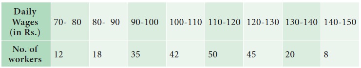
Also, find
i. The Median
ii. The number of workers whose daily wages are less than ` 125.
Solution:
Since we are displaying the distribution of Daily Wages and No.
of workers, the Ogive curve is drawn, to provide better understanding about the
wages and No. of workers.
The following procedure can be followed to draw Less than Ogive curve:
Step 1 : Daily wages are marked along the X-axis and labeled as “Wages(in `)”.
Step 2 : No. of Workers are marked along the Y-axis and labeled as “No. of workers”.
Step 3 : Find the less than cumulative frequency, by taking the upper class-limit of daily wages. The cumulative frequency corresponding to any upper class-limit of daily wages is the sum of all the frequencies less than the limit of daily wages.
Step 4 : The less than cumulative frequency of Number of workers are plotted as points against the daily wages (upper-limit). These points are joined to form less than ogive curve.
The Less than Ogive curve is presented in Fig 4.12.
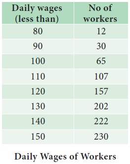
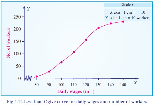
i. Median = ` 120
ii. 183 workers get daily wages less than ` 125
Example 4.15
The following table shows the marks obtained by 120 students of
class IX in a cycle test-I . Draw the more than Ogive curve for the following
data :
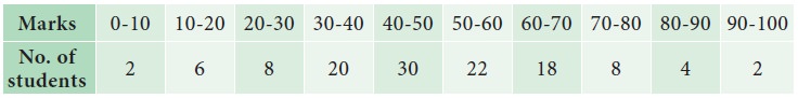
Also, find
i. The Median
ii. The Number of students who get more than 75 marks.
Solution:
Since we are displaying the distribution marks and No. of students, the more than Ogive curve is drawn, to provide better understanding about the marks of the students and No. of students.
The following procedure can be followed to draw More than Ogive curve:
Step 1 : Marks of the students are marked along the X-axis and labeled as ‘Marks’.
Step 2 : No. of students are marked along the Y-axis and labeled as ‘No. of students’.
Step 3 : Find the more than cumulative frequency, by taking the lower class-limit of marks. The cumulative frequency corresponding to any lower class-limit of marks is the sum of all the frequencies above the limit of marks.
Step 4 : The more than cumulative frequency of number of students are plotted as points against the marks (lower-limit). These points are joined to form more than ogive curve.
The More than Ogive curve is presented in Fig 4.13.
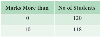
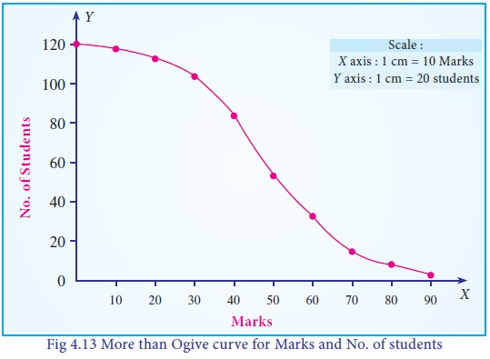
i. Median =42 students
ii. 7 students get more than 75 marks.
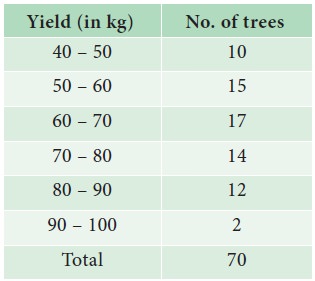
Example 4.16
The yield of mangoes were recorded (in kg)are given below:
Graphically,
i. find the number of trees which yield mangoes of less than 55
kg.
ii. find the number of trees from which mangoes of more than 75
kg.
iii. find the median.
Draw the Less than and More than Ogive curves. Also, find the
median using the Ogive curves
Solution:
Since we are displaying the distribution of Yield and No. of trees, the Ogive curve is drawn, to provide better understanding about the Yield and No. of trees
The following procedure can be followed to draw Ogive curve:
Step 1 : Yield of mangoes are marked along the X-axis and labeled as ‘Yield (in Kg.)’.
Step 2 : No. of trees are marked along the Y-axis and labeled as ‘No. of trees’.
Step 3 : Find the less than cumulative frequency, by taking the upper class-limit of Yield of mangoes. The cumulative frequency corresponding to any upper class-limit of Mangoes is the sum of all the frequencies less than the limit of mangoes.
Step 4 : Find the more than cumulative frequency, by taking the lower class-limit of Yield of mangoes. The cumulative frequency corresponding to any lower class-limit of Mangoes is the sum of all the frequencies above the limit of mangoes.
Step 5 : The less than cumulative frequency of Number of trees are plotted as points against the yield of mangoes (upper-limit). These points are joined to form less than ogive curve.
Step 6 : The
more than cumulative frequency of Number of trees are plotted as points against
the yield of mangoes (lower-limit). These points are joined to form more than O
give curve.
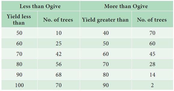
The Ogive curve is presented in Fig 4.14.
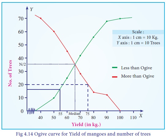
i. 16 trees yield less than 55 kg
ii. 20 trees yield more than 75 kg
iii. Median =66 kg
Related Topics