Statistics - Types of Diagrams | 11th Statistics : Chapter 4 : Diagrammatic and Graphical Representation of Data
Chapter: 11th Statistics : Chapter 4 : Diagrammatic and Graphical Representation of Data
Types of Diagrams
Types of
Diagrams
In
practice, varieties of diagrams are used to present the data. They are
explained below.
Simple Bar Diagram
Simple
bar diagram can be drawn either on horizontal or vertical base. But, bars on
vertical base are more common. Bars are erected along the axis with uniform
width and space between the bars must be equal. While constructing a simple bar
diagram, the scale is determined as proportional to the highest value of the variable.
The bars can be coloured to make the diagram attractive. This diagram is mostly
drawn for categorical variable. It is more useful to present the data related
to the fields of Business and Economics.
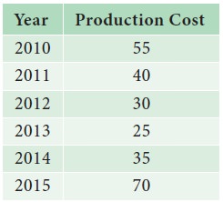
Example 4.1
The
production cost of the company in lakhs of rupees is given below.
i.
Construct a simple bar diagram.
ii.
Find in which year the production cost of the company is (a) maximum (b) minimum (c) less than 40 lakhs.
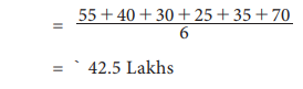
iii.
What is the average production cost of the company?
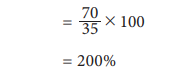
iv.
What is the percentage increase from 2014 to 2015?
Solution:
(i)
We represent the above data by simple bar diagram in the following manner:
Step-1: Years are marked along the X-axis and labelled as ‘Year’.
Step-2: Values of Production Cost are marked along the Y-axis and
labelled as ‘Production Cost (in lakhs of `).
Step-3: Vertical rectangular bars are erected on the years marked
and whose height is proportional to the magnitude of the respective production
cost.
Step-4: Vertical bars are filled with the same colours.
The
simple bar diagram is presented in Fig.4.1.
(ii)
(a) The maximum production cost of the company was in the year 2015.
(b)
The minimum production cost of the company was in the year 2013.
(c)
The production cost of the company during the period 2012- 2014 is less than 40
lakhs.
iii.
Average production Cost of the company
iv.
Percentage increase in the production cost of the company is
Pareto Diagram:
Vilfredo Pareto
(1848-1923), born in
Paris in an Italian
aristocratic family, studied
Engineering and Mathematics at
the University of Turin. During his studies at the University of Lousane in
Switzerland, Pareto derived a complicated mathematical formula to prove the distribution
of income and wealth in society is not random. Approximately 80% of total
wealth in a society lies with only 20% of the families. The famous law about
the ‘Vital few and trivial many’ is widely known as ‘Pareto Principle’ in
Economics.
Pareto
diagram is similar to simple bar diagram. But, in Pareto diagram, the bars are
arranged in the descending order of the heights of the bars. In addition, there
will be a line representing the cumulative frequencies (in %) of the different
categories of the variable. The line is more useful to find the vital
categories among trivial categories.
Example 4.2
Administration
of a school wished to initiate suitable preventive measures against breakage of
equipment in its Chemistry laboratory. Information collected about breakage of
equipment occurred during the year 2017 in the laboratory are given below:
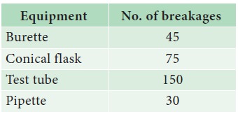
Draw Pareto Diagram for the above data. Which equipment requires
more attention in order to reduce breakages?
Solution:
Since we have to find the vital few among the several, we draw
Pareto diagram.
Step 1 : Arrange
the equipment according to the descending order of the number of breakages.
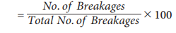
Step 2 : Find
the percentage of breakages for each equipment using the formula No. of Breakages
Step 3 : Calculate
cumulative percentage for each equipment.
Step 4 : Mark
the equipment along the X-axis and the number of breakages along the Y-axis.
Construct an attached simple bar diagram to this data. In an attached simple
bar diagram, the vertical bars are erected adjacently.
Step 5 : Mark
the cumulative no. of breakages for each equipment corresponding to the
mid-point of the respective vertical bar.
Step 6 : Draw a
free hand curve joining those plotted points.
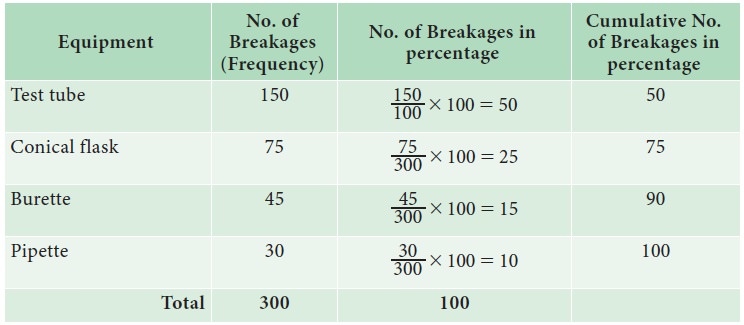
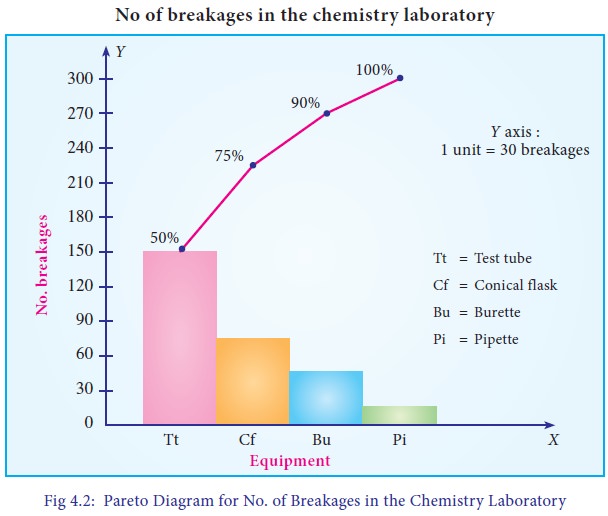
From
Fig 4.2, it can be found that 50% of breakages is due to Test tube, 25% due to
Conical Flask. Therefore, the School Administration has to focus more attention
on reducing the breakages of Test Tubes and Conical Flasks.
Multiple Bar Diagram
Multiple
bar diagram is used for comparing two or more sets of statistical data. Bars
with equal width are placed adjacently for each cluster of values of the
variable. There should be equal space between clusters. In order to distinguish
bars in each cluster, they may be either differently coloured or shaded.
Legends should be provided.
Example 4.3
The
table given below shows the profit obtained before and after tax payment(in
lakhs of rupees) by a business man on selling cars from the year 2014 to 2017.
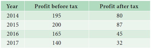
a.
Construct
a multiple bar diagram for the above data.
b.
In
which year, the company earned maximum profit before paying the tax?
c.
In
which year, the company earned minimum profit after paying the tax?
d.
Find
the difference between the average profit earned by the company before paying
the tax and after paying the tax.
Solution:
Since
we are comparing the profit earned before and after paying the tax by the same
Company, the multiple bar diagram is drawn. The diagram is drawn following the
procedure presented below:
Step 1 : Years are marked along the X-axis and labeled as “Year”.
Step 2 : Values of Profit before and after paying the tax are
marked along the Y-axis and labeled as “Profit (in lakhs of `)”.
Step 3 : Vertical rectangular bars are erected on the years marked,
whose heights are proportional to the respective profit. The vertical bars
corresponding to the profit earned before and after paying the tax in each year
are placed adjacently.
Step 4 : The vertical bars drawn corresponding to the profit earned
before paying the tax are filled with one type of colour. The vertical bars
drawn corresponding to the profit earned after paying the tax are filled with
another type of colour. The colouring procedure should be applied to all the
years uniformly.
Step 5 : Legends
are displayed to describe the different colours applied to the bars drawn for
profit earned before and after paying the tax.
The
multiple bar diagram is presented in Fig 4.3.
(i)
The company earned the maximum profit before paying the tax in the year 2015.
(ii)
The company earned the minimum profit after paying the tax in the year 2017.
(iii)
The average profit earned before paying the tax = 700/4 = 175lak
The average profit earned after paying the tax
= 244/4 = 61 lakhs
Hence,
difference between the average profit earned by the company before paying the
tax and after paying the tax is = 175 – 61 = ` 114 lakhs.
Component Bar Diagram(Sub-divided Bar Diagram)
A
component bar diagram is used for comparing two or more sets of statistical
data, as like multiple bar diagram. But, unlike multiple bar diagram, the bars
are stacked in component bar diagrams. In the construction of sub-divided bar
diagram, bars are drawn with equal width such that the heights of the bars are
proportional to the magnitude of the total frequency. The bars are positioned
with equal space. Each bar is sub-divided into various parts in proportion to
the values of the components. The subdivisions are distinguished by different
colours or shades. If the number of clusters and the categories in the clusters
are large, the multiple bar diagram is not attractive due to more number of
bars. In such situation, component bar diagram is preferred.
Example 4.4
Total
expenditure incurred on various heads of two schools in an year are given
below. Draw a suitable bar diagram.
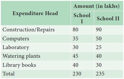
Which
school had spent more amount for
(a)
construction/repairs
(b) Watering plants?
Solution :
Since
we are comparing the amount spent by two schools in a year towards various
expenditures with respect to their total expenditures, a component bar diagram
is drawn.
Step 1 : Schools are marked along the X-axis and labeled as
“School”.
Step 2 : Expenditure Head are marked along the Y-axis and labeled
as “Expenditure (` in lakhs)”.
Step 3 : Vertical rectangular bars are erected for each school,
whose heights are proportional to their respective total expenditure.
Step 4 : Each vertical bar is split into components in the order of
the list of expenditure heads. Area of each rectangular box is proportional to
the frequency of the respective expenditure head/component. Rectangular boxes
for each school are coloured with different colours. Same colours are applied
to the similar expenditure heads for each school.
Step 5 : Legends are displayed to describe the colours applied to
the rectangular boxes drawn for various expenditure heads.
The
component bar diagram is presented in Fig 4.4.
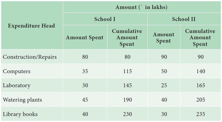
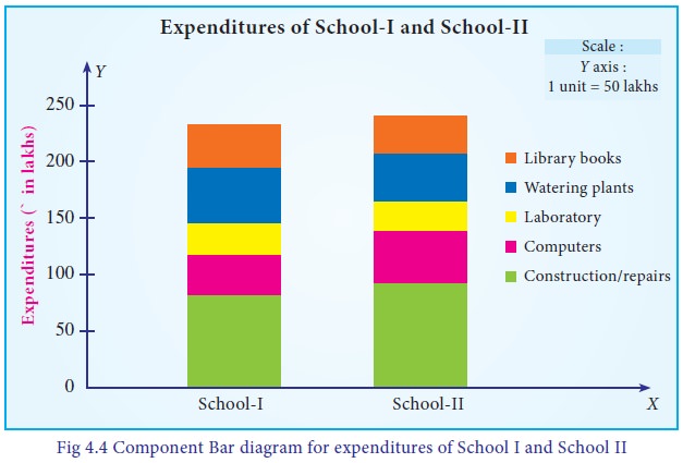
(i)
School- II had spent more amount towards Construction/Repairs.
(ii)
School- I had spent more amount towards Watering plants.
Percentage Bar Diagram
Percentage
bar diagram is another form of component bar diagram. Here, the heights of the
components do not represent the actual values, but percentages. The main
difference between sub-divided bar diagram and percentage bar diagram is that,
in the former, the height of the bars corresponds to the magnitude of the
value. But, in the latter, it corresponds to the percentages. Thus, in the
component bar diagram, heights of the bars are different, whereas in the
percentage bar diagram, heights are equal corresponding to 100%. Hence,
percentage bar diagram will be more appealing than sub-divided bar diagram.
Also, comparison between components is much easier using percentage bar
diagram.
Example 4.5
Draw the percentage sub-divided bar diagram to the data given in Example 4.4. Also find
(i) The percentage of amount spent for computers in School I
(ii)
What are the expenditures in which School II spent more than School I.
Solution:
Since we are comparing the amount spent by two schools in a year towards various expenditures with respect to their total expenditures in percentages, a percentage bar diagram is drawn.
Step 1 : Schools are marked along the X-axis and labeled as “School”.
Step 2 : Amount spent in percentages are marked along the Y-axis and labeled as “Percentage of Expenditure (` in lakhs)”.
Step 3 : Vertical rectangular bars are erected for each school, whose heights are taken to be hundred.
Step 4 : Each vertical bar is split into components in the order of the list of percentage expenditure heads. Area of each rectangular box is proportional to the percentage of frequency of the respective expenditure head/component. Rectangular boxes for each school are coloured with different colours. Same colours are applied to the similar expenditure heads for each school.
Step 5 : Legends are displayed to describe the colours applied to
the rectangular boxes drawn for various expenditure heads.
The percentage bar diagram is presented in Fig 4.5.
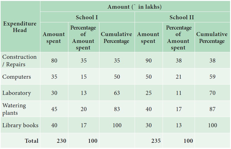
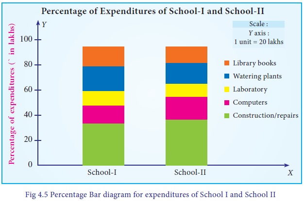
i.
21% of the amount was spent for computers in School I
ii.
38% of expenditure was spent for construction/Repairs by School II than School
I.
Pie Diagram
The
Pie diagram is a circular diagram. As the diagram looks like a pie, it is given
this name. A circle which has 360c is divided into different sectors. Angles of
the sectors, subtending at the center, are proportional to the magnitudes of
the frequency of the components.
Procedure:
The
following procedure can be followed to draw a Pie diagram for a given data:
i.
Calculate
total frequency, say, N.
ii.
Compute
angles for each component using the formula.
iii.
Draw
a circle with radius of sufficient length as a horizontal line.
iv.
Draw
the first sector in the anti-clockwise direction at an angle calculated for the
first component.
v.
Draw
the second sector adjacent to the first sector at an angle corresponding to the
second component.
vi.
This process may be continued for all the components.
vii.
Shade/colour each sector with different shades/colours.
viii.
Write legends to each component.
Example 4.6
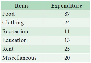
Draw a pie diagram for the following data (in hundreds) of house
hold expenditure of a family.
Also find
i. The central angle of the sector corresponding to the
expenditure incurred on Education
ii. By how much percentage the recreation cost is less than the
Rent.
Solution :
The following procedure is followed to draw a Pie diagram for a
given data:
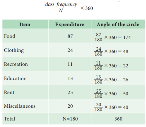
i. Calculate the total expenditure, say, N.
ii. Compute angles for each component food, clothing, recreation, education, rent
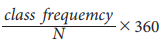
and miscellaneous using the formula class
frequency/N x 360
iii. Draw a circle with radius of sufficient length as a
horizontal line.
iv. Draw the first sector in the anti-clockwise direction at an
angle calculated for the first component food.
v. Draw the second sector adjacent to the first sector at an
angle corresponding to the second component clothing.
vi. This process is continued for all the components namely
recreation, education, rent and miscellaneous.
i.
Shade/colour each sector with different shades/colours.
viii. Write legends to each component.
The pie diagram is presented in Fig 4.6.
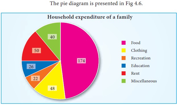
The central angle of the sector corresponding to the expenditure
incurred on Education is 26o
Recreation cost is less than rent by 28o
Pictogram
Pictograms are diagrammatic representation of statistical data
using pictures of resemblance. These are very useful in attracting attention.
They are easily understood. For the purpose of propaganda, the pictorial
presentations of facts are quite popular and they also find places in
exhibitions. They are extensively used by the government organizations as well
as by private institutions. If needed, scales can be fixed.
Despite its visual advantages, pictogram has limited application
due to the usage of pictures resembling the data. It can express an approximate
value than the given actual numerical value.
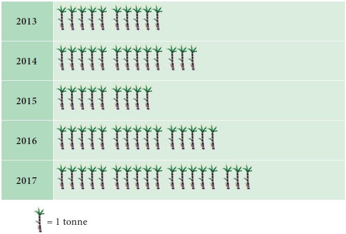
Example 4.7
The following table gives the sugarcane production in tonnes per
acre for various years.
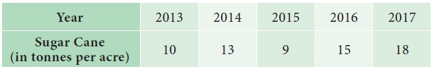
Represent the above data by pictogram.
Solution :
The above data is represented by pictogram in the following
manner:
Example 4.8
The Pictogram given below shows the number of persons who have
traveled by train from Chennai to Rameshwaram on each day of a week
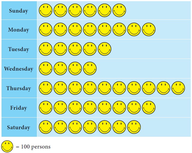
From the Pictogram find:
i. Number of travelers travelled during the week
ii. On which day there was a maximum rush in the train
iii. The difference between the maximum and minimum number of travelers.
Solution :
i. Here total number of ![]() is 48, and each
is 48, and each ![]() represents
100 persons. Hence number of travelers travelled during the week is
48×100=4800.
represents
100 persons. Hence number of travelers travelled during the week is
48×100=4800.
ii. The maximum rush in the train is on Thursday.
iii. Maximum number of persons travelled on Thursday = 10
Hence the number of persons travelled on Thursday is 10×100 =
1000
Minimum number of persons travelled on Wednesday = 4
Hence the number of persons travelled on Wednesday is 4×100=400
Therefore difference between maximum and minimum number of
travelers is 1000-400=600 persons.
Related Topics