Chapter: 11th 12th std standard Indian Economy Economic status Higher secondary school College
Types of Diagrams : 1.Bar chart 2.Pie chart 3.Pictograms or cartograms
Diagrams and Graphs
One of the most attractive ways in which statistical results may be presented is through diagrams and graphs.
Significance of Diagrams and Graphs
Diagrams and graphs are extremely useful because of the following reasons:
They give a bird's eye view of the entire data. Therefore the information presented is easily understood.
They are attractive to the eye
They have a great memorising effect.
They facilitate comparison of data.
Difference between Diagrams and Graphs
Diagrams are prepared in a plain paper whereas graphs should be prepared in graph paper.
A Graph represents mathematical relations between two variables. But diagrams do not represent mathematical relationship. They help for comparisons.
Diagrams are more attractive to the eye. Therefore they are suitable for publicity and propaganda. They are not so useful for research analysis whereas Graphs are very much useful for research analysis.
Types of Diagrams
The followings are the important types of diagrams
Bar diagrams
Pie chart or circular diagram
Pictograms and cartograms
Bar diagrams
Bar diagrams are one-dimensional diagrams where the length is considered and width is not considered. There are different types of bar diagrams.
They are
Simple Bar diagram
Sub-divided bar diagram
Multiple bar diagram
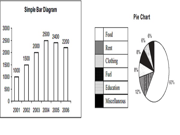
Simple Bar Diagram
A simple bar diagram is used to represent only one variable. For example, the figures of sales, height, weight of students, production and population. In simple bar, the height of the bar represents the magnitude of the variable.
Pie Diagrams
Steps to draw a pie chart
The different components of the variables are converted into percentage form to draw a pie diagram. These percentages are converted into corresponding degrees on the circle.
Draw a circle of appropriate size with a compass. The size of the radius depends upon the available space and other factors of presentation.
Measure the points on the circle representing the size of each sector with the help of protractor.
Arrange the sectors according to the size
Different shades and proper labels must be given to different sectors.
Measures of Central Tendency
One of the important objectives of statistical analysis is to get one single value that describes the characteristics of the entire data. Such a value is called central value or an average.
Thus a central value or an average is a single value that represents a group of values. That single value (the average) explains the characteristics of the entire group. As the average lies in-between the largest and the smallest value of the series, it is called central value.
Characteristics of a good average
It should be rigidly defined so that there is no confusion regarding its meaning.
It should be easy to understand
It should be simple to compute
Its definition must be in the form of a mathematical formula.
It should be based on all the items of a series
It should not be influenced by a single item or a group of items
It should be capable of further algebraic treatment
It should have sampling stability
Simple Arithmetic Mean or Arithmetic Mean
It is the most common type and widely used measure of central tendency. Arithmetic mean of a series is equal to the total value of the various items in a series divided by the number of items. Arithmetic mean is denoted by X (X bar)
Related Topics