Chapter: 12th Geography : Chapter 12 : Representation of Geographical Data
Classification of statistical diagrams
Classification of statistical
diagrams
There are three classes of statistical
diagrams. They are as follows;
1. One-dimensional statistical diagrams
such as line graph, poly graph, bar diagram,
histogram, and star diagram. etc., in these diagrams quantities are represented
by the line, length of bars and length of radiating lines in a star diagram.
2. Two-dimensional statistical diagrams
are also known as area diagram such as squares, rectangles and circles.
Divided squares, divided circles also called as pie diagrams are two dimensional
diagrams.
3.
Three-dimensional statistical diagrams are
also called volume diagram examples cube, block piles and spherical diagrams.
We will discuss the following diagrams alone
a.
Line graphs
b.
Bar diagrams
c.
Pie diagram
a. Line Graph
The line graphs are usually drawn to
represent the time series data related to the temperature, rainfall, population,
birth rates and the death rates.
Uses of line-graphs
Line-graphs are commonly used for representing
* Climatic data pertaining to elements
such as temperature, pressure, humidity, etc.,
* Population data such as growth of population,
birth rate, death rate, etc, and
* Economic data such as crop yield, minerals
extraction, production of industrial goods over a period of time etc.
Simple line graph
A simple line-graph is a line or a curve
drawn by joining together, points plotted with the help of two co-ordinates i.e.
is a vertical axis and horizontal scale. It represents the successive changes in
the value of one variable over a certain period of time.
How to construct a Line Graph
Line graphs are very easy to construct
on graph paper.
1. Draw a horizontal line to represent
x-axis and vertical line to represent y-axis. The point where x-axis and y-axis
intersect at right angles is the starting point. Normally assigned the value zero
(0).
2. Next add label and scale for both
axes.
3. After that, plot your data points.
4. Next draw a line through the plotted
data points.
5. Finally add a title.
Let us see some of the solved examples
given below.
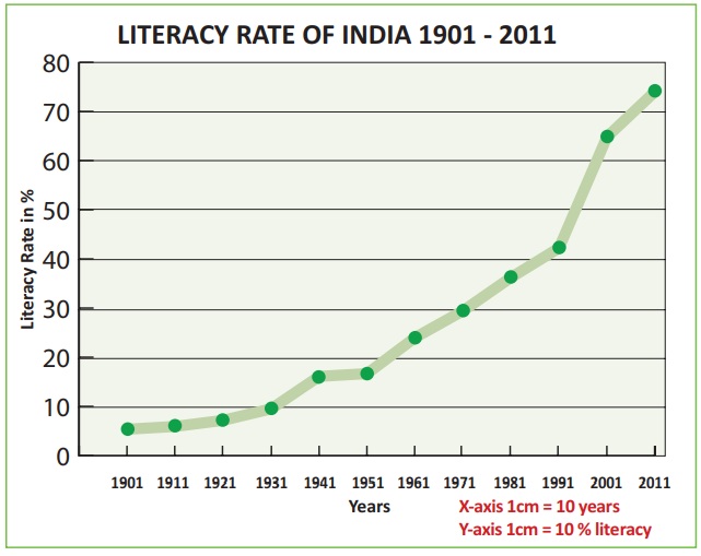
Example
Construct a line graph
to represent the data as given in Table 12.1 Table 12.1: Literacy Rate of India
– 1901 to 2011

Polygraph
Polygraph is a line graph in which two
or more variables are shown by an equal number of lines for an immediate comparison,
such as the growth rate of different crops like rice, wheat pulses or the birth
rates, death rates and life expectancy or sex ratio in different states or countries.
A different line pattern such as straight line (__), broken line (---), dotted line
(…...) or a combination of dotted and broken line (.-.-.-) or line of different
colours may be used to indicate the value of different variables.
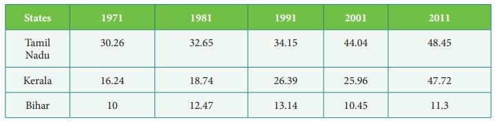
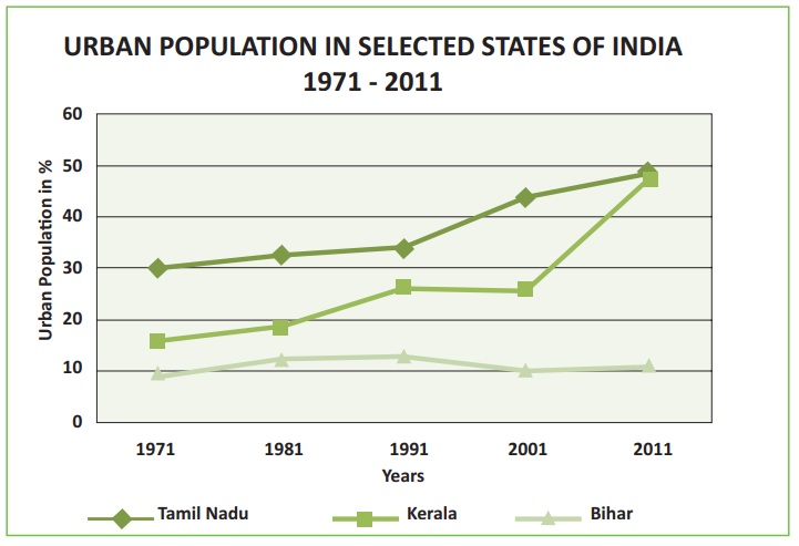
Example
Construct a polygraph to
represent the data as given in Table 12.2.
Table 12.2 Urban Population in percentage of selected states of India
b. Bar Diagram
In Bar diagrams quantities are represented by bars, the length of which are proportional to the quantities, they represent. The diagrams which represent quantities by bars are known as bar diagrams, columnar diagrams or bar-graphs. When compared with other diagrams, the bar diagram gives more accurate idea of the size of the quantities represented by them. They are also drawn on maps for showing regional variations in the distribution of a quantity. The bars are either vertical or horizontal.
* The width
of all the bars or columns should be similar.
* All the
bars should be placed on intervals of equal distance.
* Bars may be shaded with colours or
patterns to make them distinct and attractive.
Kinds of Bar Diagrams
1. Simple bar diagram.
2. Comparative or multiple
bar diagram.
3. Compound or sub-divided
bar diagram.
4. Percentage bar diagram.
We shall discuss Simple Bar Diagram and
Multiple Bar Diagram in this unit.
Simple Bar Diagram
A simple bar diagram consists of a series
of bars each of which shows total value of only one variable. We can represent for
example the total population of different states of a country for a particular year,
the annual production of wheat, rice, cotton for a particular place etc., and monthly
rainfall for 12 months of the year. A simple bar diagram is constructed for an immediate
comparison. It is advisable to arrange the given data set in an ascending or descending
order and plot the data variables accordingly.
Construction of Simple Bar Diagram
Solution:
We represent the above data by simple
bar diagram in the following manner:
Step-1:
Time (Years) is marked along the X-axis and labelled as ‘Year’.
Step-2: Production Cost is marked along the Y-axis and labelled as ‘Production Cost’ (in lakh of rupees).
Step-3:
Vertical rectangular bars are erected for each year marked on x-axis and the
height of each bar is proportional to the value of the respective production cost.
Step-4:
Simple Vertical bars are filled with
the same colours.
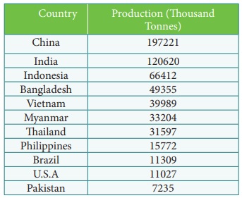
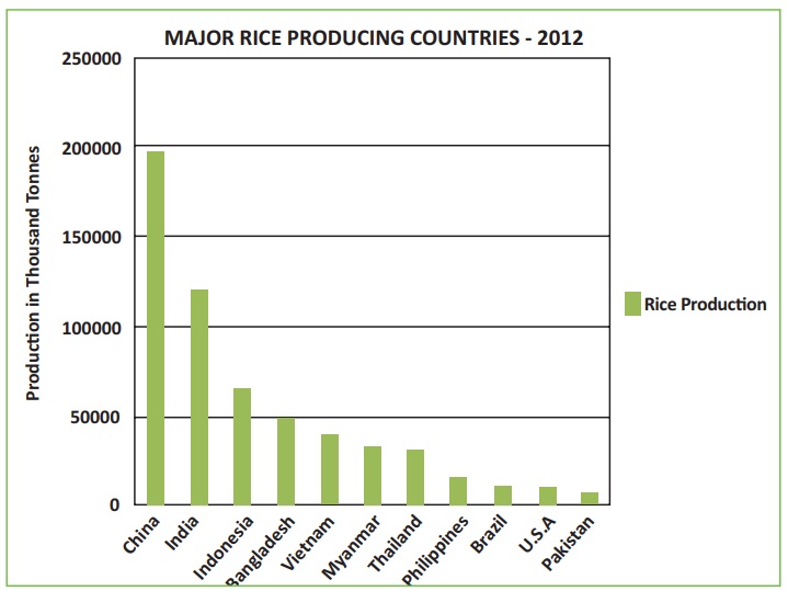
Example
Construct a simple bar
diagram to represent the data given in Table 12.3.
Table 12.3 Major Rice producing countries – 2012
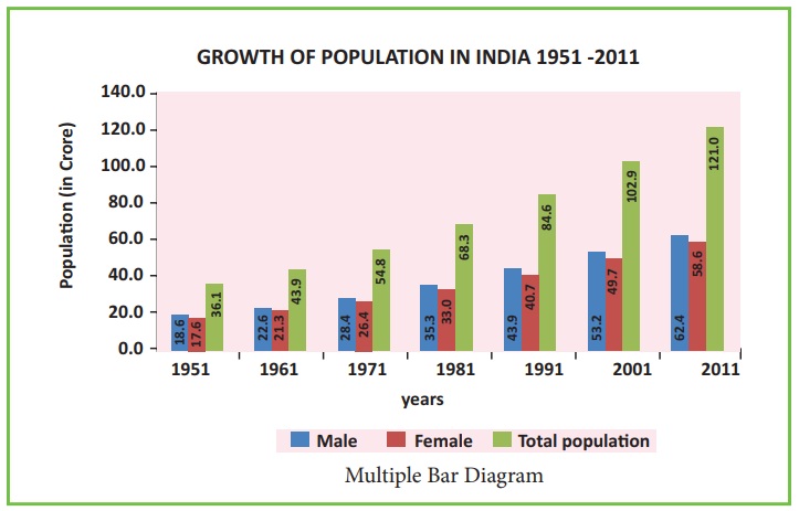
Multiple bar Diagram
Multiple bar diagrams are constructed
to represent two or more variables for the purpose of comparison. For example, a
multiple bar diagram may be constructed to show proportion of males and females
in the total, ural and urban population or the share of canal, tube well and well
irrigation of the total irrigated area in different states or yield of rice, wheat
sugar cane, coffee in the different states of a country, etc.
Example
Construct a Multiple Bar
diagram to represent the data given in Table 12.4.
Table 12.4: Population of India from 1951-2011
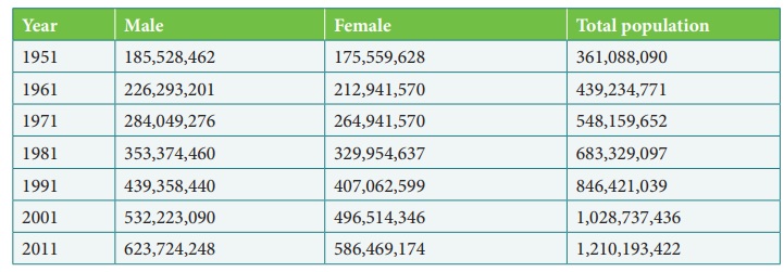
Source: Office of the Registrar General, India.
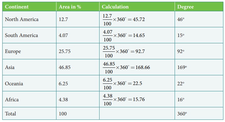
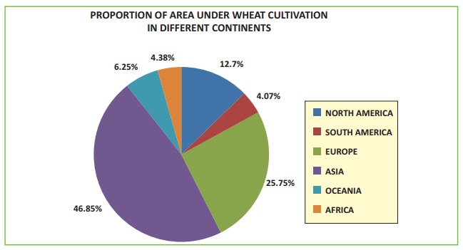
c. Pie Diagram
The Pie diagram is a circular diagram.
A circle which has 360° is divided into different sectors. Angles of the sectors,
subtending at the center, are proportional to the magnitudes of the frequency of
the components. When a circle is sub-divided into various component sectors, it
is called a Pie diagram.
How to construct a pie diagram?
The following procedure can be followed
to draw a Pie diagram for a given data:
1. Draw a
circle by using a particular radius.
2. The proportional
values of various components should be converted into degrees.
3. The angles
are obtained by the following formula
Angle value = [ Value of component / Total value ]× 360
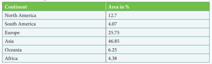
Example
Construct a Pie diagram
to represent the data given in Table 12.5.
Table 12.5 Percentage of area under wheat cultivation
Related Topics