Chapter: Web Technology : Style Sheets: CSS
Normal Flow Box Layout
NORMAL FLOW BOX LAYOUT
Understanding
the box model is critical to developing web pages that don't rely on tables for
layout. In the early days of writing HTML, before the advent of CSS, using
tables was the only way to have discreet content in separate boxes on a page.
But tables were originally conceived to display tabular information. With the
advent of CSS floating and positioning, there is no longer a need to use tables
for layout, though many years later many, if not most, sites are still using
tables in this manner.
The box
model, as defined by the W3C "describes the rectangular boxes that are
generated for elements in the document tree and laid out according to the
visual formatting model". Don't be confused by the term "boxes".
They need not appear as square boxes on the page. The term simply refers to
discreet containers for content. In fact, every element in a document is
considered to be a rectangular box.
Padding, Borders, Margins
Padding
immediately surrounds the content, between content and borders. A margin is the
space outside of the borders. If there are no borders both paddng and margin
behave in roughly the same way, except that you can have negative margins,
while you cannot have negative padding. Also padding does not collapse like
margins. See below for the section on collapsing margins.
Margin Collapse
Vertical
margins collapse when they meet. Though it may seem like a strange thing, if
you have assigned top and bottom margins to the P element of, say, 10px each,
you will not have 20px of margin between paragraphs, but rather 10px. This is
considered to be desirable and expected behavior, and not a bug. Now consider
the following declaration.
p
{margin: 10px 0 16px;}
Display Property
This is one of the most useful properties. The
complete list of values is in the appendix of this document, but the most
useful ones follow.
block
Block
display provides behavior similar to a default DIV element. A line break occurs
at the close of the tag. Elements that are block by default are DIV, P,
BLOCKQUOTE, H1 through H6, UL, OL, LI, ADDRESS, etc. Block elements accept
width, height, top and bottom margins, and top and bottom padding. A block
element constitutes a separate block box.
inline
Inline
display creates no such line break. Elements that are inline by default are SPAN,
IMG, INPUT, SELECT, EM, STRONG, etc. Inline elements do not accept width,
height, top and bottom padding, and top and bottom margins, which makes good
sense, since they are used for part of a line of text (i.e. of a block box).
They do,
however, accept left and right padding, left and right margins, and
line-height. Line-height can then be used to approximate height. If you need to
apply width, height or other block properties to an inline element, consider
assigning the element block display and/or floating it. Block display, of
course, will force the element on to a separate line (unless the element is
floated). Alternatively you can assign the inline-block value to make an inline
element take block properties (see below).
none
Display
set to none sets the element to invisible similar to the hidden value of the visibility property (see below).
However, unlike the visibility property,
this value takes up no space on the
page. This is very useful for DHTML hidden tools and for other instances when
you need items to expand and collapse based on whether they contain content to
be viewed on demand. Moreover, when you generate content, items whose display
is set to none will not be included in the loop. (For more on generated
content, see below.) Display set to none will also be hidden from most screen
readers. If you are trying to make something readable only for those with sight
disabilities, use an off-screen class like this:
.offScreen
{position: absolute; left: -10000px; top: auto; width: 1px; height: 1px;
overflow: hidden;}
inline-block
This
value causes the element to generate a block element box that will be flowed
with surrounding content as if it were a single inline box. It lets you place a
block inline with the content of its parent element. It also allows you to
assign properties associated with block display, such as width and height to an
element that naturally takes inline display. This property is also used to
trigger hasLayout in IE6,
which is a difficult concept, but briefly means making IE6 assume CSS certain
properties.
run-in
This
display mode causes the element to appear as an inline element at the start of
the block immediately following it. If there is no block following a run-in
element, it is displayed as a normal block instead. Currently, there seems to
be no browser support for this value except for IE8, but here is an example of
how it is coded, and how it should look.
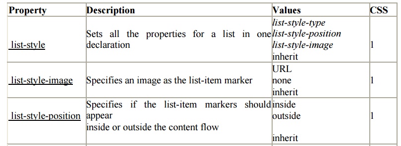
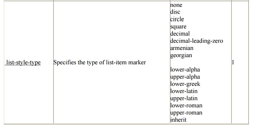
list-item
Unordered
lists are traditionally used to list bulleted items vertically. But you can
assign bullets to other elements using the list-item value.
div
{display: list-item;}
Beyond the Normal Flow
Positioning
The CSS
positioning properties allow you to position an element. It can also place an
element behind another, and specify what should happen when an element's
content is too big.Elements can be positioned using the top, bottom, left, and
right properties. However, these properties will not work unless the position
property is set first. They also work differently depending on the positioning
method.There are four different positioning methods.
Static Positioning
HTML
elements are positioned static by default. A static positioned element is
always positioned according to the normal flow of the page.Static positioned
elements are not affected by the top, bottom, left, and right properties.
Fixed Positioning
An
element with fixed position is positioned relative to the browser window.It
will not move even if the window is scrolled
Relative Positioning
A
relative positioned element is positioned relative to its normal position.
Example h2.pos_lef
t
{
position:relativ
e; left:-20px;
}
h2.pos_right
{
position:relative;
left:20px;
}
The
content of a relatively positioned elements can be moved and overlap other
elements, but the reserved space for the element is still preserved in the
normal flow.
Absolute Positioning
An absolute position element is positioned relative
to the first parent element that has a position other than static. If no such
element is found, the containing block is <html>:
Example
h2
{
position:absolute;
left:100px;
top:150px;
}
Absolutely
positioned elements are removed from the normal flow. The document and other
elements behave like the absolutely positioned element does not
exist.Absolutely positioned elements can overlap other elements.
Overlapping Elements
When elements are positioned outside the normal flow, they can overlap
other elements.The z-index property specifies the stack order of an element
(which element should be placed in front of, or behind, the others).An element
can have a positive or negative stack order:
Example
img
{
position:absolute;
left:0px;
top:0px;
z-
index:-1
}


Table Borders
To specify table borders in CSS, use the border
property.The example below specifies a black border for table, th, and td
elements:Notice that the table in the example above has double borders. This is
because both the table, th, and td elements have separate borders.
Example table,
th, td
{
border:
1px solid black;
}
To
display a single border for the table, use the border-collapse property.
Collapse Borders
The
border-collapse property sets whether the table borders are collapsed into a
single border or separated:
table
{
border-collapse:collapse;
}
table,th,
td
{
border:
1px solid black;
}
Table Width and Height
Width and height of a table is defined by the width
and height properties.The example below sets the width of the table to 100%,
and the height of the th elements to 50px:
table
{
width:100%;
}
th
{
height:50px;
}
Related Topics