Chapter: Java The Complete Reference : Introducing GUI Programming with Swing : Introducing Swing Menus
Use JRadioButtonMenuItem and JCheckBoxMenuItem - Swing
Use
JRadioButtonMenuItem and JCheckBoxMenuItem
Although the type of menu
items used by the preceding examples are, as a general rule, the most commonly used,
Swing defines two others: check boxes and radio buttons. These items can
streamline a GUI by allowing a menu to provide functionality that would
otherwise require additional, stand-alone components. Also, sometimes,
including check boxes or radio buttons in a menu simply seems the most natural
place for a specific set of features. Whatever your reason, Swing makes it easy
to use check boxes and radio buttons in menus, and both are examined here.
To add a check box to a menu,
create a JCheckBoxMenuItem. It
defines several constructors. This is the one used in this chapter:
JCheckBoxMenuItem(String name)
Here, name specifies the name of the item. The initial state of the check
box is unchecked. If you want to specify the initial state, you can use this
constructor:
JCheckBoxMenuItem(String name, boolean state)
In this case, if state is true, the box is initially checked. Otherwise, it is cleared. JCheckBoxMenuItem also provides
constructors that let you specify an icon. Here is one example:
JCheckBoxMenuItem(String name, Icon icon)
In this case, name specifies the name of the item and
the image associated with the item is passed in icon. The item is initially unchecked. Other constructors are also
supported.
Check boxes in menus work
like stand-alone check boxes. For example, they generate action events and item
events when their state changes. Check boxes are especially useful in menus
when you have options that can be selected and you want to display their
selected/ deselected status.
A radio button can be added
to a menu by creating an object of type
JRadioButtonMenuItem.
JRadioButtonMenuItem inherits
JMenuItem. It provides a rich
assortment of constructors. The ones used in this chapter are shown here:
JRadioButtonMenuItem(String name) JRadioButtonMenuItem(String name, boolean state)
The first constructor creates
an unselected radio button menu item that is associated with the name passed in
name. The second lets you specify the
initial state of the button. If state
is true, the button is initially
selected. Otherwise, it is deselected. Other constructors let you specify an icon. Here is one example:
JRadioButtonMenuItem(String name, Icon icon, boolean state)
This creates a radio button
menu item that is associated with the name passed in name and the image passed in icon.
If state is true, the button is initially selected. Otherwise, it is
deselected. Several other constructors are supported.
A JRadioButtonMenuItem works like a stand-alone radio button,
generating item and action events. Like stand-alone radio buttons, menu-based
radio buttons must be put into a button group in order for them to exhibit
mutually exclusive selection behavior.
Because both JCheckBoxMenuItem and JRadioButtonMenuItem inherit JMenuItem, each has all of the
functionality provided by JMenuItem.
Aside from having the extra capabilities of check boxes and radio buttons, they
act like and are used like other menu items.
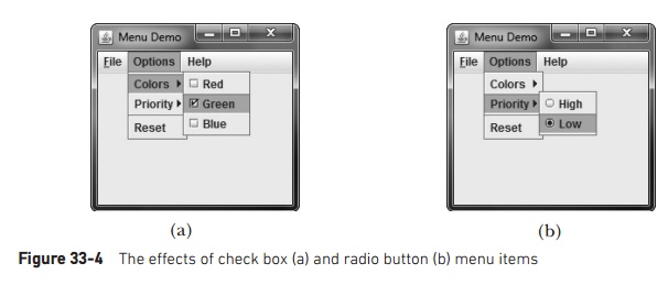
To try check box and radio
button menu items, first remove the code that creates the Options menu in the MenuDemo example program. Then
substitute the following code sequence, which uses check boxes for the Colors
submenu and radio buttons for the Priority submenu. After making the
substitution, the Options menu will look like those shown in Figure 33-4.
// Create the Options menu.
JMenu jmOptions
= new JMenu("Options");
// Create the Colors submenu.
JMenu jmColors
= new JMenu("Colors");
//Use check boxes for colors. This allows
//the user to select more than one color.
JCheckBoxMenuItem jmiRed = new
JCheckBoxMenuItem("Red"); JCheckBoxMenuItem jmiGreen = new
JCheckBoxMenuItem("Green"); JCheckBoxMenuItem jmiBlue = new
JCheckBoxMenuItem("Blue");
jmColors.add(jmiRed);
jmColors.add(jmiGreen);
jmColors.add(jmiBlue);
jmOptions.add(jmColors);
// Create the Priority submenu.
JMenu jmPriority = new
JMenu("Priority");
//Use radio buttons for the priority setting.
//This lets the menu show which priority is
used
//but also ensures that one and only one
priority
//can be selected at any one time. Notice that
//the High radio button is initially selected.
JRadioButtonMenuItem jmiHigh =
new JRadioButtonMenuItem("High",
true);
JRadioButtonMenuItem jmiLow =
new JRadioButtonMenuItem("Low");
jmPriority.add(jmiHigh);
jmPriority.add(jmiLow);
jmOptions.add(jmPriority);
//Create button group for the radio button menu
items.
ButtonGroup bg = new ButtonGroup();
bg.add(jmiHigh);
bg.add(jmiLow);
//Create the Reset menu item.
JMenuItem jmiReset = new
JMenuItem("Reset");
jmOptions.addSeparator();
jmOptions.add(jmiReset);
//Finally, add the entire options menu to
//the menu bar
jmb.add(jmOptions);
Related Topics