Chapter: User Interface Design : Windows and controls
Presentation Controls
Presentation
Controls
Common presentation controls are static
text fields, group boxes column headings,
ToolTips, balloon tips, and progress
indicators.
Static
Text Fields
Description:
Read-only
textual information.
Purpose:
To
identify a control by displaying a control caption.
To
clarify a screen by providing instructional or prompting information.
To
present descriptive information.
Proper
usage:
To
display a control caption.
To
display instructional or prompting information.
To
display descriptive information.
Static Text Field Guidelines
Captions:
Include a
colon (:) as part of the caption.
Include a
mnemonic for keyboard access.
When the
associated control is disabled, display it dimmed.
Follow
all other presented guidelines for caption presentation and layout.
Instructional
or prompting information:
Display
it in a unique and consistent font style for easy recognition and
differentiation.
Follow
all other presented guidelines for prompting and instructional information.
Descriptive
information:
Follow
all other guidelines for required screen or control descriptive information.
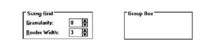
Group
Boxes
Description:
A
rectangular frame that surrounds a control or group of controls.
An
optional caption may be included in the frame’s upper-left corner.
Purpose:
To
visually relate the elements of a control.
To
visually relate a group of related controls.
Proper
usage:
To
provide a border around radio button or check box controls.
To
provide a border around two or more functionally related controls.
Guidelines:
Label or
heading:
Typically, use a noun or noun phrase for the label
or heading.
Provide a brief label or heading, preferably one or
two words.
Relate label or heading’s content to the group
box’s content.
Capitalize the first letter of each significant
word.
Do not include and ending colon ( : ).
Follow
all other guidelines presented for control and section borders.
Column Headings
Description:
Read-only
textual information that serves as a heading above columns of text or numbers.
Can be
divided into two or more parts.
Purpose:
To
identify a column of information contained in a table.
Proper
usage:
To
display a heading above a column of information contained in a table.
Guidelines:
Heading:
-
Provide a brief heading.
-
Can include text and a graphic image.
-
Capitalize the first letter of each significant
word.
-
Do not include an ending colon ( : ).
The width
of the column should fit the average size of the column entries.
Does not
support keyboard access.
ToolTips
Description:
A small
pop-up window containing descriptive text that appears when a pointer is moved
over a control or element either:
Not possessing a label.
In need of additional descriptive or status
information.
Purpose:
To
provide descriptive information about a control or screen element.
Advantages:
Identifies
an otherwise unidentified control.
Reduces
possible screen clutter caused by control captions and descriptive information.
Enables
control size to be reduced.
Disadvantages:
Not
obvious, must be discovered.
Inadvertent
appearance can be distracting.
Proper
usage:
To
identify a control that has no caption.
To
provide additional descriptive or status information about a screen element.
ToolTip
Guidelines
Display after a short time-out.
For toolbars, provide a brief word as a label.
-
Use mixed case in the headline style of
presentation with no ending punctuation.
For other elements, provide a brief phrase presenting descriptive or
status information.
-
Use mixed case in the sentence style of
presentation.
Present ToolTips at the lower-right edge of the pointer.
-
Display them fully on the screen.
For text
boxes, display ToolTips centered under the control.
Display them in the standard system ToolTip colors.
Remove the ToolTip when the control is activated or the pointer is moved
away.
Don’t
substitute ToolTips for good design.
Balloon
Tips
Description:
A small
pop-up window that contains information in a word balloon.
Components
can include:
-
Title.
-
Body text.
-
Message Icons.
Appear
adjacent to the item to which they apply, generally above or to left.
Only one
tip, the last posted, is visible at any time.
Tips are
removed after a specified time period.
Purpose:
To
provide additional descriptive or status information about a screen element.
Advantages:
Provides
useful reminder and status information.
Disadvantages:
If
overused they lose their attention-getting value.
If
overused in situations the user considers not very important, their continual
appearance can be aggravating.
Proper
usage:
To
display noncritical:
-
Reminder information.
-
Notification information.
Do not
use tips to display critical information.
Balloon
Tip Guidelines
General:
Use a
notification tip to inform the user about state changes.
Use a
reminder tip for state changes that the user might not usually notice.
Point the
tip of the balloon to the item it references.
Do not
use them to replace ToolTips.
Do not
overuse balloon tips.
Content:
Restrict
them to a length of 100 characters, including title and body text.
Title
text should:
If the tip refers to an icon or other image
representing a specific object,
include:
-
The object’s name, using its normal capitalization.
-
The object’s status, using sentence-style
presentation without ending punctuation.
Be presented in bold.
Body text should:
Include a description of the situation in one or
two brief sentences.
Include a brief suggestion for correcting the
situation.
Be presented using mixed-case in the sentence
style.
Progress
Indicators
Description:
A
rectangular bar that fills as a process is being performed, indicating the
percentage of the process that has been completed.
Purpose:
To
provide feedback concerning the completion of a lengthy operation.
Proper
usage:
To
provide an indication of the proportion of a process completed.
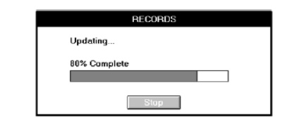
Progress
Indicator Guidelines
When filling the indicator:
-
If horizontally arrayed, fill it from left to
right.
-
If vertically arrayed, fill it from bottom to top.
Fill it with a color or a shade of gray.
Include descriptive text for the process, as necessary.
Place text outside of the control.
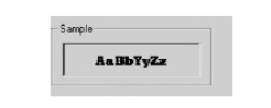
Sample
Box
Description:
A box
illustrating what will show up on the screen based upon the parameter or
parameters selected.
May
include text, graphics, or both.
Purpose:
To
provide a representation of actual screen content based upon the parameter or
parameters selected.
Guidelines:
Include a
brief label.
Use mixed
case in the headline style.
Locate it
adjacent to the controls upon which it is dependent.
Scrolling
Tickers
Description:
Text that
scrolls horizontally through a container window.
Advantages:
Consume
less screen space than full text.
Disadvantages:
Hard to
read.
Time-consuming
to interpret.
Distracting.
Guideline:
Do not
use.
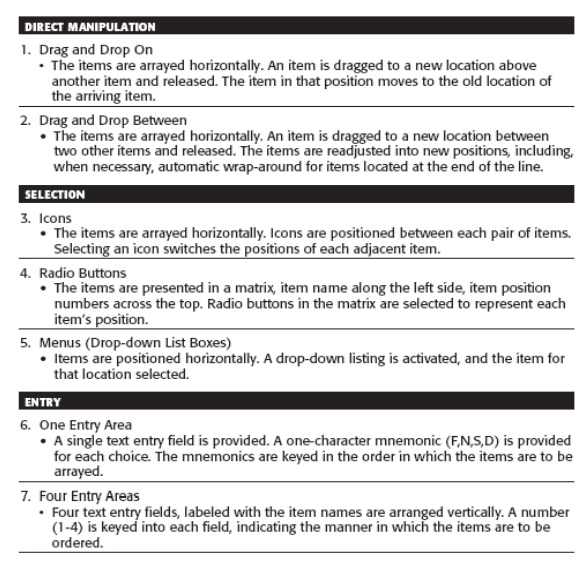
Selecting
the Proper Controls
The proper control will enable a person to make needed selections,
entries, and changes quickly, efficiently, and with fewer mistakes. Improper
selection most often leads to the opposite result.
Entry
versus Selection—A Comparison
Studies looked at the advantages and disadvantages of using either entry
fields or selection fields for data collection.
Entry involved keying text; selection was performed by pointing at a
choice through the keyboard using the cursor control keys (not a mouse).
The information compared was of three kinds: dates, text, and data. The
first conclusion:
Choosing
a Type of Control
For familiar, meaningful data choose the technique that, in theory,
requires the fewest number of keystrokes to complete.
If the data is unfamiliar or prone to typing errors, choose a selection
technique
Aided versus Unaided Entry
Provide aided entry whenever possible.
-
Absorb any extra and unnecessary keystrokes.
-
Provide an auditory signal that auto completion has
been performed.
Comparison
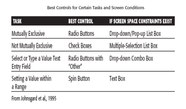
of GUI Controls
Mutually Exclusive Choice Controls
For a small set of options (5), a medium set (12),
and a large set (30), radio buttons were significantly faster than the other
mutually exclusive controls.
The medium and large set sizes (12 and 30) are
larger than generally recommended for radio buttons (8 or less). The results
indicate that radio buttons may effectively be used for these larger quantities
Nonexclusive Choice Controls
For a
small set of options (5) with two selected choices, a medium set (12) with
three selected choices, and a large set (30) with eight selected choices, check
boxes were significantly faster than the other nonexclusive controls.
Controls for Selecting a Value within a Range
Setting range values included indicating a time, a percentage, or the
transmission frequency of a radio station.
Controls evaluated were the spin button, text entry field, and the slider.
The spin button was the most accurate, and the text entry field fastest
and most preferred.
General conclusions are:
-
Making all options always visible will enhance
performance.
-
Requiring additional actions to make further
options visible slows performance.
-
For longer lists, scrolling tends to degrade
performance more than the action associated with retrieving a hidden list.
Control
Selection Criteria
Selection of the proper control, then, depends on several factors. The
first is the structure and characteristics of the property or data itself.
Other considerations include the nature of the task, the nature of the
user, and the limitations of the display screen itself
Data considerations include the following:
-
Is the property or data mutually exclusive or nonexclusive?
Does entry/selection require single or multiple items?
-
Is the property or data discrete or continuous?
Discrete data can be meaningfully specified and categorized, while continuous
data cannot.
-
Is the property or data limited or unlimited in
scope? If limited, how many items will the data normally not exceed?
-
Is the property or data fixed or variable in list
length? Are there always a fixed number of items, or will it varies?
-
Is the property or data ordered in a predictable or unpredictable fashion? If predictable, will the user be able to
anticipate the next, unseen, item?
-
Can the property or data be represented pictorially? Will a picture or graphic be as meaningful
as a textual description?
Task considerations reflect the nature of the job. Considerations
include the following:
-
How often
is an
item entered or selected?
-
How often
is an
item changed?
-
How precisely
must the item be entered or selected?
User considerations reflect the characteristics of the user. Important
considerations:
-
How much training in control operation will be
provided?
-
How meaningful or known is the property or data to the
user?
-
How easily
remembered or learned by the
user is the property or data?
-
How frequently
used will the
system be?
-
Is the user an experienced
typist?
Display
considerations reflect the characteristics of the screen and hardware. o
-
How much screen
space
is
available to display the various controls?
Choosing
a Control Form
When to
Permit Text Entry
Permit text entry if any of the following questions can be answered Yes:
-
Is the data unlimited in size and scope?
-
Is the data familiar?
-
Is the data not
conducive to typing errors?
-
Will typing be faster than choice selection?
-
Is the user an experienced typist?
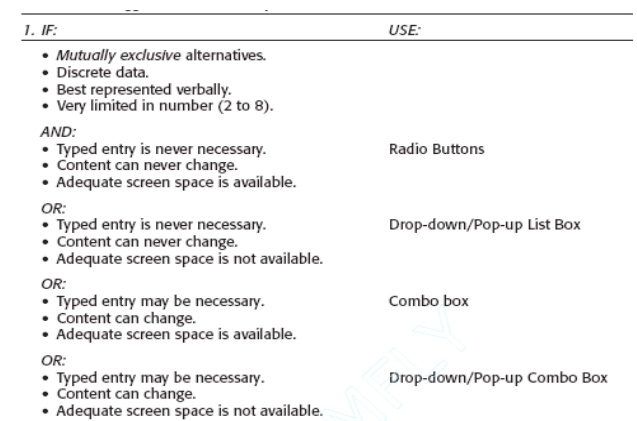
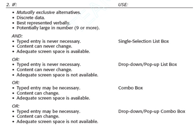
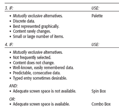
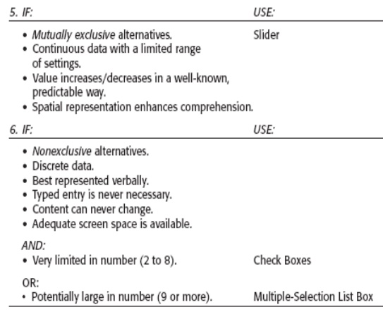
What Kind of Control to Choose
Next are two tables providing some control recommendations based upon a
control’s known advantages, disadvantages, and proper usage characteristics
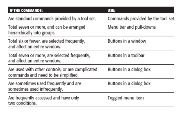
Choosing between Buttons and Menus for Commands
Determining the proper way to present a command also depends on several
factors.
- The
following considerations are involved in choosing the correct command form: o Whether or not the command part
of a standard tool set.
-
The total number of commands in the application. o The complexity of the commands.
-
The frequency with which commands are used.
-
Whether or not the command is used in association with
another control.
Applications:
-
Embedded
Systems
-
Multimedia
-
Graphical
System
-
Book
Banking system
-
Online
course reservation
Related Topics