Data Visualization Using Pyplot - Getting Started | 12th Computer Science : UNIT 16 : Integrating Python with MySql and C++ : Data Visualization Using Pyplot: Line Chart, Pie Chart and Bar Chart
Chapter: 12th Computer Science : UNIT 16 : Integrating Python with MySql and C++ : Data Visualization Using Pyplot: Line Chart, Pie Chart and Bar Chart
Getting Started
Getting Started
After installing Matplotlib, we will begin
coding by importing Matplotlib using the command:
import matplotlib.pyplot as plt
Now you have imported Matplotlib in your
workspace. You need to display the plots. Using Matplotlib from within a Python
script, you have to add plt.show() method inside the file to display your plot.
Example
import matplotlib.pyplot as plt
plt.plot([1,2,3,4])
plt.show()
Output
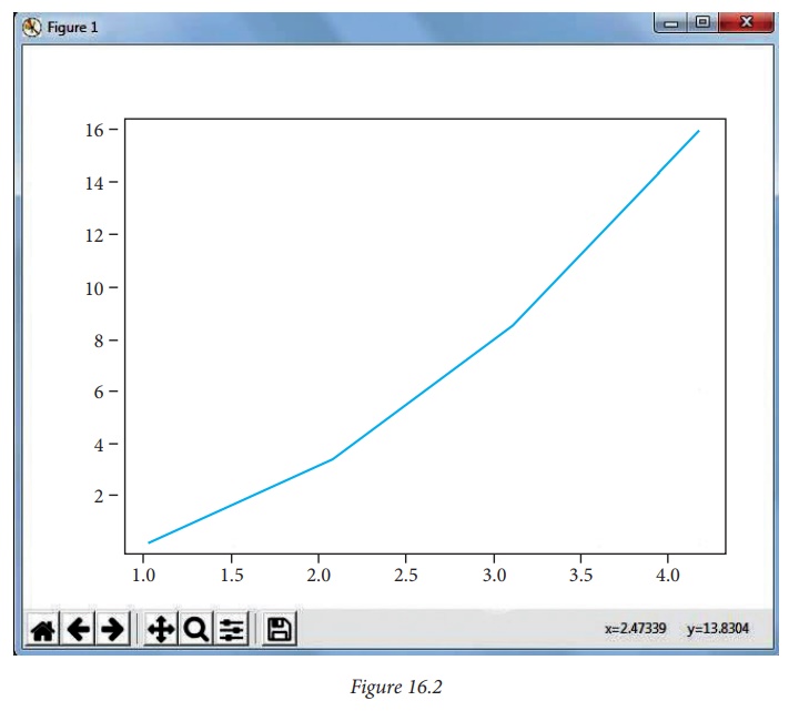
This window is a matplotlib
window, which allows you to see your graph. You can hover the graph and see the
coordinates in the bottom right.
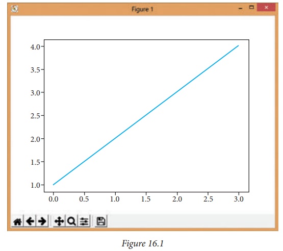
You may be wondering why the x-axis ranges from
0-3 and the y-axis from 1-4. If you provide a single list or array to the plot
() command, matplotlib assumes it is a sequence of y values, and automatically
generates the x values for you. Since python ranges start with 0, the default x
vector has the same length as y but starts with 0. Hence the x data are [0, 1,
2, 3].
plot() is a versatile command, and will take an
arbitrary number of arguments.
Program
For example, to plot x versus y,
you can issue the command:
import matplotlib.pyplot as plt
plt.plot([1,2,3,4], [1,4,9,16])
plt.show()
This .plot takes many parameters, but the first
two here are 'x' and 'y' coordinates. This means, you have 4 co-ordinates
according to these lists: (1,1), (2,4), (3,9) and (4,16).
Plotting Two Lines
To plot two lines, use the following code:
import matplotlib.pyplot as plt
x = [1,2,3]
y = [5,7,4]
x2 = [1,2,3]
y2 = [10,14,12]
plt.plot(x, y, label='Line 1')
plt.plot(x2, y2, label='Line 2')
plt.xlabel('X-Axis')
plt.ylabel('Y-Axis')
plt.title('LINE GRAPH')
plt.legend()
plt.show()
Output
With plt.xlabel and plt.ylabel, you can assign
labels to those respective axis. Next, you can assign the plot's title with
plt.title, and then you can invoke the default legend with plt. legend().

Buttons in the output
In the output figure, you can see few buttons
at the bottom left corner. Let us see the use of these buttons.
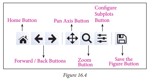
Home Button → The Home Button will help once you have begun
navigating your chart. If you ever want to return back to the
original view, you can click on this.
Forward/Back buttons → These buttons can be used like the Forward and Back buttons in your browser. You can click these to move back to the previous point you were at, or forward again.
Pan Axis → This cross-looking button allows
you to click it, and then click and drag your graph around.
Zoom → The Zoom button lets you click on
it, then click and drag a square that you would like to zoom into specifically. Zooming
in will require a left click and drag. You can alternatively zoom out with a
right click and drag.
Configure Subplots → This button allows you to configure various spacing
options with your figure and plot.
Save Figure → This button will allow you to save your figure in
various forms.
Related Topics