Chapter: User Interface Design : Multimedia
Coloring
Coloring
What is a color?
A color can only be described in terms of a
person’s report of his or her perceptions.
The visual spectrum of wavelengths to which the eye
is sensitive ranges from about 400 to 700 milli microns.
Objects in the visual environment often emit or
reflect light waves in a limited area of this visual spectrum, absorbing light
waves in other areas of the spectrum.
The
dominant wavelength being “seen” is the one that we come to associate with a
specific color name. The visible color spectrum and the names commonly
associated with the various light wavelengths
Red 700
Orange 600
Yellow 570
Yellow-green 535
Green 500
Blue-green 493
Blue 470
Violet 400
A color
posses three properties
·
Hue is the
spectral wavelength composition of a color. It is to this we attach a meaning such as green or red.
·
Chroma or saturation is the purity of a color in
a scale from gray to the most vivid
version of the color. The more saturated a hue is, the more visible it is at a
distance.
·
saturated, the less visible it is. Value or intensity is the relative lightness or darkness of a color in a
range from black to white.
The long-wavelength colors (red) are commonly referred to as warm, and
shortwavelength colors (blue) as cool.
Color, then, is a combination of hue, chroma, and value.(HSV) or primary
wavelength colors RGB
Dithering
The eye is never steady, instead trembling slightly as we see.
If pixels of different colors are placed next to each other, this tremor
combines the two colors into a third color. This is referred to as dithering, and sometimes texture mapping.
Taking advantage of this phenomena, an optical illusion, a third color
can be created on a screen. Dithering is often used to create a gray scale when
only black and white pixels are available to work with.
Color Uses
Use color to assist in formatting a screen:
Relating
or tying elements into groupings.
Breaking
apart separate groupings of information.
Associating
information that is widely separated on the screen.
Highlighting
or calling attention to important information by setting it off from the other
information.
Use color as a visual code to identify:
Screen
components.
The
logical structure of ideas, processes, or sequences.
Sources
of information.
Status of
information.
Use color to:
Realistically
portray natural objects.
Increase
screen appeal.
Possible Problems with Color
When used improperly, color may even impair performance by distracting
the viewer and interfering with the handling of information.
Possible
problems may be caused by the perceptual system itself or the physiological
characteristics of the human eye.
High
Attention-Getting Capacity
This quality causes the screen viewer to associate,
or tie together, screen elements of the same color, whether or not such an
association should be
made.
The result is often bewilderment, confusion, and
slower reading.
Interference
with Use of Other Screens
Indiscriminate or poor use of color on some screens
will diminish the effectiveness of color on other screens.
Varying
Sensitivity of the Eye to Different Colors
All colors are not equal in the eye of the viewer.
The eye is more sensitive to those in the middle of the visual spectrum (yellow
and green), which appear brighter than those at the extremes (blue and red).
Thus, text composed of colors at the extremes is thought to be more difficult
to read.
The wavelengths of light that produce blue are
normally focused in front of the eye’s retina, the red wavelengths behind it.
Simultaneous
or sequential viewing of red and blue causes the eye to continually refocus to
bring the image directly onto the retina, thereby increasing the potential for
eye fatigue.
The perceived appearance of a color is also
affected by a variety of other factors, including the size of the area of
color, the ambient illumination level, and other colors in the viewing area.
Also, larger changes in wavelength are needed in
some areas of the visual spectrum for a color change to be noticed by the eye.
Small changes in extreme reds and purples are more difficult to detect than
small changes in yellow and blue-green.
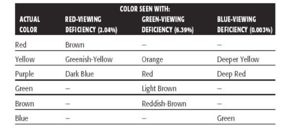
Color-Viewing
Deficiencies
A red viewing deficiency is called protanopia, a green deficiency is called
deuteranopia, and a blue deficiency
is called tritanopia.
These common color deficiencies, their results, and
the percentage of people who experience these problems are given below
Cross-Disciplinary and
Cross-Cultural Differences
Colors can have different meanings in different situations to different
people.
The same color may also have a different connotation, depending upon its
viewer. The color blue has the following quite different meanings:
·
For financial managers—Corporate qualities or
reliability.
o For
health care professionals—Death.
·
For nuclear reactor monitors—Coolness or water.
·
For American movie audiences—Tenderness or
pornography.
Color appeal is also subjective. People have different tastes in color,
what is pleasing to one person may be distasteful or unusable by someone else
Color and Human Vision
To understand how color should be used on a screen, it is helpful to
know something of the physiology of the human eye.
The Lens
Muscles control the lens of the eye. These muscles focus received
wavelengths of light on the retina.
The lens itself is not color corrected. The wavelengths of light that
create different colors are focused at different distances behind the lens, the
longer wavelengths (red) being focused farther back than the shorter
wavelengths (blue).
The result is that colors of a different wavelength from the color
actually being focused by the lens will appear out of focus. To create a sharp
image of the out-of-focus colors requires a refocusing of the eye.
Very pure or saturated colors require more refocusing than less pure or
unsaturated colors. Therefore, a color with a large white component will
require less refocusing.
The lens does not transmit all light wavelengths equally. It absorbs
more wavelengths in the blue region of the spectrum than those in the other
regions.
The Retina
The retina is the light-sensitive surface of the eye.
It comprises two kinds of receptors, rods and cones, which translate the
incoming light into nervous impulses.
Rods are sensitive to lower light levels and function primarily at
night.
Cones are stimulated by higher light levels and react to color. The
sensitivity of cones to colors varies, different cones possessing maximum
sensitivity to different wavelengths of light.
Rods and cones vary in distribution across the retina. The center is
tightly packed with cones and has no rods. Toward the periphery of the retina,
rods increase and cones decrease.
Thus, color sensitivity does not exist at the retina’s outer edges, although
yellows and blues can be detected further into the periphery than reds and
greens.
The brightness sensitivity of the eye to different colors also varies.
It is governed by output from the red and green cones.
The greater the output, the higher the brightness, which results in the
eye being most sensitive to colors in the middle of the visual spectrum and
less sensitive to colors at the extremes.
The components of the eye—the lens and retina—govern the choices, and
combinations, of colors to be displayed on a screen. The proper colors will
enhance performance; improper colors will have the opposite effect,
Choosing Colors
When choosing colors for display, one must consider these factors:
·
the human visual system,
·
the possible problems that the colors’ use may
cause,
·
the viewing environment in which the display is
used,
·
the task of the user, how the colors will be used,
and
·
the hardware on which the colors will be displayed
Choosing Colors for Categories of
Information
Choosing colors for categories of information requires a clear
understanding of how the information will be used.
Some examples:
·
If different parts of the screen are attended to
separately, color-code the different parts to focus selective attention on each
in turn.
·
If decisions are made based on the status of
certain types of information on the screen, color-code the types of status that
the information may possess.
·
If screen searching is performed to locate
information of a particular kind or quality, color-code these kinds or
qualities for contrast.
·
If the sequence of information use is constrained
or ordered, use color to identify the sequence.
·
If the information displayed on a screen is packed
or crowded, use color to provide visual groupings.
Use color as a redundant screen code.
Colors in Context
Colors
are subject to contextual effects. The size of a colored image, the color of
images adjacent to it, and the ambient illumination all exert an influence on
what is actually perceived.
At the
normal viewing distance for a screen, maximal color sensitivity is not reached
until the size of a colored area exceeds about a 3-inch square.
Adjacent
images can influence the perceived color. A color on a dark background will
look lighter and brighter than the same color on a light background
Colors
also change as light levels change. Higher levels of ambient light tend to
desaturate colors. Saturated colors will also appear larger than desaturated
colors.
Usage
Design for monochrome first.
·
in shades of black, white and gray.
·
Doing this will permit the screen to be effectively
used:
o By people
with a color-viewing deficiency.
o On
monochrome displays.
o In
conditions where ambient lighting distorts the perceived color.
o If the
color ever fails.
Use colors conservatively.
Do not
use color where other identification techniques, such as location, are
available.
Discrimination and Harmony
For best absolute discrimination, select no more than four or five
colors widely spaced on the color spectrum.
Good
colors: red, yellow, green, blue, and brown.
For best comparative discrimination, select no more than six or seven
colors widely spaced on the color spectrum.
Other
acceptable colors: orange, yellow-green, cyan, violet, and magenta.
Choose harmonious colors.
One color
plus two colors on either side of its complement.
Three
colors at equidistant points around the color circle.
For extended viewing or older viewers, use brighter colors.
Emphasis
To draw attention or to emphasize elements, use bright or highlighted
colors. To deemphasize elements, use less bright colors.
The
perceived brightness of colors from most to least is white, yellow, green,
blue, red.
To emphasize separation, use contrasting colors.
Red and
green, blue and yellow.
To convey similarity, use similar colors.
Orange
and yellow, blue and violet.
Common Meanings
To indicate that actions are necessary, use warm colors.
Red,
orange, yellow.
To provide status or background information, use cool colors.
Green,
blue, violet, purple.
Conform to human expectations.
·
In the job.
·
In the world at large.
Some common color associations are the following:
·
Red—Stop, fire, hot, danger.
·
Yellow—Caution, slow, test.
·
Green—Go, OK, clear, vegetation, safety.
·
Blue—Cold, water, calm, sky, neutrality.
·
Gray—Neutrality.
·
White—Neutrality.
·
Warm colors—Action, response required, spatial
closeness.
·
Cool colors—Status, background information, spatial
remoteness.
Some typical implications of color with dramatic portrayal are:
·
High illumination—Hot, active, comic situations.
·
Low illumination—Emotional, tense, tragic,
melodramatic, romantic situations.
·
High saturation—Emotional, tense, hot,
melodramatic, comic situations. o Warm colors—Active, leisure, recreation, comic
situations.
·
Cool colors—Efficiency, work, tragic and romantic
situations.
Location
In the center of the visual field, use red and green.
For peripheral viewing, use blue, yellow, black, and white.
Use adjacent colors that differ by hue and value or lightness.
Ordering
Order colors by their spectral position.
Red,
orange, yellow, green, blue, indigo, violet.
Foregrounds and Backgrounds
Foregrounds:
·
Use colors that highly contrast with the background
color.
·
For text or data, use:
o
Black.
o
Desaturated or spectrum center colors such as
white, yellow, or green.
o
Warmer more active colors.
·
Use colors that possess the same saturation and
lightness.
·
To emphasize an element, highlight it in a light
value of the foreground color, pure white, or yellow.
·
To deemphasize an element, lowlight it in a dark
value of the foreground color.
Backgrounds:
·
Use a background color to organize a group of
elements into a unified whole.
·
Use colors that do not compete with the foreground.
Use:
·
Light-colored backgrounds of low intensity:
Off-white or light gray.
·
Desaturated colors.
·
Cool, dark colors such as blue or black.
·
Colors on the spectral extremes.
Three-Dimensional Look
Use at least five colors or color values to create a 3-D look on a
screen.
Background:
The control itself and the window on which it appears.
Foreground:
Captions and lines for buttons, icons, and other objects.
Usually black or white.
Selected
mode: The color used when the item is selected.
Top
shadow: The bezel on the top and left of the control.
Bottom
shadow: The bezel on the bottom and right of the control.
Motif has created an algorithm to automatically calculate the top and
bottom shadows, and the select color based upon the background (Kobara, 1991).
Briefly, it recommends the following:
Background. Midrange colors, 155–175 on the
RGB scale.
Foreground. Black or white, depending on the
lightness or darkness of the background.
Selected mode. About 15 percent darker than the
background color, halfway between the background and bottom shadow. (Calculate
this by multiplying the background
color’s RGB value by 0.85.)
Top shadow. About 40 to 50 percent brighter
than the background color.
(Calculate
this by multiplying the background color’s RGB by 1.50.)
Bottom shadow. About 45 to 60 percent darker
than the background color. (Calculate this by multiplying the background’s RGB
values by 0.50.)
Color Palette, Defaults, and
Customization
Permit users to customize their colors.
Provide a default set of colors for all screen components.
Provide a palette of six or seven foreground colors.
Provide 2
to 5 values or lightness shades for each foreground color.
Provide a palette of six or seven background colors.
Never refer to a screen element by its color.
Gray Scale
For fine discriminations use a black-gray-white scale.
·
Recommended values are white, light gray, medium
gray, dark gray, black.
Text in Color
When switching text from black to color:
·
Double the width of lines.
·
Use bold or larger type:
·
If originally 8 to 12 points, increase by 1 to 2
points.
·
If originally 14 to 24 points, increase by 2 to 4
points.
Check legibility by squinting at text.
·
Too-light type will recede or even disappear.
Monochromatic Screens
At the standard viewing distance, white, orange, or green are acceptable
colors.
At a far viewing distance, white is the best choice.
Over all viewing distances, from near to far, white is the best choice.
Cultural, Disciplinary, and
Accessibility Considerations
Consider the impact of specific colors on:
·
Users of various cultures.
·
Users of various disciplines.
·
Users with color-viewing deficiencies.
·
Users relying on accessibility utilities.
Choosing Colors for Textual
Graphic Screens
For displaying data, text, and symbols on a textual graphical screen
colors selected should have adequate visibility, meaning, contrast, and
harmony.
Use effective foreground/background combinations.
Use effective foreground combinations.
Choose the background color first.
Display no more than four colors at one time.
Use colors in toolbars sparingly.
Test the chosen colors.
Effective Foreground/Background
Combinations
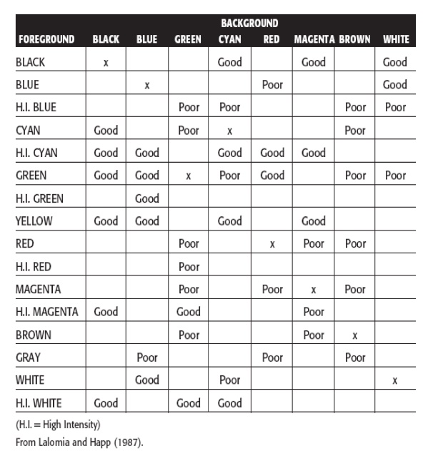
Lalomia and Happ (1987) established effective foreground/background
color combinations
From a color set of 16 different foregrounds and 8 different
backgrounds, 120 color combinations were evaluated for (1) response time to
identify characters, and (2) subjective preferences of users.
The results from each measure were ranked and combined to derive an
overall measure of color combination effectiveness.
The best and poorest color combinations are summarized in Table given
below
The results yield some interesting conclusions:
·
The majority of good combinations possess a bright
or high-intensity color as the foreground color.
·
The majority of poor combinations are those with
low contrast.
·
The best overall color is black.
·
The poorest overall color is brown.
·
Maximum flexibility and variety in choosing a
foreground color exists with black or blue backgrounds.
·
Brown and green are the poorest background choices.
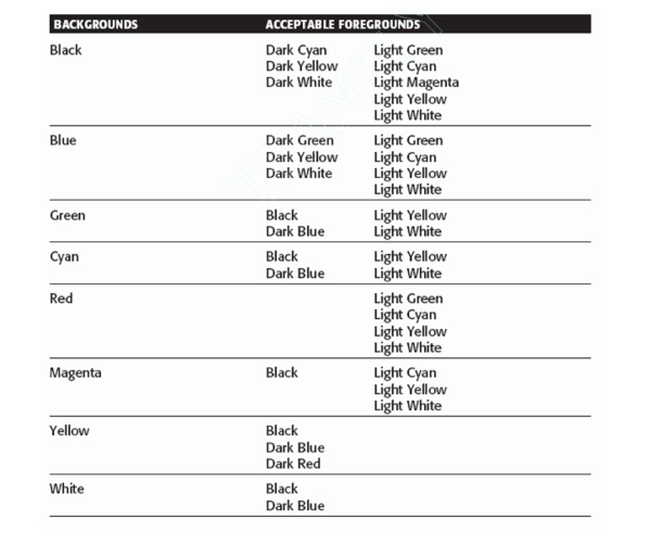
Bailey
and Bailey (1989), in their screen creation utility Protoscreens, have a table summarizing
research-derived good foreground/background combinations.
Uses of Color to Avoid
Relying exclusively on color.
Too many colors at one time.
Highly saturated, spectrally extreme colors together:
Red and
blue, yellow and purple.
Low-brightness colors for extended viewing or older viewers.
Colors of equal brightness.
Colors lacking contrast:
For
example, yellow and white; black and brown; reds, blues, and browns against a
light background.
Fully saturated colors for text or other frequently read screen
components.
Pure blue for text, thin lines, and small shapes.
Colors in small areas.
Color for fine details.
Non-opponent colors.
Red and green in the periphery of large-scale displays.
Adjacent colors that only differ in the amount of blue they possess.
Single-color distinctions for color-deficient users.
Using colors in unexpected ways.
Using
color to improve legibility of densely packed text.
Applications:
Graphical
system
Screen
presentation
Animation
Multimedia